
Covid Testing In Texas
Covid tests in Texas
The second entry to look at the testing in Texas. This time there is much more data to examine, but also a new and irritating problem. At some point, for some counties, antibody testing got mixed in with the PCR tests, so the numbers are not nearly as good as they should be. Last I read, about 10% of the tests are the wrong test, but I suspect this is not evenly distributed by county, but rather concentrated in a few. The total test numbers for the state are supposed to be free of this issue, so I’ll also look at those.
The raw data comes from the State Health Department website.
Compare totals to total
Let’s look at differences between the state total and the sum of the county numbers.
county <- Tests_by_county %>%
  filter(!County=="TOTAL") %>%
  group_by(Date) %>%
    summarise(County=sum(Tests))
## `summarise()` ungrouping output (override with `.groups` argument)foo <- Tests_by_county %>% filter(County=="TOTAL")
left_join(Tests_Total, county, by="Date") %>%
select(Date, State=Total, County) %>%
pivot_longer(-Date, names_to="Source", values_to="Test_Total") %>%
ggplot(aes(x=Date, y=Test_Total, color=Source)) +
geom_line() +
geom_line(data=foo, aes(x=Date, y=Tests), color="red")+
labs(title="Number of Tests, Texas", y="Total Tests")## Warning: Removed 33 row(s) containing missing values (geom_path).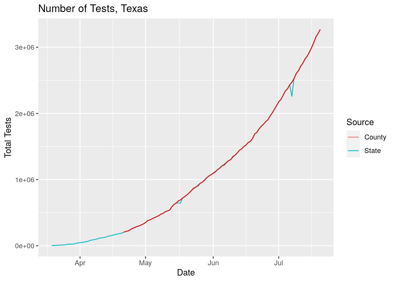
So good news, the figures have been updated, hopefully to include only relevant tests and not the antibody tests.
Positive tests
So let’s join the tests dataset with the positive cases dataset and get a measure of percent positive
full_data <- left_join(Covid_data,
                      Tests_by_county,
                      by=c("Date", "County")) %>%
  filter(!grepl("Probable.*", County))

full_data <- full_data %>%
  group_by(Date) %>%
    mutate(Test_Total=sum(Tests, na.rm=TRUE), Case_Total=sum(Cases, na.rm=TRUE)) %>%
  mutate(pct_pos=Cases/Tests*100)

# Plot total

full_data %>%
  filter(Test_Total>0) %>%
  group_by(Date) %>%
    summarise(Test_Total=sum(Tests, na.rm=TRUE),
              Case_Total=sum(Cases, na.rm=TRUE)) %>%
  mutate(pct_pos=Case_Total/Test_Total*100) %>%
  ggplot(aes(x=Date, y=pct_pos)) +
    geom_line() +
    labs(title="Percent Positive Tests for Texas", x="Date", y="Percent")
## `summarise()` ungrouping output (override with `.groups` argument)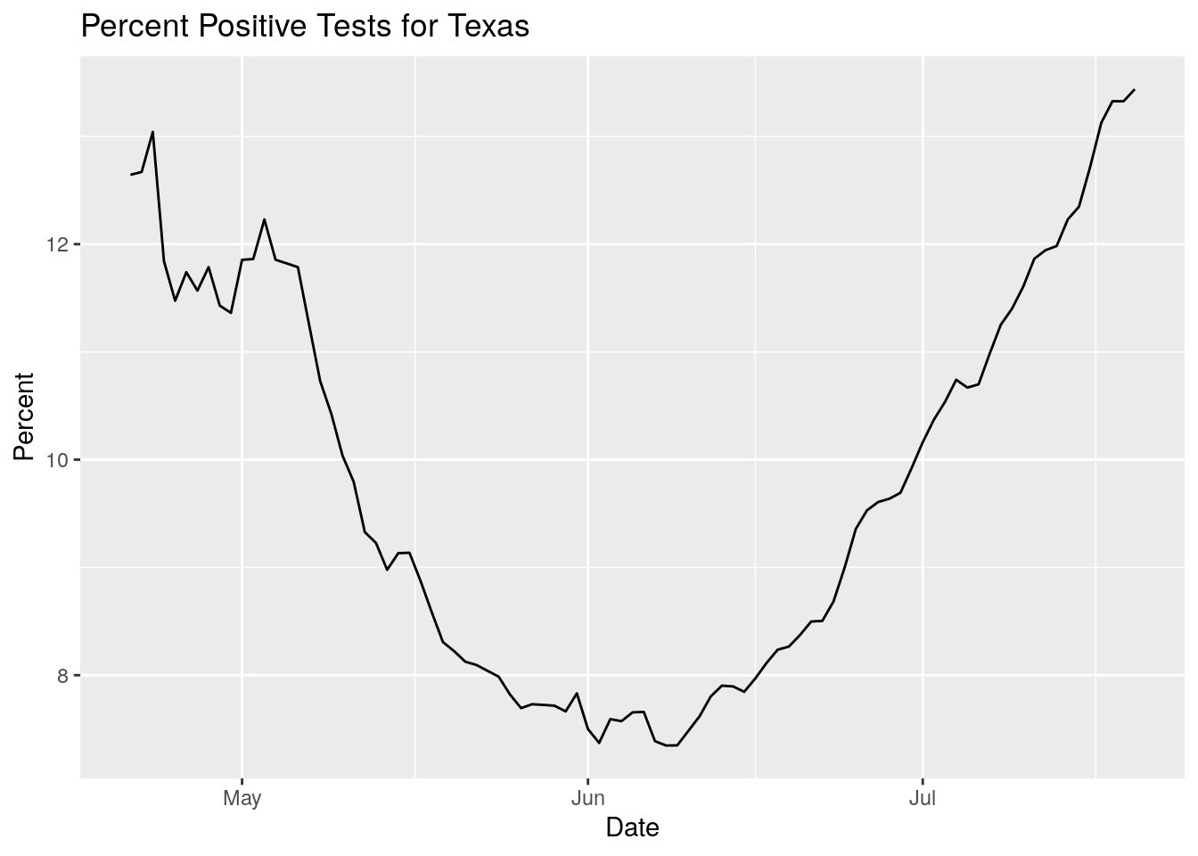
Not good. The percentage is rising rapidly. Just for clarification, let’s calculate the daily tests and cases instead of looking at integrated values.
full_data <- full_data %>%
  group_by(County) %>%
  mutate(Daily_tests=Tests-lag(Tests, default=0),
         Daily_Cases=Cases-lag(Cases, default=0))

#   and let's look at it

foo <-
full_data %>%
  filter(Daily_tests>0) %>%
  group_by(Date) %>%
    summarise(Daily_Test_Total=sum(Daily_tests, na.rm=TRUE),
              Daily_Case_Total=sum(Daily_Cases, na.rm=TRUE))
## `summarise()` ungrouping output (override with `.groups` argument)foo %>%
ggplot(aes(x=Date, y=Daily_Test_Total)) +
geom_point() +
geom_smooth() +
theme(legend.position = "none") +
labs(title="Texas Daily Test Total", y="Daily Tests")## `geom_smooth()` using method = 'loess' and formula 'y ~ x'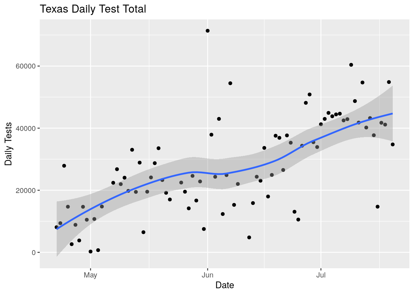
foo %>%
  mutate(Daily_pct=Daily_Case_Total/Daily_Test_Total*100) %>%
  filter(Daily_pct<50) %>%
  ggplot(aes(x=Date, y=Daily_pct)) +
  geom_point() +
  geom_smooth() +
  theme(legend.position = "none") +
  labs(title="Texas Daily Positive Test Percent", y="Percent")
## `geom_smooth()` using method = 'loess' and formula 'y ~ x'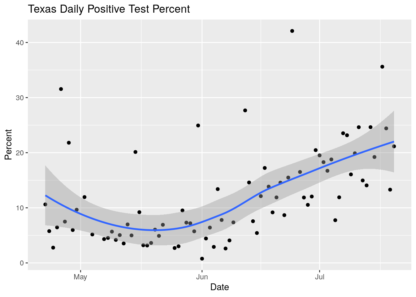
Definitely looks like things going in the wrong direction. But the data is also surprisingly noisy. Let’s spend some time looking into the data quality.
#  Look for large deviations in daily tests

foo <- full_data %>%
  filter(Daily_tests>0) %>%
  mutate(pct=Daily_Cases/Daily_tests*100) %>%
  filter(pct>20) %>%
  select(County, Date, Cases, Daily_tests, Daily_Cases, pct)
foo %>%
    ggplot(aes(x=Date, y=pct)) +
    geom_point()
#   Okay let's look at > 2000 first

foo %>% filter(pct>2000) %>%
    ggplot(aes(x=Date, y=pct, color=County)) +
    geom_point()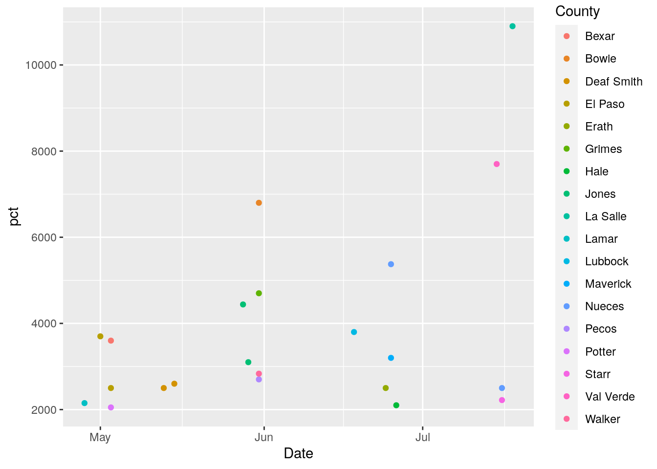
# Let's plot full dataset for all counties with pct > 2000

foo <- full_data %>%
  filter(Daily_tests>0) %>%
  mutate(pct=Daily_Cases/Daily_tests*100) %>%
  group_by(County) %>%
    mutate(maxpct=max(pct, na.rm = TRUE)) %>%
  ungroup() %>%
  select(County, Date, Cases, Daily_tests, Daily_Cases, pct, maxpct)

foo %>% filter(maxpct>2000) %>%
    ggplot(aes(x=Date, y=pct, color=County)) +
      geom_point() +
      geom_line()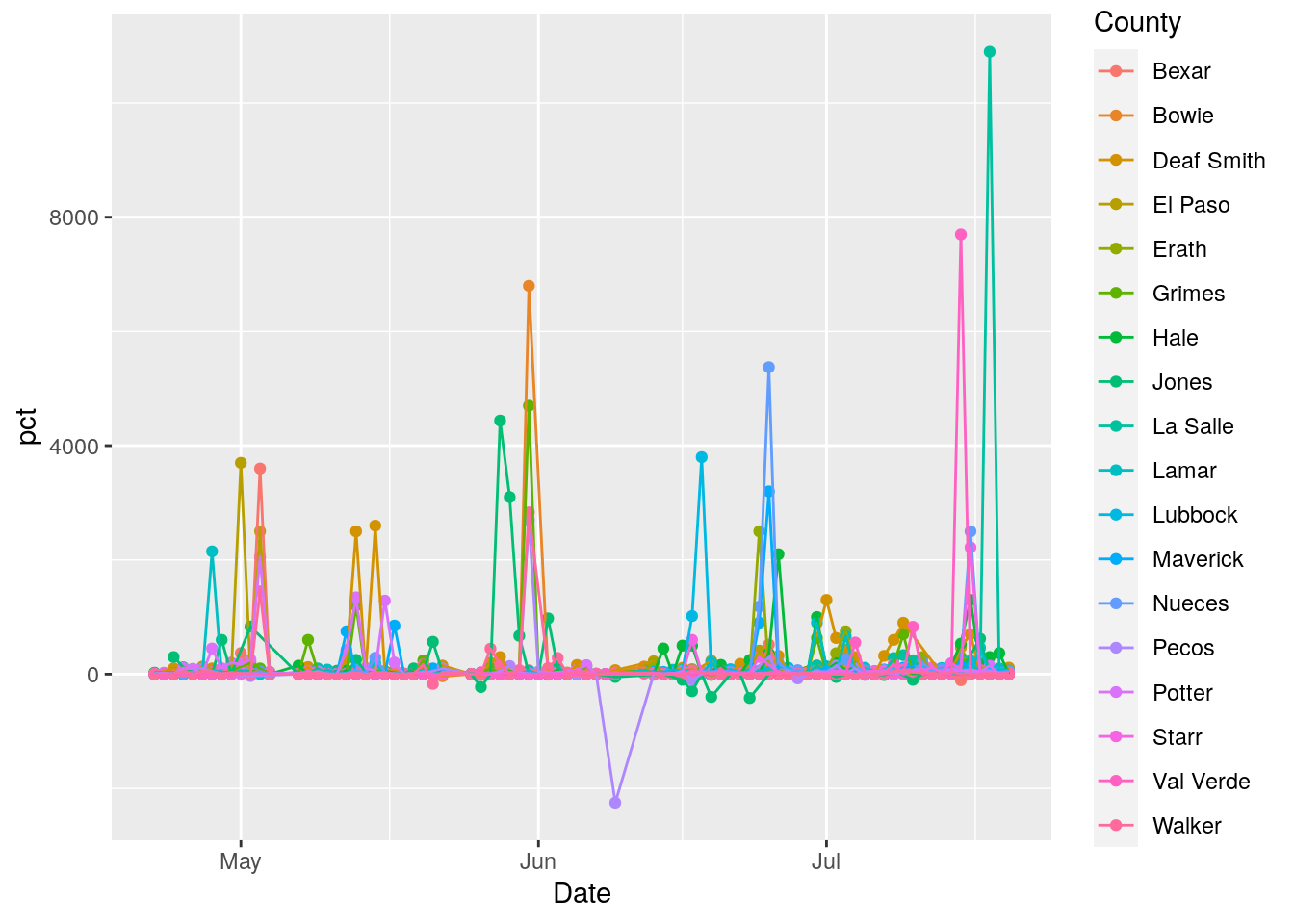
foo %>% filter(maxpct>2000) %>%
    ggplot(aes(x=Date, y=Daily_tests, color=County)) +
      geom_point() +
      geom_line()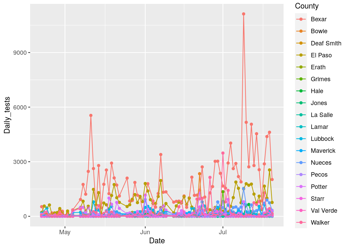
Wow. Data is super noisy. Clearly some pre-processing is in order to make the data more usable. And those annoying gaps. Those are in the original data.
Let’s look at some individual counties
foo <- full_data %>%
  filter(Daily_tests>0) %>%
  mutate(pct=Daily_Cases/Daily_tests*100) %>%
  group_by(County) %>%
    mutate(maxpct=max(pct, na.rm = TRUE)) %>%
  ungroup() %>%
  select(County, Date, Cases, Daily_tests, Daily_Cases, pct, maxpct)

foo %>%
  filter(County=="Bexar") %>%
    ggplot(aes(x=Date, y=pct)) +
      geom_point() +
      geom_line()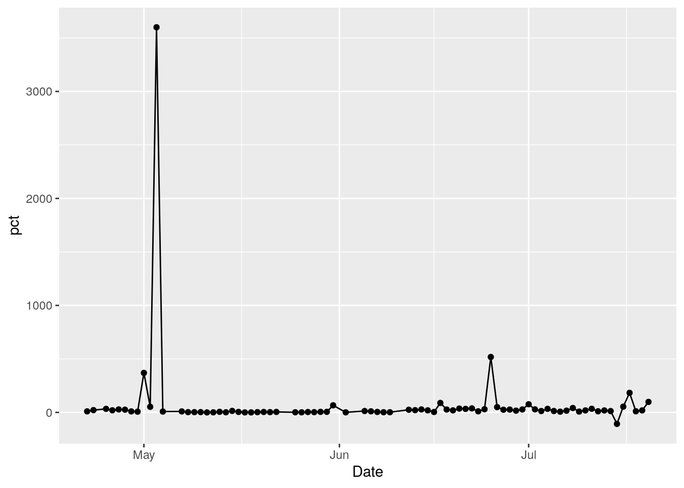
foo %>%
  filter(County=="Bexar") %>%
    ggplot(aes(x=Date, y=Daily_tests)) +
      geom_point() +
      geom_line()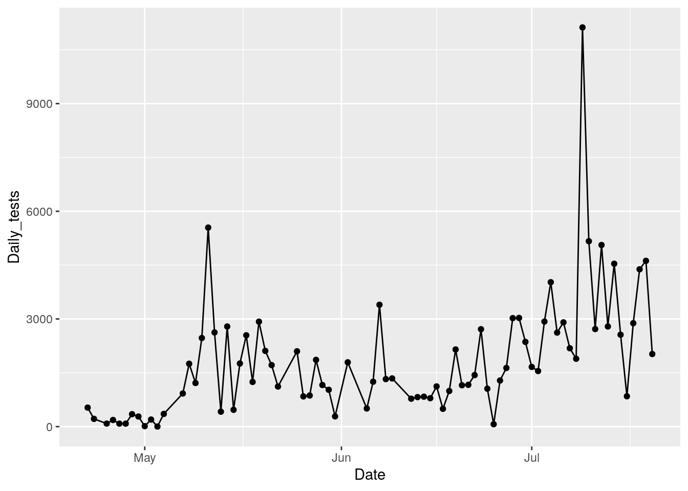
#   and how about trying some rolling averages

bexar <- foo %>% filter(County=="Bexar")

vars <- c("avg3", "avg5", "avg7", "avg9")

window <-  c(3,5,7,9)
for (i in 1:4) {
  bexar <- bexar %>%
    mutate(!!vars[i] := zoo::rollapply(Daily_tests, window[i],
                  FUN=function(x) mean(x, na.rm=TRUE),
                  fill=c(first(Daily_tests), NA, last(Daily_tests))))
}

bexar %>% select(-County, -Daily_Cases,-Cases, -pct, -maxpct) %>%
  pivot_longer(c(-Date, -Daily_tests),
               names_to="Length",
               values_to="Averages") %>%
    ggplot(aes(x=Date, y=Daily_tests)) +
      geom_point() +
      geom_line(aes(y=Averages, color=Length)) +
      geom_smooth(aes(y=Daily_tests)) +
      labs(title="Bexar County Daily Tests Averaged Over Various Windows",
           y="Daily Tests")
## `geom_smooth()` using method = 'loess' and formula 'y ~ x'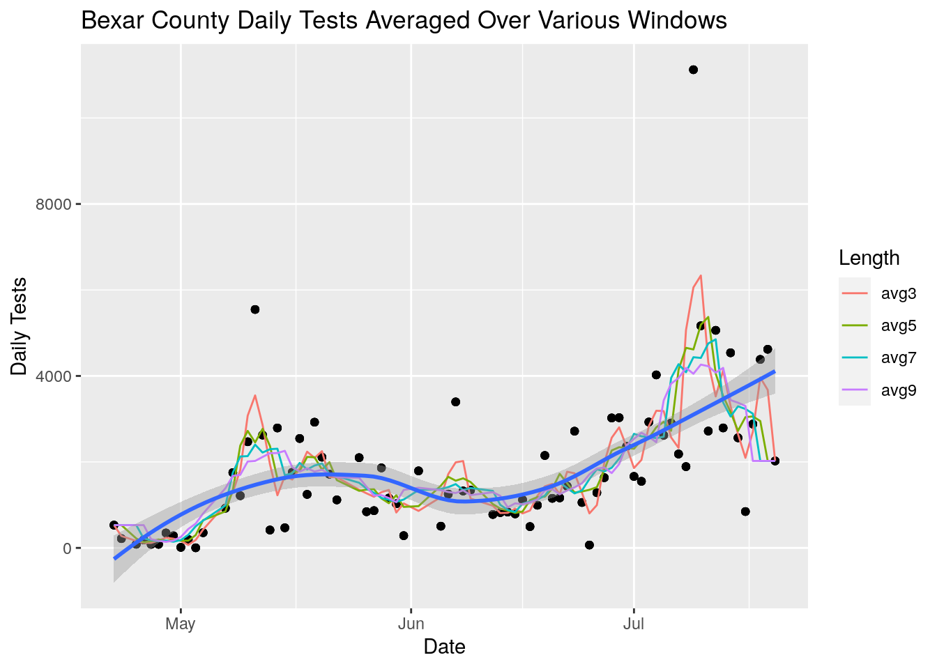
Even a short 3-day window does a pretty good job of cleaning up the jitter in the data - for the most part all the windows give very similar answers. Arbitrarily I will pick the 5-point window as enough. Since we want to look at ratios of tests to cases, let’s also look at the daily case numbers with a similar analysis.
foo <- full_data %>%
  group_by(County) %>%
    mutate(maxcase=max(Cases, na.rm = TRUE)) %>%
  ungroup() %>%
  select(County, Date, Cases, Daily_tests, Daily_Cases, maxcase) %>%
  filter(maxcase>=30)

foo %>%
  ggplot(aes(x=Date, y=Daily_Cases, color=County)) +
  geom_line() +
  theme(legend.position = "none")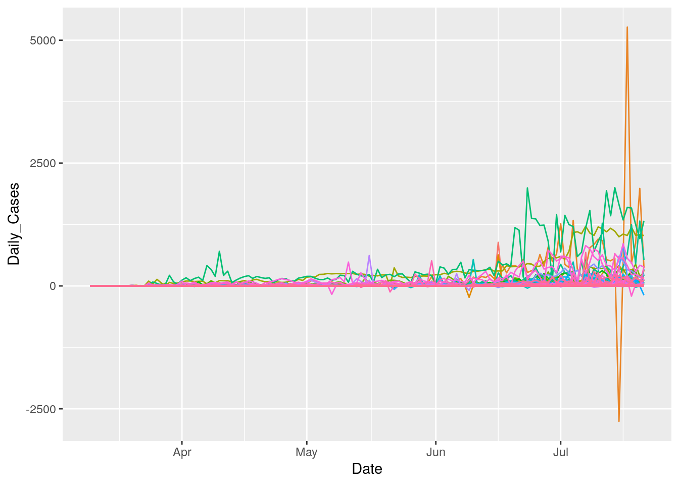
Daily case numbers are pretty noisy as well. To usefully do anything with them and the test numbers, smoothing will be required.
Let’s try it out for Harris county, since that has suitably large deviations.
harris <- foo %>% filter(County=="Harris")

harris <- harris %>%
  filter(Daily_tests>0) %>%
  mutate(avg_tests := zoo::rollapply(Daily_tests, 5,
                FUN=function(x) mean(x, na.rm=TRUE),
                fill=c(first(Daily_tests), NA, last(Daily_tests)))) %>%
  mutate(avg_cases := zoo::rollapply(Daily_Cases, 5,
                FUN=function(x) mean(x, na.rm=TRUE),
                fill=c(first(Daily_Cases), NA, last(Daily_Cases)))) %>%
  mutate(pct=avg_cases/avg_tests*100,
         rawpct=Daily_Cases/Daily_tests*100 )

harris %>%
  select(Date, pct, rawpct) %>%
  pivot_longer(-Date, names_to="Smoothing", values_to="Percent") %>%
    ggplot(aes(x=Date, y=Percent)) +
      geom_point() +
      geom_line() +
      geom_smooth() +
      facet_wrap(~ Smoothing, scales = "free_y") +
      labs(title="Harris County Daily Cases/Tests",
           y="Percent")
## `geom_smooth()` using method = 'loess' and formula 'y ~ x'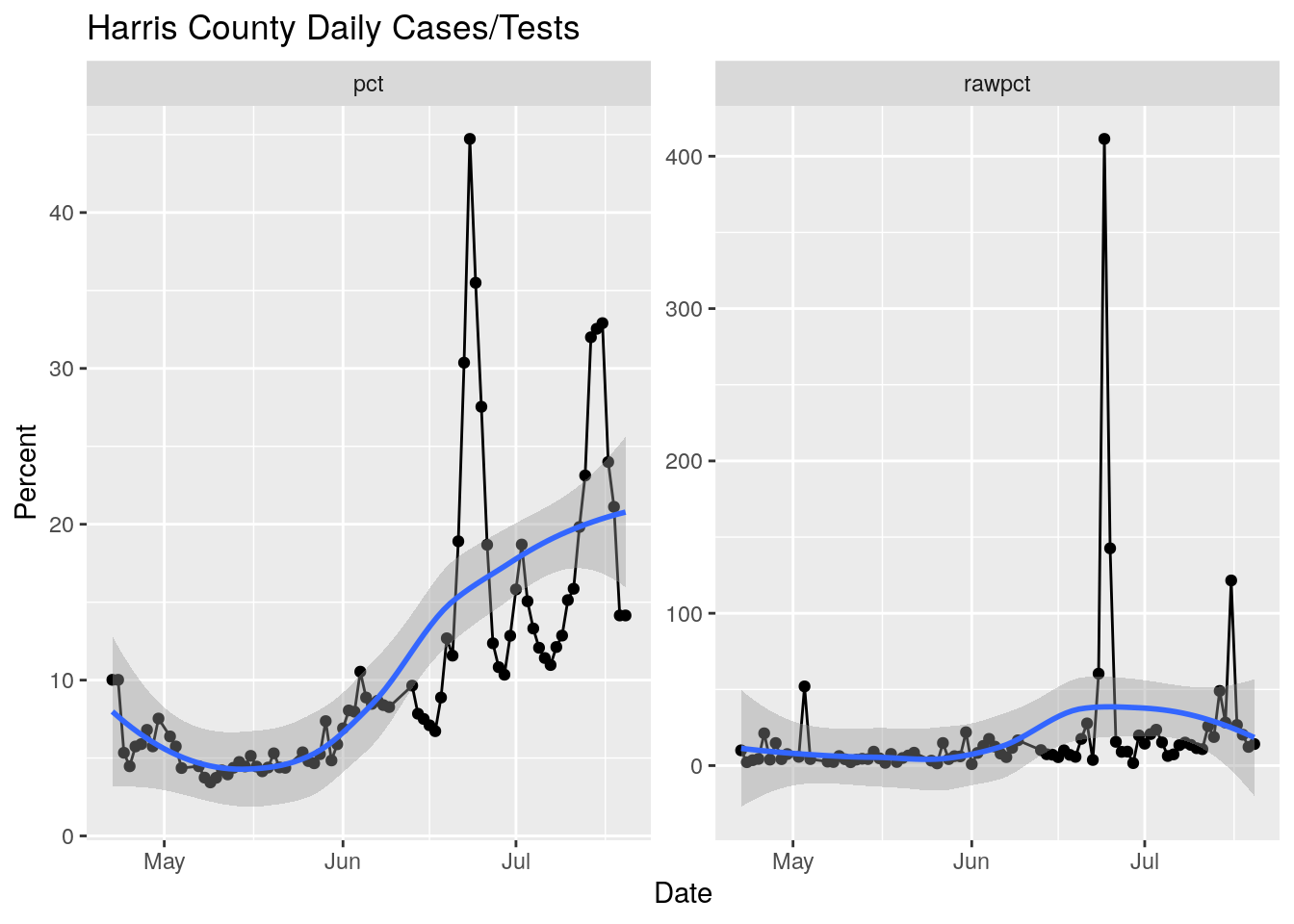
Truthfully, I’m liking the loess fit more and more, as it really blows through what are obviously bad data areas. What if we use a loess prior to calculating the percent?
models <- foo %>%
  mutate(Days=as.integer(Date-ymd("2020-03-10"))) %>%
  select(County, Days, Daily_tests, Daily_Cases) %>%
  mutate(rawpct=Daily_Cases/Daily_tests*100) %>%
  filter(!is.na(Daily_tests)) %>%
  filter(Daily_tests>0) %>%
        tidyr::nest(-County) %>%
        dplyr::mutate(
                # Perform loess calculation on each County group
                m_case = purrr::map(data, loess,
                               formula = Daily_Cases ~ Days, span = .5),
                # Retrieve the fitted values from each model
                fitcase = purrr::map(m_case, `[[`, "fitted"),
                m_test = purrr::map(data, loess,
                               formula = Daily_tests ~ Days, span = .5),
                # Retrieve the fitted values from each model
                fittest = purrr::map(m_test, `[[`, "fitted"),
                m_pct = purrr::map(data, loess,
                               formula = rawpct ~ Days, span = .5),
                # Retrieve the fitted values from each model
                fitpct = purrr::map(m_pct, `[[`, "fitted")
        )
## Warning: All elements of `...` must be named.
## Did you want `data = c(Days, Daily_tests, Daily_Cases, rawpct)`?# Apply fitted y's as a new column
results <- models %>%
dplyr::select(-m_case, -m_test, -m_pct) %>%
tidyr::unnest(c(data, fitcase, fittest, fitpct)) %>%
mutate(Date=ymd("2020-03-10")+Days) %>%
mutate(pct=fitcase/fittest*100)
# Plot with loess line for each group
ggplot(results, aes(x = Date, y = pct, group = County, colour = County)) +
geom_point() +
geom_line() +
theme(legend.position = "none")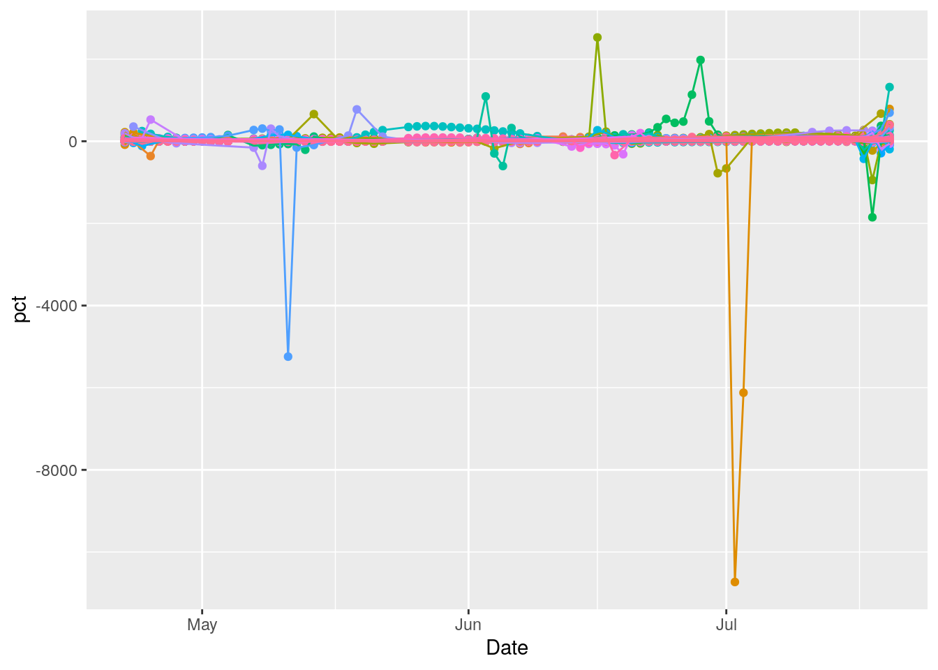
Hmmm… issues. Let’s start looking at the individual counties that have the biggest issues.
topten <- results %>%
  arrange(desc(pct)) %>%
  select(County) %>%
  unique() %>%
  head(10)

results %>%
  filter(County %in% topten[[1]]) %>%
  select(County, Date, pct, rawpct, fitpct) %>%
  pivot_longer(c(-Date, -County), names_to="Algorithm", values_to="Percent") %>%
    ggplot(aes(x=Date, y=Percent, color=Algorithm)) +
      geom_point() +
      geom_line() +
      facet_wrap(~ County, scales = "free_y") +
      labs(title="County Daily Cases/Tests",
           y="Percent")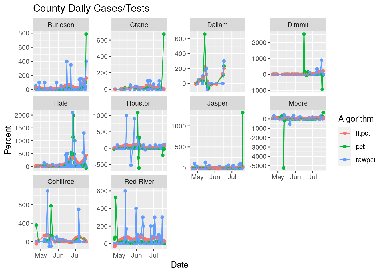
results %>%
  filter(County %in% topten[[1]]) %>%
  select(County, Date, Daily_Cases, Daily_tests) %>%
  pivot_longer(c(-Date, -County), names_to="Tests_Cases", values_to="Number") %>%
    ggplot(aes(x=Date, y=Number, color=Tests_Cases)) +
      geom_point() +
      geom_line() +
      facet_wrap(~ County, scales = "free_y") +
      labs(title="County Daily Cases and Tests",
           y="Number")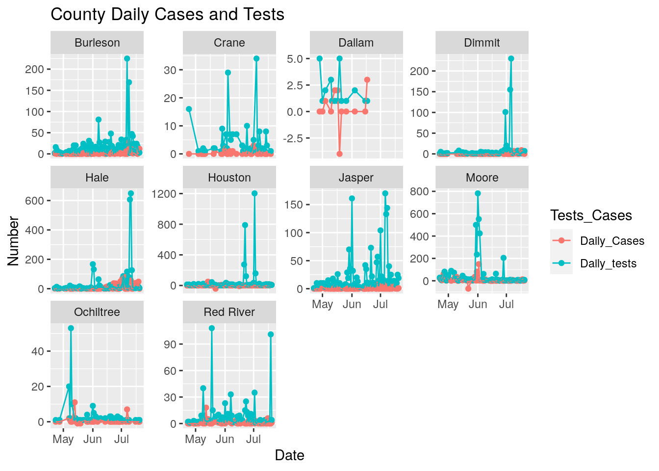
Wow. Kind of a mess. Houston county I suspect someone got confused with city of Houston. Moore county is probably real - meat-packing or a prison - Jones looks suspicious. Bee county is a prison?
Let’s smooth everything with a loess on the cumulative numbers. First we’ll do it for a few counties to test the loess parameters.
counties <- c("Harris", "Dallas", "Tarrant", "Bexar", "Travis",
              "Collin", "Denton", "Hidalgo", "El Paso", "Fort Bend",
              "Williamson")

counties <- c("Bexar", "Tarrant",  "Williamson")
models <- full_data %>%
  filter(County %in% counties) %>%
  filter(Tests>0) %>%
  mutate(Days=as.integer(Date-ymd("2020-03-10"))) %>%
  select(County, Days, Tests, Cases) %>%
        tidyr::nest(-County) %>%
        dplyr::mutate(
                # Perform loess calculation on each County group
                m_case = purrr::map(data, loess,
                               formula = Cases ~ Days, span = .5),
                # Retrieve the fitted values from each model
                fitcase = purrr::map(m_case, `[[`, "fitted"),
                m_test = purrr::map(data, loess,
                               formula = Tests ~ Days, span = .5),
                # Retrieve the fitted values from each model
                fittest = purrr::map(m_test, `[[`, "fitted"),
        )
## Warning: All elements of `...` must be named.
## Did you want `data = c(Days, Tests, Cases)`?# Apply fitted y's as a new column
results <- models %>%
dplyr::select(-m_case, -m_test) %>%
tidyr::unnest(c(data, fitcase, fittest)) %>%
mutate(Date=ymd("2020-03-10")+Days) %>%
group_by(County) %>%
mutate(Daily_tests=fittest-dplyr::lag(fittest, default=NA),
Daily_Cases=fitcase-dplyr::lag(fitcase, default=NA)) %>%
mutate(pct=Daily_Cases/Daily_tests*100) %>%
ungroup()
# Plot with loess line for each group
ggplot(results, aes(x = Date, y = fitcase, group = County, colour = County)) +
geom_point() +
geom_point(aes(y=fittest))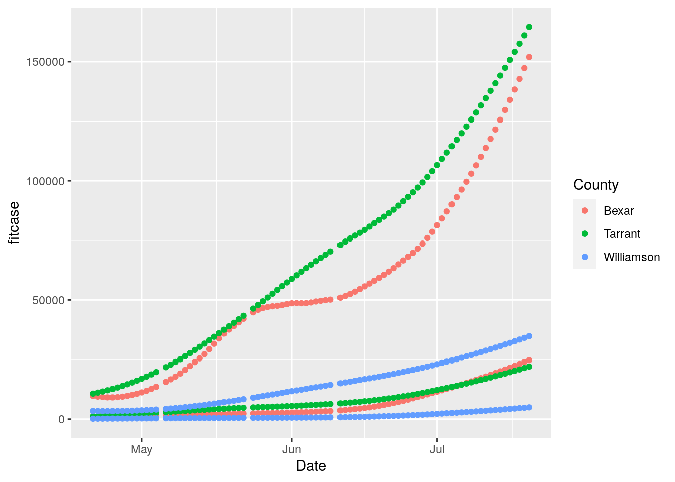
# Williamson and Bexar counties
full_data %>%
filter(County=="Williamson") %>%
ggplot(aes(x=Date)) +
geom_smooth(aes(y=Cases)) +
geom_point(aes(y=Cases)) +
geom_smooth(aes(y=Tests)) +
geom_point(aes(y=Tests)) ## `geom_smooth()` using method = 'loess' and formula 'y ~ x'
## `geom_smooth()` using method = 'loess' and formula 'y ~ x'## Warning: Removed 45 rows containing non-finite values (stat_smooth).## Warning: Removed 45 rows containing missing values (geom_point).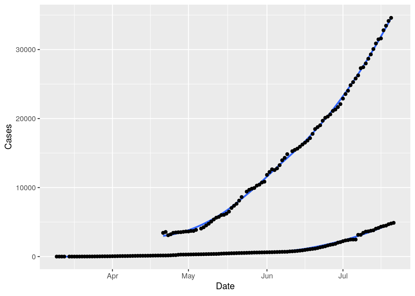
results %>%
filter(County=="Williamson") %>%
ggplot(aes(x=Date)) +
geom_smooth(aes(y=Daily_Cases)) +
geom_point(aes(y=Daily_Cases)) +
geom_smooth(aes(y=Daily_tests)) +
geom_point(aes(y=Daily_tests)) ## `geom_smooth()` using method = 'loess' and formula 'y ~ x'## Warning: Removed 1 rows containing non-finite values (stat_smooth).## `geom_smooth()` using method = 'loess' and formula 'y ~ x'## Warning: Removed 1 rows containing non-finite values (stat_smooth).## Warning: Removed 1 rows containing missing values (geom_point).
## Warning: Removed 1 rows containing missing values (geom_point).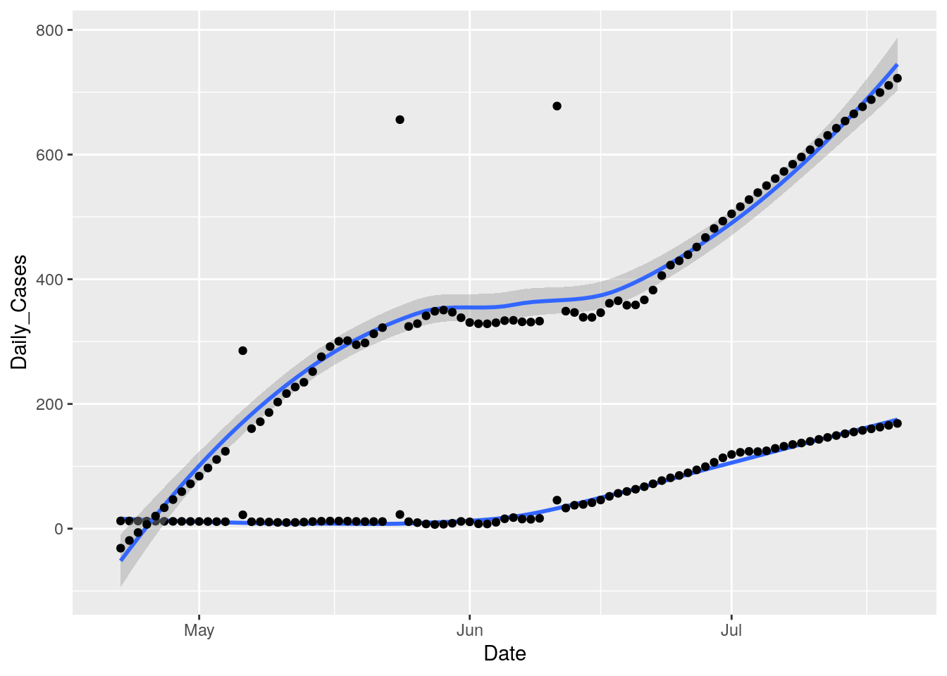
Hmmm…. I need to fill in the holes that cause the derivative to blow up. A simple linear interpolation ought to be just fine.
# First trim NA's from in front of data, then interpolate gaps
foo <- full_data %>%
filter(Days>41) %>%
filter(Days<116) %>%
group_by(County) %>%
mutate(Tests = zoo::na.approx(Tests, Days, na.rm=FALSE)) %>%
ungroup()
counties <- c("Harris", "Dallas", "Tarrant", "Bexar", "Travis",
"Collin", "Denton", "Hidalgo", "El Paso", "Fort Bend",
"Williamson")
counties <- c("Bexar", "Williamson")
models <- foo %>%
filter(County %in% counties) %>%
mutate(Days=as.integer(Date-ymd("2020-03-10"))) %>%
select(County, Days, Tests, Cases) %>%
tidyr::nest(-County) %>%
dplyr::mutate(
# Perform loess calculation on each County group
m_case = purrr::map(data, loess,
formula = Cases ~ Days, span = .5),
# Retrieve the fitted values from each model
fitcase = purrr::map(m_case, `[[`, "fitted"),
m_test = purrr::map(data, loess,
formula = Tests ~ Days, span = .5),
# Retrieve the fitted values from each model
fittest = purrr::map(m_test, `[[`, "fitted"),
)## Warning: All elements of `...` must be named.
## Did you want `data = c(Days, Tests, Cases)`?# Apply fitted y's as a new column
results <- models %>%
dplyr::select(-m_case, -m_test) %>%
tidyr::unnest(c(data, fitcase, fittest)) %>%
mutate(Date=ymd("2020-03-10")+Days) %>%
filter(!is.na(Tests)) %>%
group_by(County) %>%
mutate(Daily_tests=fittest-dplyr::lag(fittest, default=NA),
Daily_Cases=fitcase-dplyr::lag(fitcase, default=NA)) %>%
mutate(pct=Daily_Cases/Daily_tests*100) %>%
ungroup()
# Plot with loess line for each group
ggplot(results, aes(x = Date, y = fitcase, group = County, colour = County)) +
geom_point() +
geom_point(aes(y=fittest))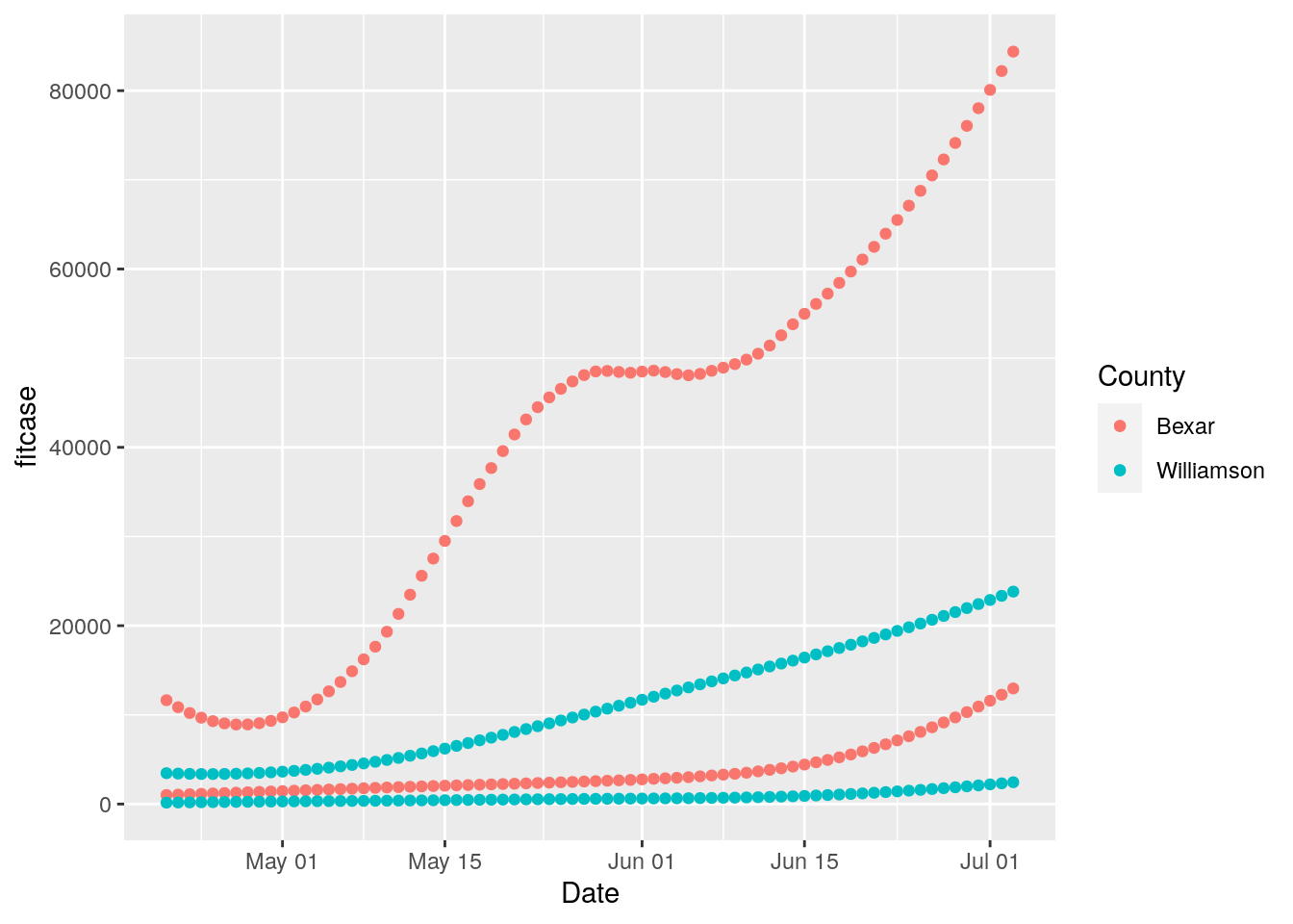
# Now let's try various span values
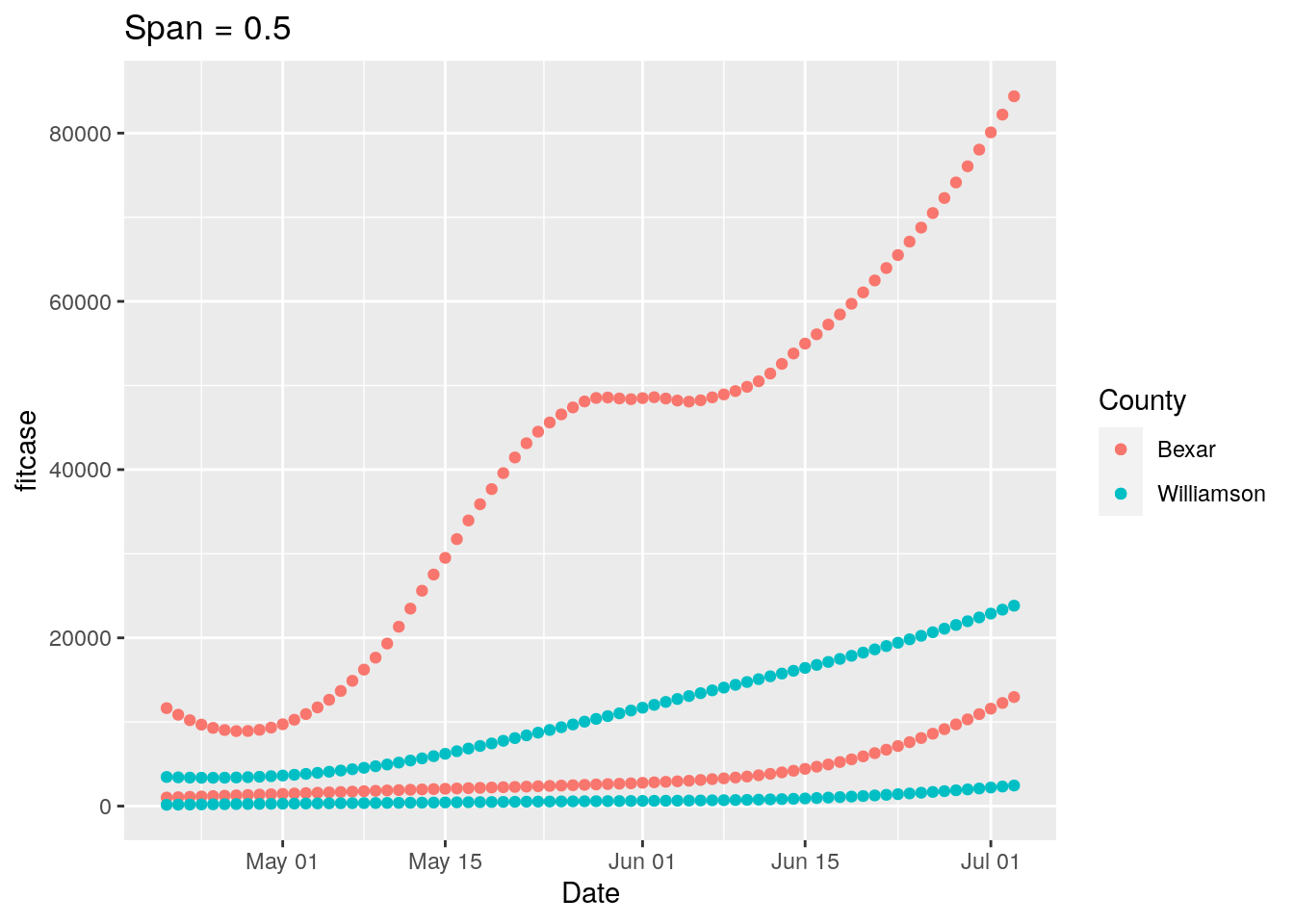
for (span in (1:5)*0.1) {
models <- foo %>%
filter(County %in% counties) %>%
mutate(Days=as.integer(Date-ymd("2020-03-10"))) %>%
select(County, Days, Tests, Cases) %>%
tidyr::nest(-County) %>%
dplyr::mutate(
# Perform loess calculation on each County group
m_case = purrr::map(data, loess,
formula = Cases ~ Days, span = span),
# Retrieve the fitted values from each model
fitcase = purrr::map(m_case, `[[`, "fitted"),
m_test = purrr::map(data, loess,
formula = Tests ~ Days, span = span),
# Retrieve the fitted values from each model
fittest = purrr::map(m_test, `[[`, "fitted"),
)
# Apply fitted y's as a new column
results <- models %>%
dplyr::select(-m_case, -m_test) %>%
tidyr::unnest(c(data, fitcase, fittest)) %>%
mutate(Date=ymd("2020-03-10")+Days) %>%
filter(!is.na(Tests)) %>%
group_by(County) %>%
mutate(Daily_tests=fittest-dplyr::lag(fittest, default=NA),
Daily_Cases=fitcase-dplyr::lag(fitcase, default=NA)) %>%
mutate(pct=Daily_Cases/Daily_tests*100) %>%
ungroup()
# Plot with loess line for each group
p <-
ggplot(results, aes(x = Date, y = fitcase, group = County, colour = County)) +
geom_point() +
geom_point(aes(y=fittest)) +
labs(title=paste("Span =", span))
print(p)
p <-
ggplot(results, aes(x = Date, y = Daily_tests, group = County, colour = County)) +
geom_point() +
labs(title=paste("Span =", span))
print(p)
p <-
ggplot(results, aes(x = Date, y = pct, group = County, colour = County)) +
geom_point() +
labs(title=paste("Span =", span))
print(p)
}## Warning: All elements of `...` must be named.
## Did you want `data = c(Days, Tests, Cases)`?
## Warning: Removed 2 rows containing missing values (geom_point).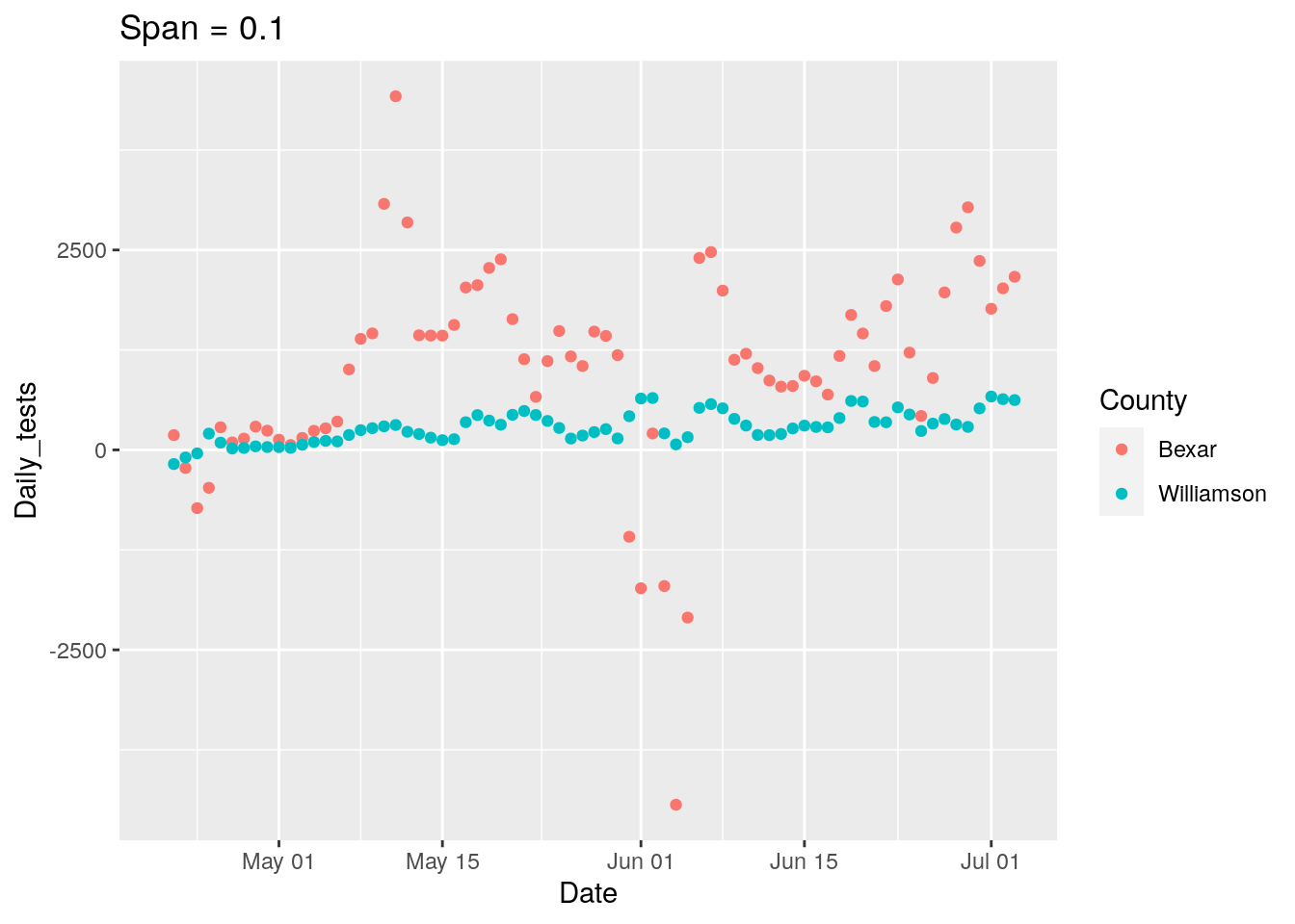
## Warning: Removed 2 rows containing missing values (geom_point).
## Warning: All elements of `...` must be named.
## Did you want `data = c(Days, Tests, Cases)`?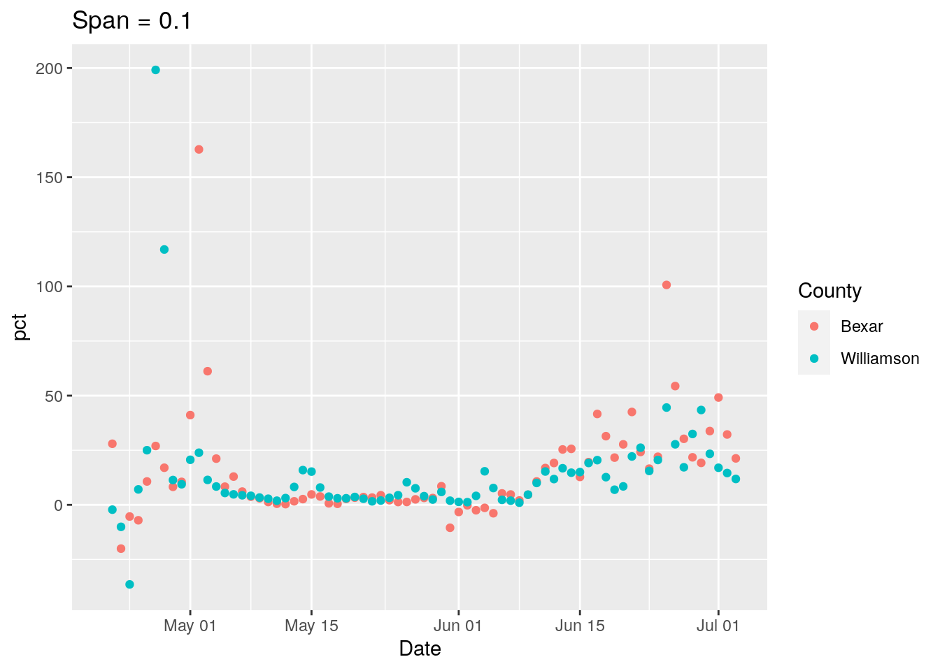

## Warning: Removed 2 rows containing missing values (geom_point).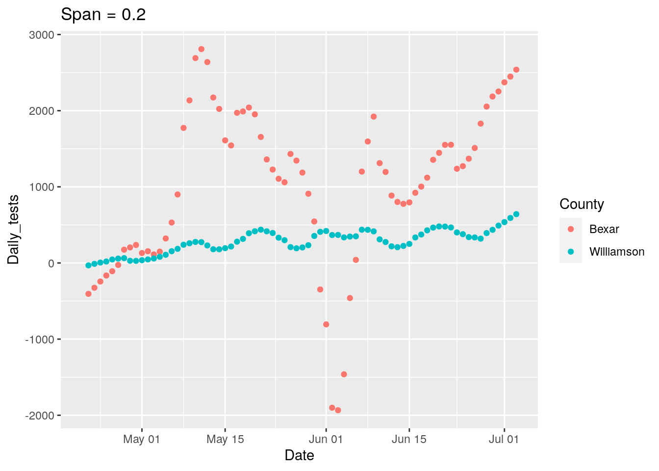
## Warning: Removed 2 rows containing missing values (geom_point).
## Warning: All elements of `...` must be named.
## Did you want `data = c(Days, Tests, Cases)`?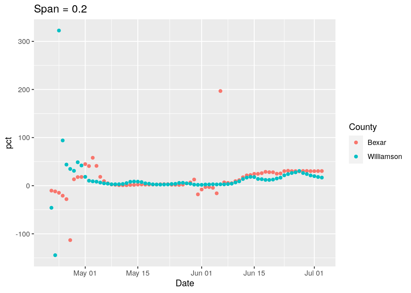

## Warning: Removed 2 rows containing missing values (geom_point).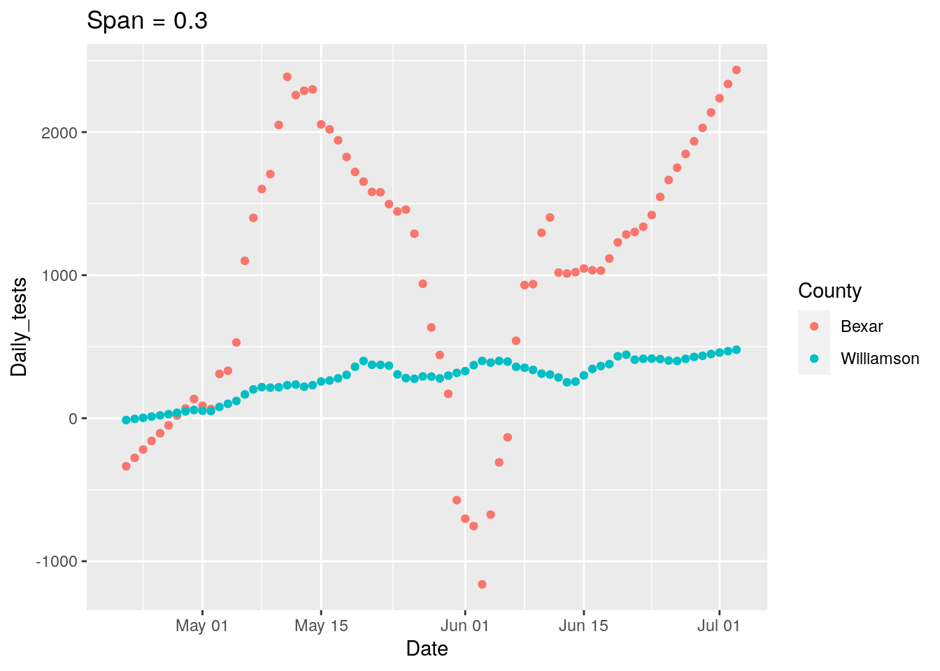
## Warning: Removed 2 rows containing missing values (geom_point).
## Warning: All elements of `...` must be named.
## Did you want `data = c(Days, Tests, Cases)`?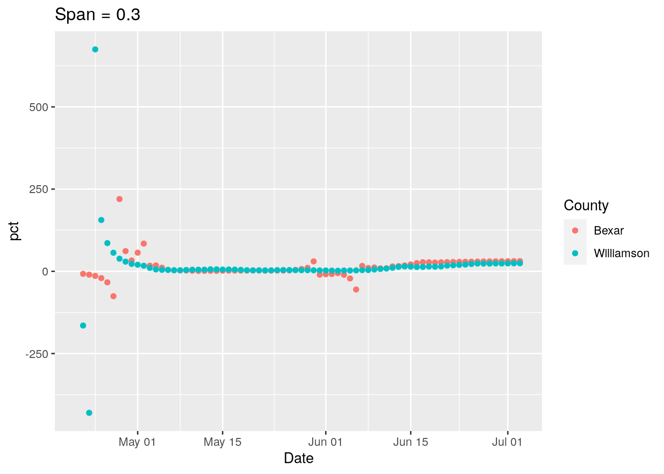

## Warning: Removed 2 rows containing missing values (geom_point).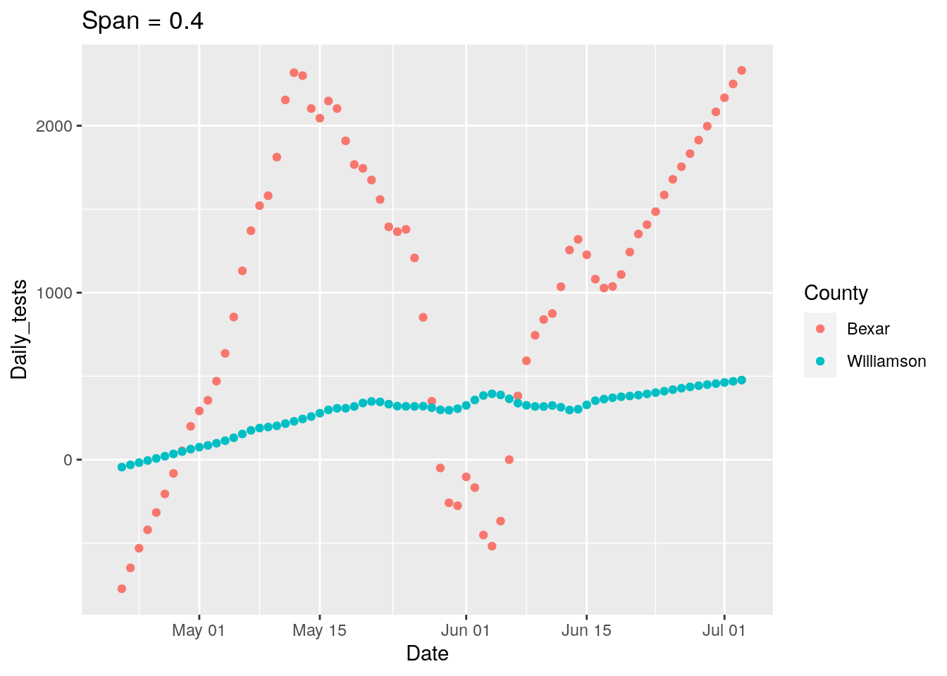
## Warning: Removed 2 rows containing missing values (geom_point).

## Warning: All elements of `...` must be named.
## Did you want `data = c(Days, Tests, Cases)`?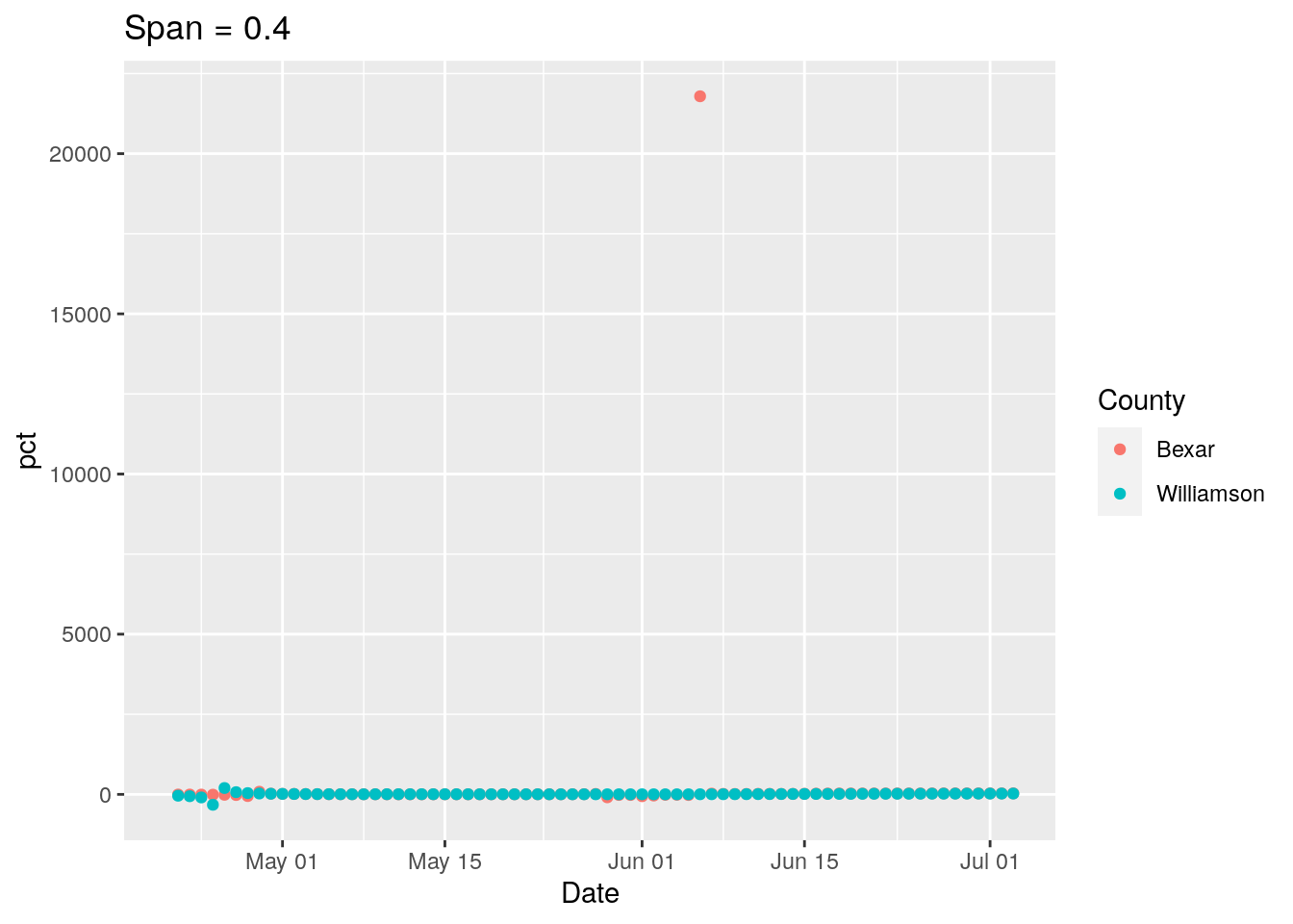
## Warning: Removed 2 rows containing missing values (geom_point).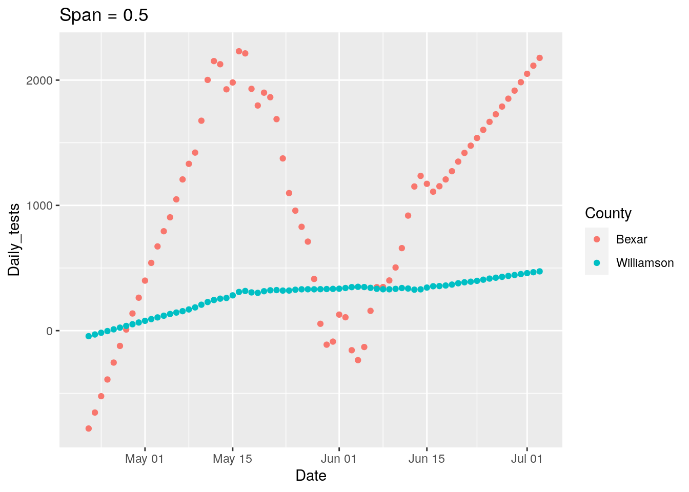
## Warning: Removed 2 rows containing missing values (geom_point).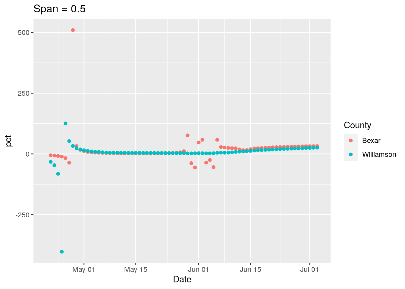
New strategy. Let’s find all the counties where the daily tests go negative, and look closely at those for a potential correction factor, county by county.
#   First trim NA's from in front of data, then interpolate gaps

foo <- full_data %>%
  filter(Days>41) %>%
  filter(Days<116) %>%
  group_by(County) %>%
    mutate(Tests = zoo::na.approx(Tests, Days, na.rm=FALSE)) %>%
    mutate(Daily_tests=Tests-lag(Tests, default=0),
         Daily_Cases=Cases-lag(Cases, default=0)) %>%
  ungroup()

foo %>% filter(Daily_tests<0,
               Daily_tests>-500) %>%
  ggplot(aes(x=Daily_tests))+
    geom_histogram()
## `stat_bin()` using `bins = 30`. Pick better value with `binwidth`.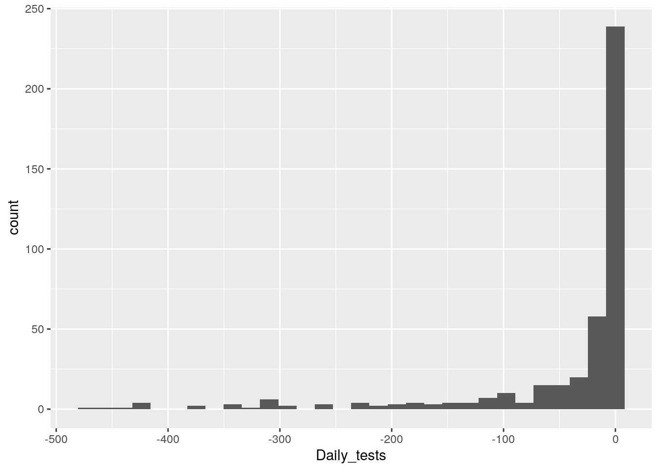
# Ignore small fry negatives, let's look at daily tests <-100
#  and total > 500

badcounties <- foo %>%
  filter(Daily_tests<=-200) %>%
  filter(Tests>500) %>%
  select(County) %>%
  unique()

badcounties <- badcounties[[1]]

foo %>% filter(County %in% badcounties) %>%
  ggplot(aes(x=Date, y=Daily_tests, color=County))+
  geom_point()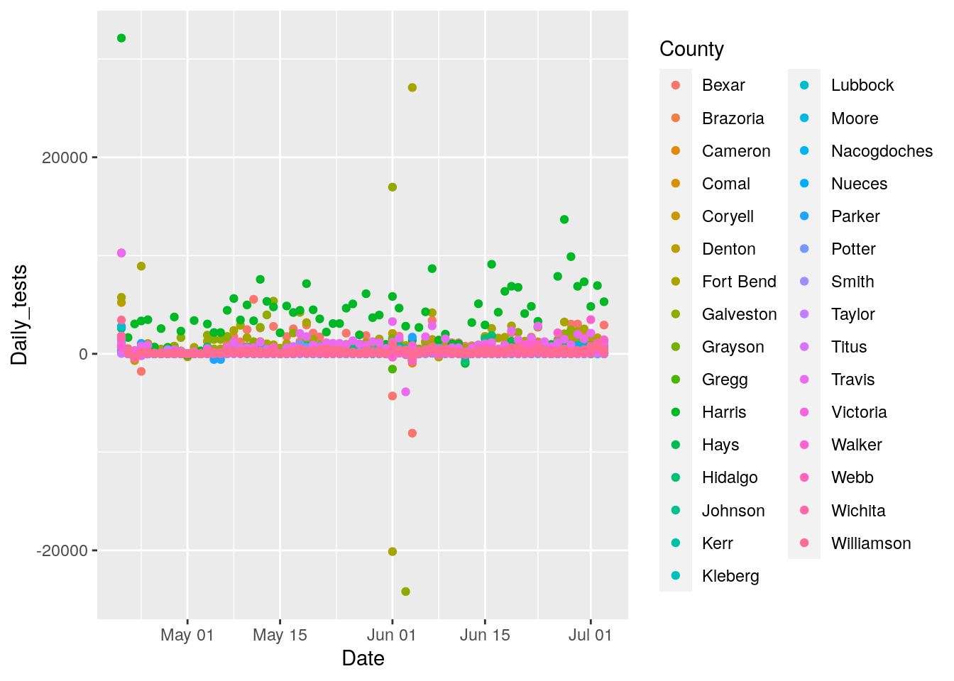
theme(legend.position = "none")## List of 1
## $ legend.position: chr "none"
## - attr(*, "class")= chr [1:2] "theme" "gg"
## - attr(*, "complete")= logi FALSE
## - attr(*, "validate")= logi TRUEfoo %>% filter(County %in% badcounties) %>%
ggplot(aes(x=Date, y=Tests, color=County))+
geom_point() +
geom_line() +
facet_wrap(~ County, scales = "free_y") +
labs(title="County Tests",
y="Number")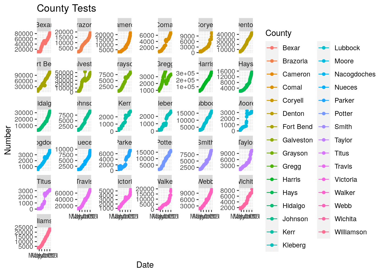
bexar <- foo %>% filter(County=="Bexar")
  #  delete from 2020-05-11 to 2020-06-03
bexar$Tests[between(bexar$Date,
                    as.Date("2020-05-11"),
                    as.Date("2020-06-03"))] <- NA
  #  reinterpolate
bexar <- bexar %>%
  mutate(Tests = zoo::na.approx(Tests, Days, na.rm=FALSE))

bexar %>%
  ggplot(aes(x=Date, y=Tests))+
      geom_point() +
      geom_line() +
      labs(title="Bexar County Tests",
           y="Number")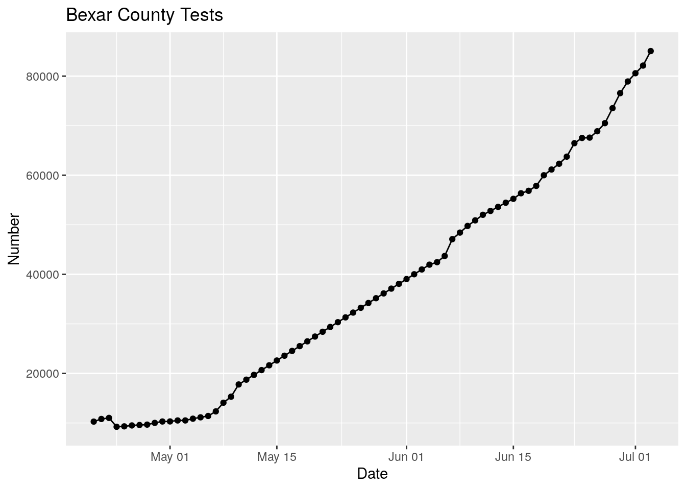
Basically the test data prior to June 4 is crap. With much effort I could fake in new data, or I could just ignore data prior to June 4. Let’s go with plan B.
#   Clean up the data (gaps), smooth cases and tests with a long loess,
#   calculate daily numbers, and then the ratio

#   First trim NA's from in front of data, then interpolate gaps

foo <- full_data %>%
  filter(Date>as.Date("2020-06-03")) %>%
  filter(Days<116) %>%
  group_by(County) %>%
    mutate(Tests = zoo::na.approx(Tests, Days, na.rm=FALSE)) %>%
    mutate(maxcases=max(Cases)) %>%
  ungroup() %>%
  filter(maxcases>=30)


models <- foo %>%
  mutate(Days=as.integer(Date-ymd("2020-03-10"))) %>%
  select(County, Days, Tests, Cases) %>%
        tidyr::nest(-County) %>%
        dplyr::mutate(
                # Perform loess calculation on each County group
                m_case = purrr::map(data, loess,
                               formula = Cases ~ Days, span = .7),
                # Retrieve the fitted values from each model
                fitcase = purrr::map(m_case, `[[`, "fitted"),
                m_test = purrr::map(data, loess,
                               formula = Tests ~ Days, span = .7),
                # Retrieve the fitted values from each model
                fittest = purrr::map(m_test, `[[`, "fitted"),
        )
## Warning: All elements of `...` must be named.
## Did you want `data = c(Days, Tests, Cases)`?# Apply fitted y's as a new column
results <- models %>%
dplyr::select(-m_case, -m_test) %>%
tidyr::unnest(c(data, fitcase, fittest)) %>%
mutate(Date=ymd("2020-03-10")+Days) %>%
filter(!is.na(Tests)) %>%
group_by(County) %>%
mutate(Daily_tests=fittest-dplyr::lag(fittest, default=NA),
Daily_Cases=fitcase-dplyr::lag(fitcase, default=NA)) %>%
mutate(pct=Daily_Cases/Daily_tests*100) %>%
ungroup()
County_list <- unique(results$County)
# Plot with loess line for each group
for (i in seq(18,162,18) ) {
p <- results %>% filter(County %in% County_list[(i-17):i]) %>%
ggplot(aes(x = Date, y = Daily_tests, group = County, colour = County)) +
geom_line() +
geom_line(aes(y=Daily_Cases), color="black")+
theme(legend.position = "none")+
facet_wrap(~ County, scales = "free_y")
print(p)
}## Warning: Removed 18 row(s) containing missing values (geom_path).## Warning: Removed 18 row(s) containing missing values (geom_path).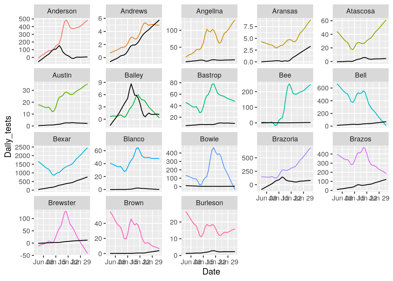
## Warning: Removed 18 row(s) containing missing values (geom_path).

## Warning: Removed 18 row(s) containing missing values (geom_path).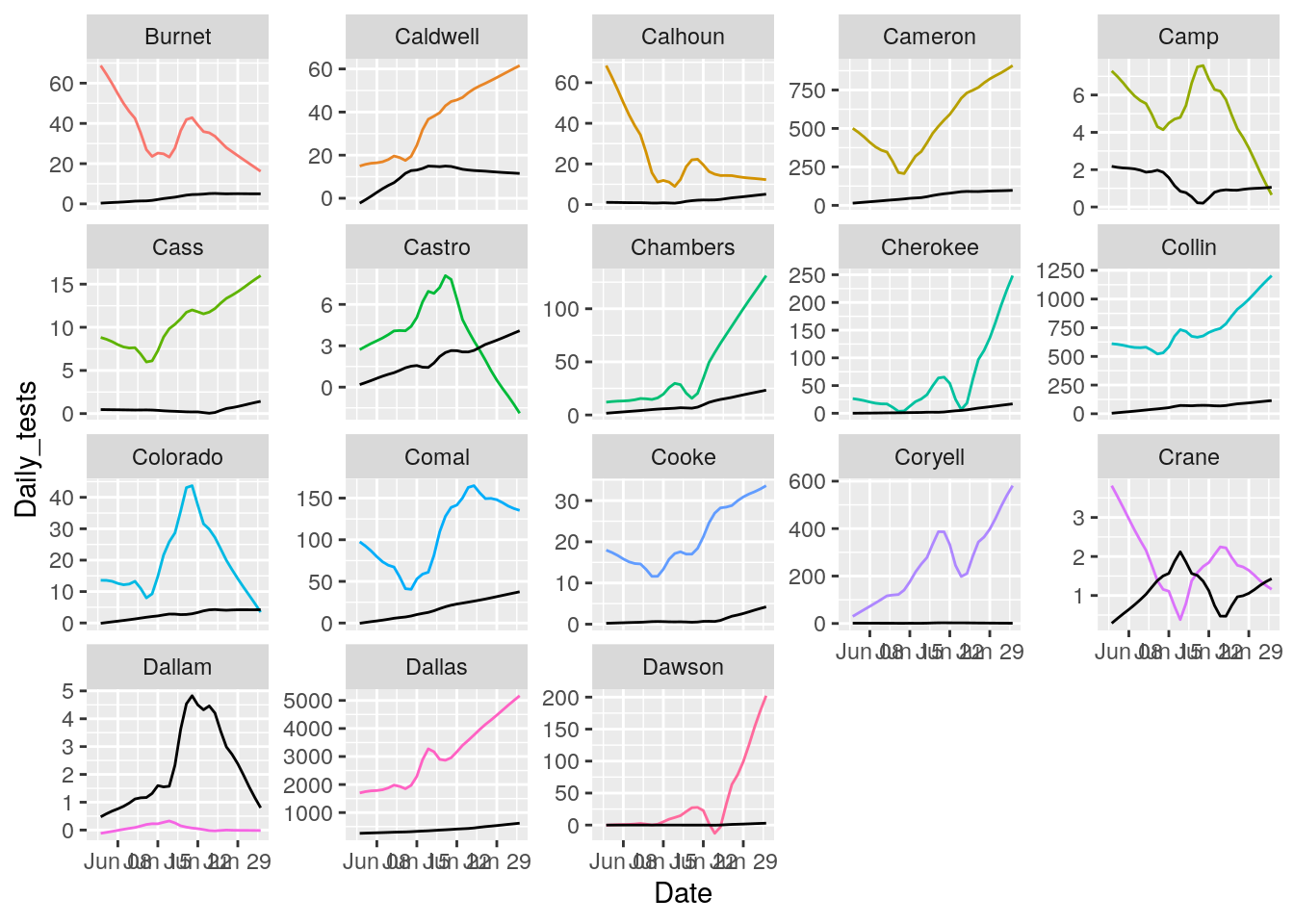
## Warning: Removed 18 row(s) containing missing values (geom_path).

## Warning: Removed 18 row(s) containing missing values (geom_path).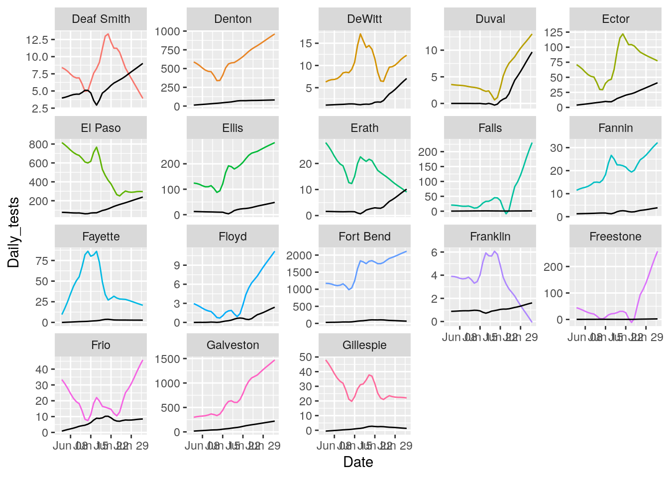
## Warning: Removed 18 row(s) containing missing values (geom_path).

## Warning: Removed 18 row(s) containing missing values (geom_path).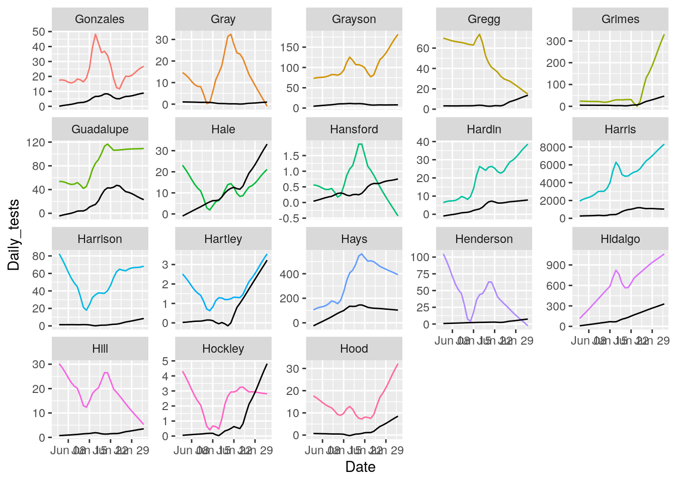
## Warning: Removed 18 row(s) containing missing values (geom_path).

## Warning: Removed 18 row(s) containing missing values (geom_path).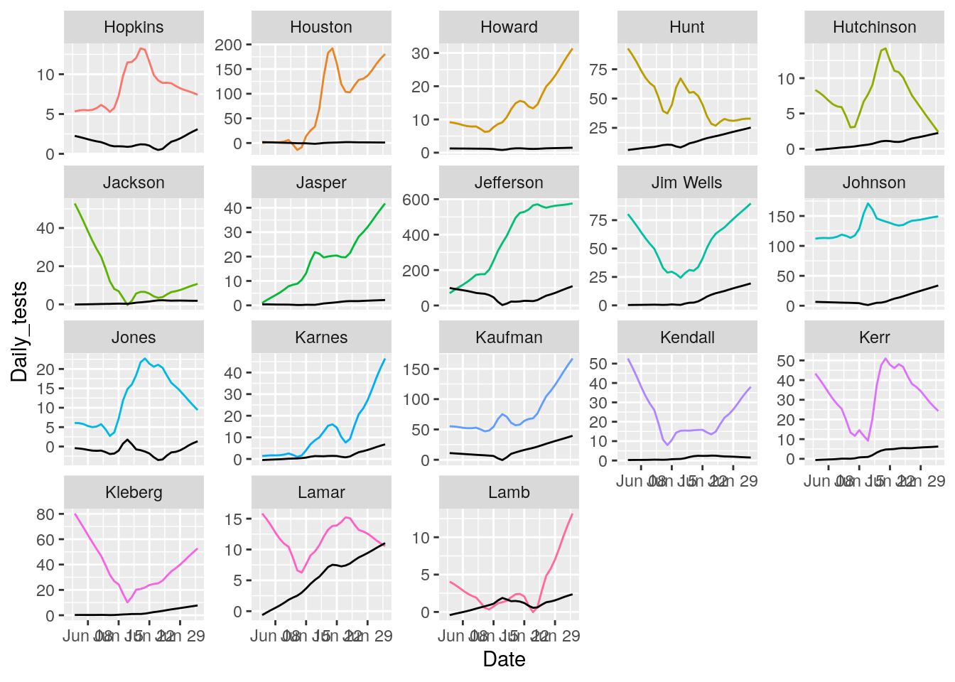
## Warning: Removed 18 row(s) containing missing values (geom_path).

## Warning: Removed 18 row(s) containing missing values (geom_path).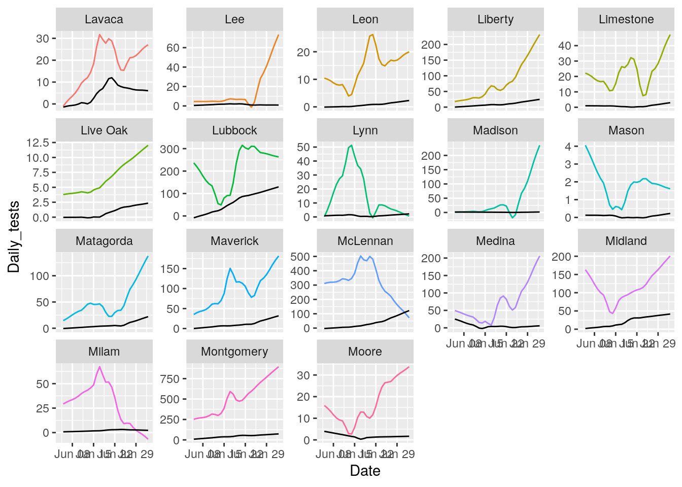
## Warning: Removed 18 row(s) containing missing values (geom_path).

## Warning: Removed 18 row(s) containing missing values (geom_path).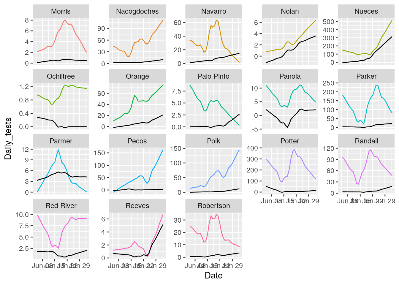
## Warning: Removed 18 row(s) containing missing values (geom_path).

## Warning: Removed 18 row(s) containing missing values (geom_path).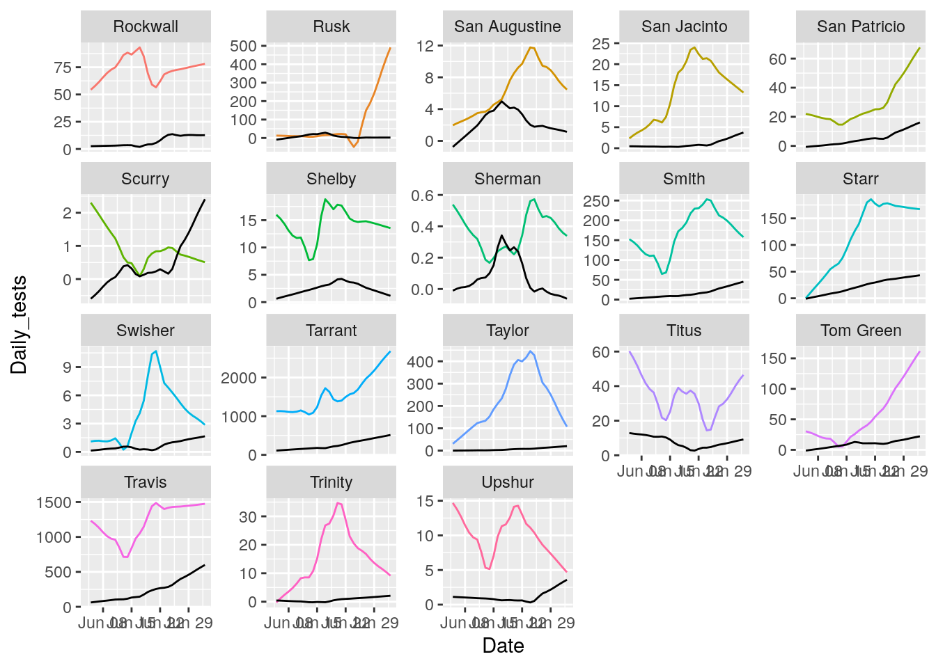
## Warning: Removed 18 row(s) containing missing values (geom_path).

## Warning: Removed 18 row(s) containing missing values (geom_path).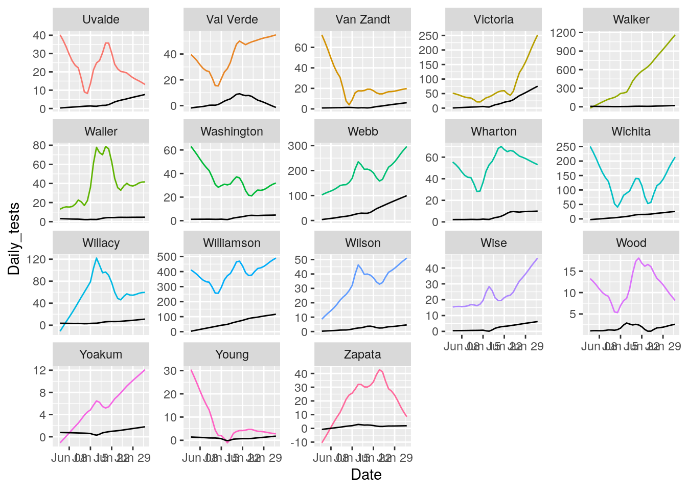
That looks pretty good. About as good as it is going to get. All I need to do now is eliminate the zero and negative tests and cases, and set some cutoffs for cases/tests.
So let’s start it all from scratch, so I’ll have some tested, portable code at the end of the day.
Also try out several plotting schemes.
path <- "/home/ajackson/Dropbox/Rprojects/Covid/Today_Data/"

Tests_by_county <- readRDS(paste0(path, "Today_County_Testing.rds"))

Tests_by_county <- Tests_by_county %>%
  mutate(Date=ymd(Date))

Covid_data <- readRDS("/home/ajackson/Dropbox/Rprojects/Covid/Covid.rds")

Covid_data <- Covid_data %>%
  mutate(Days=as.integer(Date-ymd("2020-03-10")))

full_data <- left_join(Covid_data,
                      Tests_by_county,
                      by=c("Date", "County")) %>%
  filter(!grepl("Probable.*", County))

#   De-step

Prison_counties <- c("Jones", "Anderson", "Walker", "Medina", "Rusk",
                     "Grimes", "Coryell", "Houston", "Pecos", "Angelina",
                     "Bowie", "Jefferson", "Brazoria")

full_data <- full_data %>%
  mutate(Raw_cases=Cases) %>%
  arrange(County) %>%
  group_by(County) %>%
    mutate(delta=Cases-lag(Cases)) %>%
    replace_na(list(delta=0)) %>%
    mutate(Threshold=as.numeric((abs(delta)>25)&(abs(delta)/Cases>0.10))*delta) %>%
    mutate(Threshold=cumsum(Threshold)) %>%
  ungroup() %>%
  mutate(Cases=ifelse(County %in% Prison_counties,
                      Raw_cases-Threshold,
                      Raw_cases)) %>%
  select(-Threshold, -delta)

#full_data <- full_data %>%
#  group_by(Date) %>%
#    mutate(Test_Total=sum(Tests, na.rm=TRUE), Case_Total=sum(Cases, na.rm=TRUE)) %>%
#  mutate(pct_pos=Cases/Tests*100)
#
#   First trim crap prior to June 4, then interpolate gaps

foo <- full_data %>%
  filter(Date>as.Date("2020-06-03")) %>%
  group_by(County) %>%
    mutate(Tests = zoo::na.approx(Tests, Days, na.rm=FALSE)) %>%
    mutate(maxcases=max(Cases)) %>%
  ungroup() %>%
  filter(maxcases>=500) %>%
  filter(!is.na(Tests))


models <- foo %>%
  mutate(Days=as.integer(Date-ymd("2020-03-10"))) %>%
  select(County, Days, Tests, Cases) %>%
        tidyr::nest(-County) %>%
        dplyr::mutate(
                # Perform loess calculation on each County group
                m_case = purrr::map(data, loess,
                               formula = Cases ~ Days, span = .7),
                # Retrieve the fitted values from each model
                fitcase = purrr::map(m_case, `[[`, "fitted"),
                m_test = purrr::map(data, loess,
                               formula = Tests ~ Days, span = .7),
                # Retrieve the fitted values from each model
                fittest = purrr::map(m_test, `[[`, "fitted"),
        )
## Warning: All elements of `...` must be named.
## Did you want `data = c(Days, Tests, Cases)`?# Apply fitted y's as a new column
results <- models %>%
dplyr::select(-m_case, -m_test) %>%
tidyr::unnest(c(data, fitcase, fittest)) %>%
mutate(Date=ymd("2020-03-10")+Days) %>%
filter(!is.na(Tests)) %>%
group_by(County) %>%
mutate(Daily_tests=fittest-dplyr::lag(fittest, default=0),
Daily_Cases=fitcase-dplyr::lag(fitcase, default=0)) %>%
mutate(pct=Daily_Cases/Daily_tests*100) %>%
ungroup()
# Now smooth the daily values
case_loess <- function(){
}
models2 <- results %>%
select(County, Days, Daily_tests, Daily_Cases) %>%
tidyr::nest(-County) %>%
dplyr::mutate(
# Perform loess calculation on each County group
m_case = purrr::map(data, loess,
formula = Daily_Cases ~ Days, span = .7,
na.action = na.exclude),
# Retrieve the fitted values from each model
fitcase = purrr::map(m_case, `[[`, "fitted"),
m_test = purrr::map(data, loess,
formula = Daily_tests ~ Days, span = .7,
na.action = na.exclude),
# Retrieve the fitted values from each model
fittest = purrr::map(m_test, `[[`, "fitted"),
) ## Warning: All elements of `...` must be named.
## Did you want `data = c(Days, Daily_tests, Daily_Cases)`?# Apply fitted y's as a new column
results2 <- models2 %>%
dplyr::select(-m_case, -m_test) %>%
tidyr::unnest(c(data, fitcase, fittest)) %>%
mutate(Date=ymd("2020-03-10")+Days) %>%
group_by(County) %>%
mutate(pct=fitcase/fittest*100) %>%
ungroup()
County_list <- unique(results$County)
results2 %>%
mutate(pct=ifelse(pct>100, NA, pct)) %>%
mutate(pct=ifelse(pct<0, NA, pct)) %>%
group_by(County) %>%
mutate(maxpct=max(pct, na.rm=TRUE)) %>%
ungroup() %>%
# filter(maxpct>100) %>%
#ggplot(aes(x=Date, y=Daily_tests)) +
ggplot(aes(x=Date, y=pct)) +
#theme(legend.position = "none", text = element_text(size=20)) +
geom_line(aes(group=County, color=County)) ## Warning: Removed 31 row(s) containing missing values (geom_path).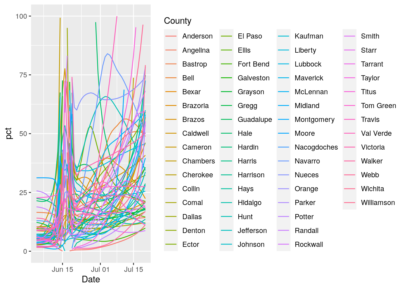
  #geom_line(aes(group=County, color=County)) +
  #geom_point(aes(y=Daily_tests, color=County))
I give up. The data is so badly compromised that I can’t see making anything useful out of it.