
Un-winding the addition of prison COVID cases to county totals
Introduction
Towards the end of May the state of Texas suddenly began adding the number of COVID-19 cases detected amongst prison inmates to the county totals for the counties in which the prisons resided. However, they have not indicated if they did this change on a single day, or if it may have taken place over several days, for different prisons. In this bit of work, I will try to ferret out what they did as best I can, so that I may best correct my own data.
Fortunately I have been collecting the prison data for some time and have a fairly complete set of data. I will also play with interpolating that data to fill in the holes I have, in particular when the URL changed in early June.
The state also changed their reporting of prison cases at about the same time, changing what numbers they reported. I will see if I can also reconcile those changes to generate a single, consistent dataset.
Join prison datasets
I have two prison datasets, one prior to May 29, and one starting May 29, when the website changed and the categories being counted changed. So I need to combine these into one consistent dataset.
The old set has variables like Pending_Tests, Negative_Tests, Positive_Tests, and Recovered. The new dataset has Offender Active Cases and Offender Recovered. It is not clear if Positive_Tests can count one individual multiple times or not. I fear that the answer may be yes. Perhaps when we combine the datasets it will become clearer.
Old_prison <- Old_prison %>%
  mutate(Inmate_cases=Positive_Tests+Recovered) %>%
  select(Date, Unit, County, Inmate_cases)

New_prison <- New_prison %>%
  # get total cases
  mutate(Inmate_cases=`Offender Active Cases`+`Offender Recovered`) %>%
  select(Date, Unit, County, Inmate_cases)

Prison <- rbind(Old_prison, New_prison)


Prison %>%
  group_by(Unit) %>%
    mutate(maxi=max(Inmate_cases)) %>%
  ungroup() %>%
  filter(maxi>50) %>%
  filter(Date>lubridate::ymd("2020-05-20")) %>%
  ggplot(aes(x=Date, y=Inmate_cases, color=Unit)) +
  geom_line() +
  geom_point()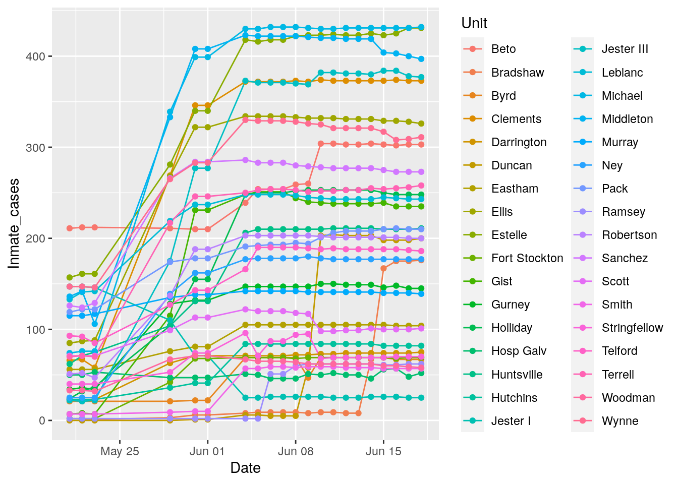
Well, I’d say it is still astonishingly unclear. If tests were being counted multiple times per person, the total should have dropped after May, but for the most part they have bumped up. I think a lot of that is that they tend to test people now in large batches, and then all the tests arrive at once adding a large jump to the numbers. In any event, it appears that Positive Tests may mean one per inmate.
Cases by county
Let’s start by looking at cases by county for both prisons and the general population, and see how they compare.
#   First sum prison cases within each county

Prison <- Prison %>%
  # Sum by county
  group_by(Date, County) %>%
    summarise(Inmate_cases=sum(Inmate_cases)) %>%
  ungroup() %>%
  filter(Inmate_cases>0)

#   Check data

Prison %>%
  filter(Inmate_cases>150) %>%
  ggplot(aes(x=Date, y=Inmate_cases, color=County)) +
  geom_line() +
  geom_point() +
  labs(title="Inmate Cases by County")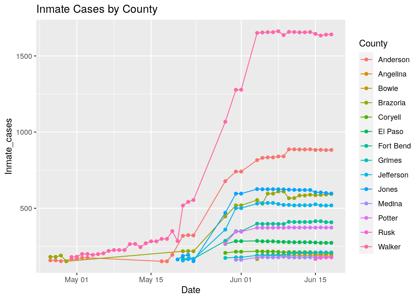
df <- left_join(Prison, Covid_data, by=c("County", "Date"))

df %>%
  group_by(County) %>%
    mutate(delta=Cases-lag(Cases)) %>%
    replace_na(list(delta=0)) %>%
    mutate(size=max(delta)/mean(delta)) %>%
  ungroup() %>%
  filter(size>10) %>%
  ggplot(aes(x=Date, y=delta, color=County)) +
  geom_point() +
  geom_line() +
  geom_line(aes(y=Inmate_cases), linetype="dotted" ) +
  labs(title="Daily change in total cases (delta), with Inmate cases overlain (dotted)")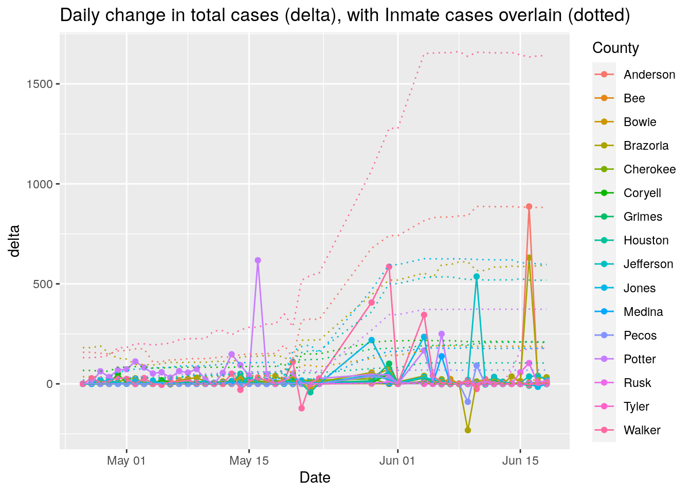
df %>%
  group_by(County) %>%
    mutate(delta=Cases-Inmate_cases) %>%
    replace_na(list(delta=0)) %>%
    mutate(size=max(abs(delta))) %>%
  ungroup() %>%
  filter(size<200) %>%
  ggplot(aes(x=Date, y=delta, color=County)) +
  geom_point() +
  geom_line() +
  geom_line(aes(y=Inmate_cases), linetype="dotted" )+
  labs(title="Daily change in total cases (delta), with Inmate cases overlain (dotted)")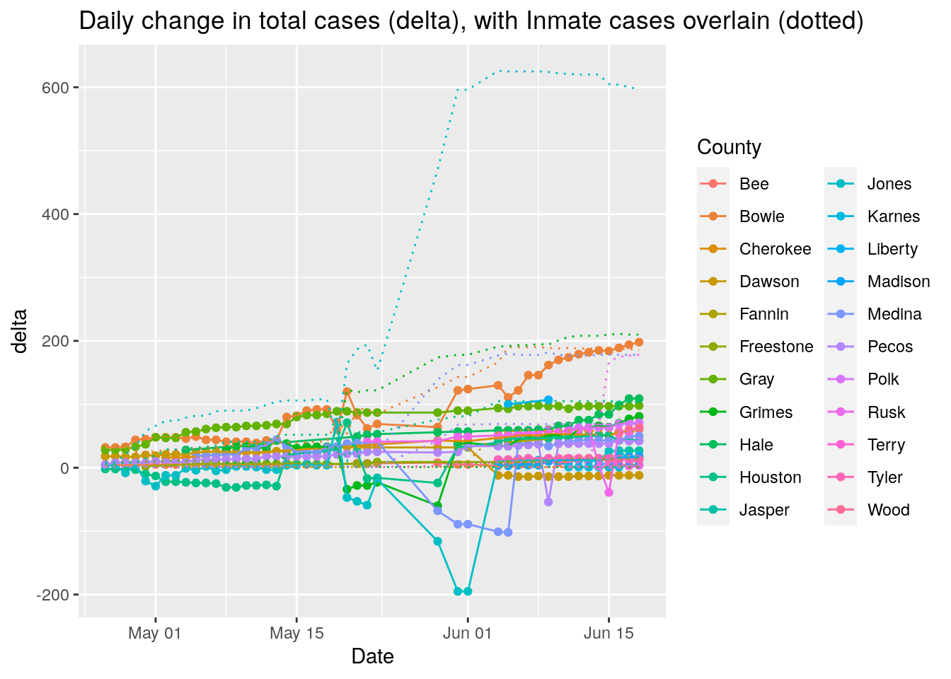
#   Look at top 25 counties to see if a pattern emerges

df <- left_join(Covid_data, Prison, by=c("County", "Date"))

df %>%
  group_by(County) %>%
    summarise(maxincases=max(Inmate_cases, na.rm=TRUE),
              maxcases=max(Cases, na.rm=TRUE)) %>%
    mutate(fraction=maxincases/(maxincases+maxcases)) %>%
  ungroup() %>%
  arrange(desc(fraction)) %>%
  mutate(rank=row_number()) %>%
  filter(rank<=25) %>%
  select(County) -> bigcounties

Bigdata <- df %>%
  filter(County %in% bigcounties$County)

Bigdata %>%
  ggplot(aes(x=Date, y=Inmate_cases)) +
  geom_line() +
  geom_point() +
  geom_line(aes(y=Cases), linetype="dashed" ) +
  facet_wrap(~ County, scales = "free_y")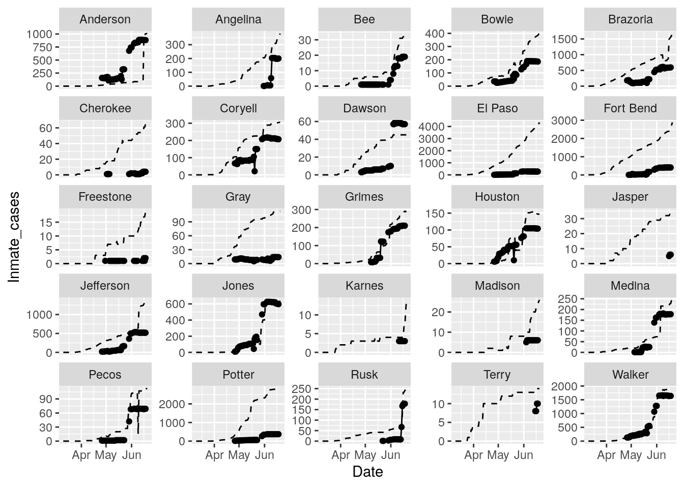
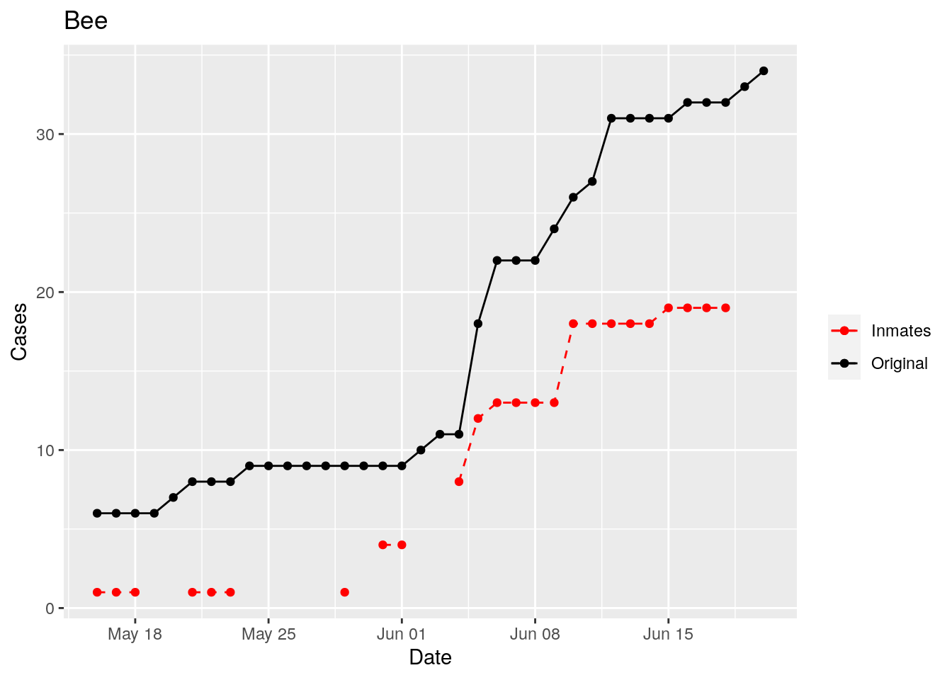
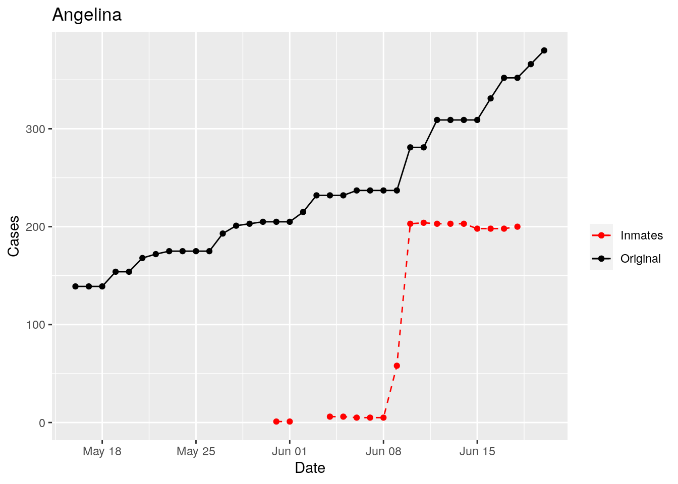
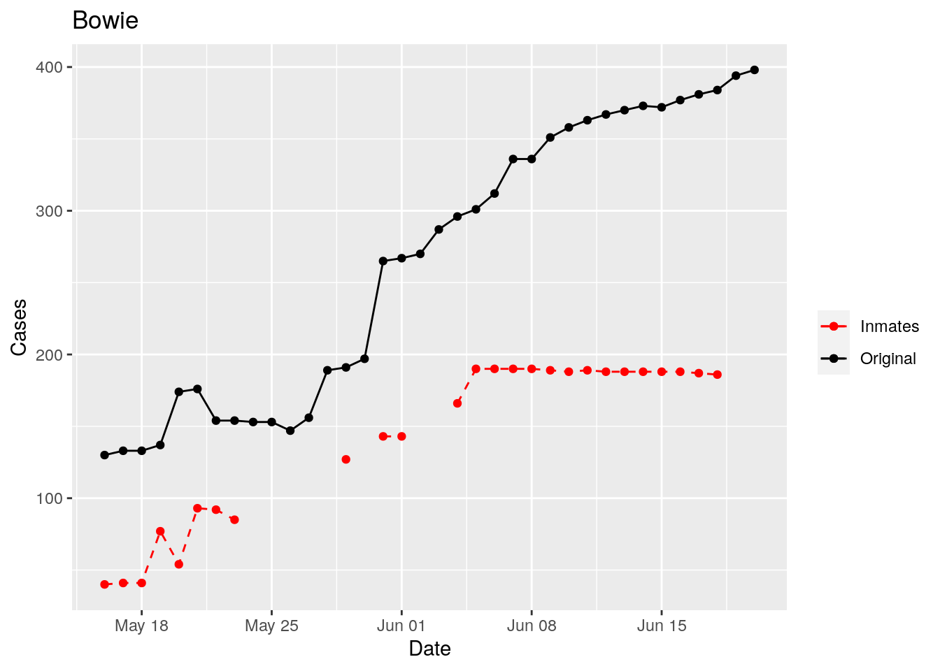
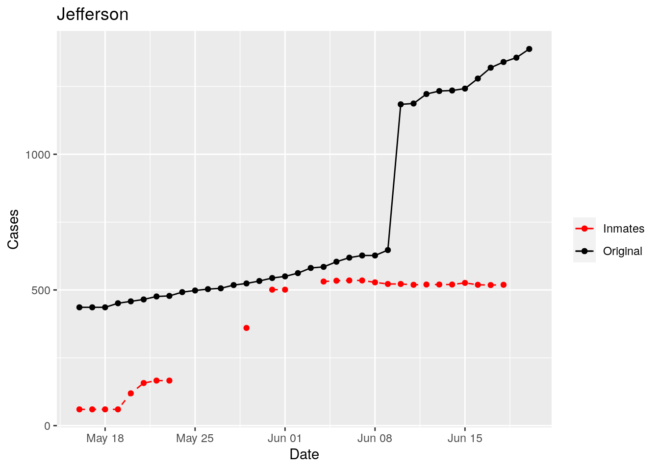
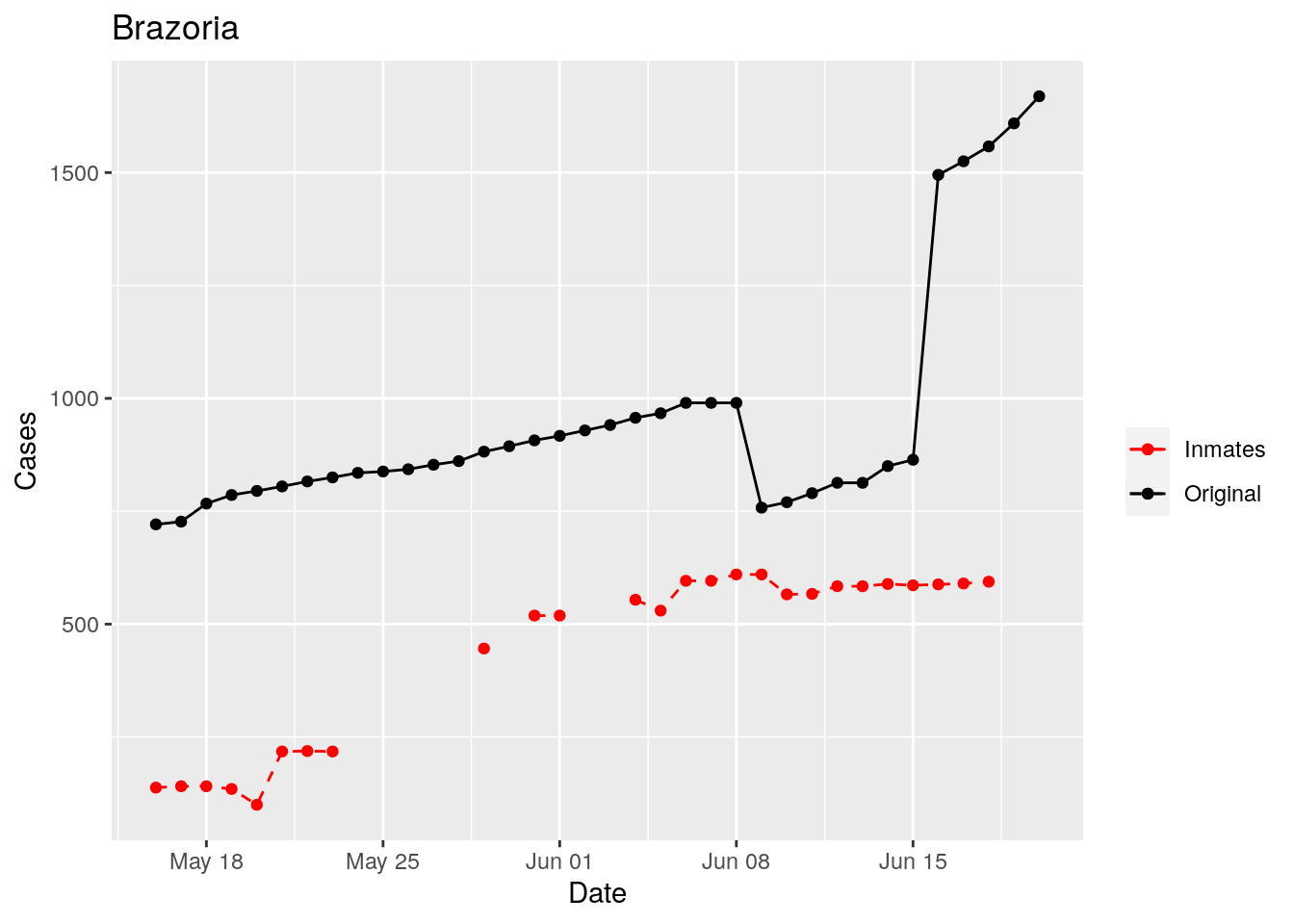
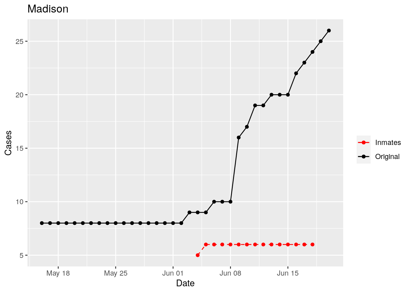
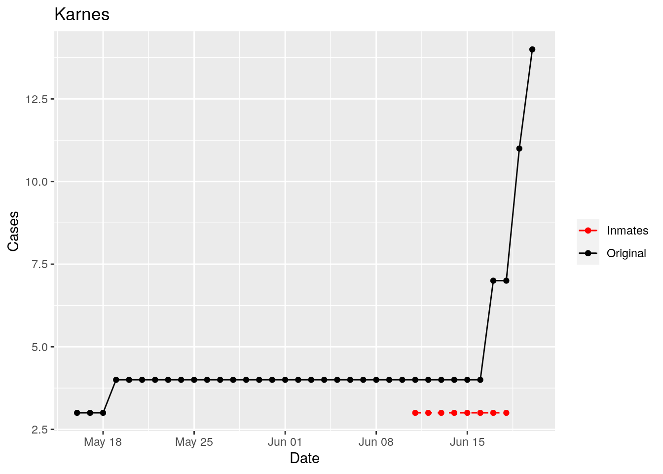
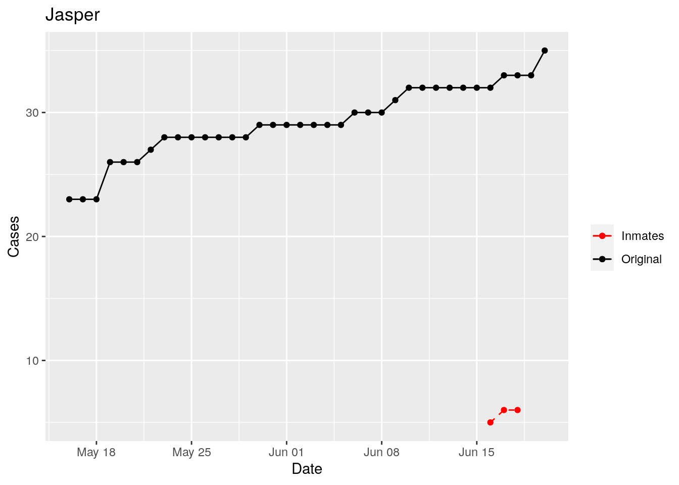
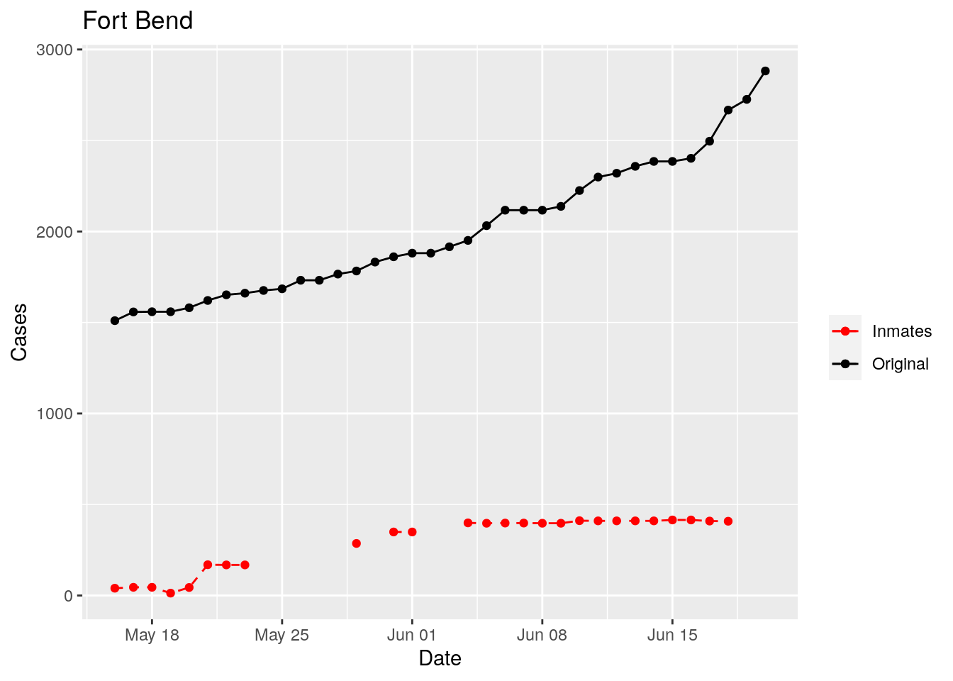
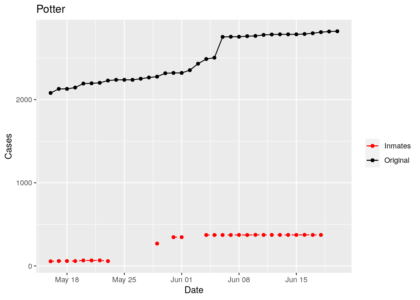
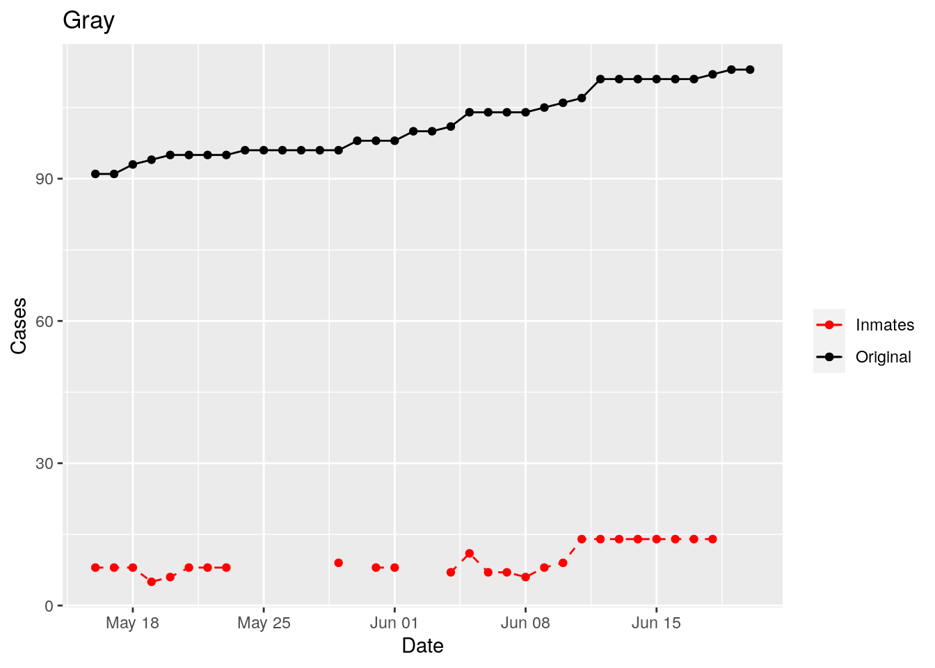
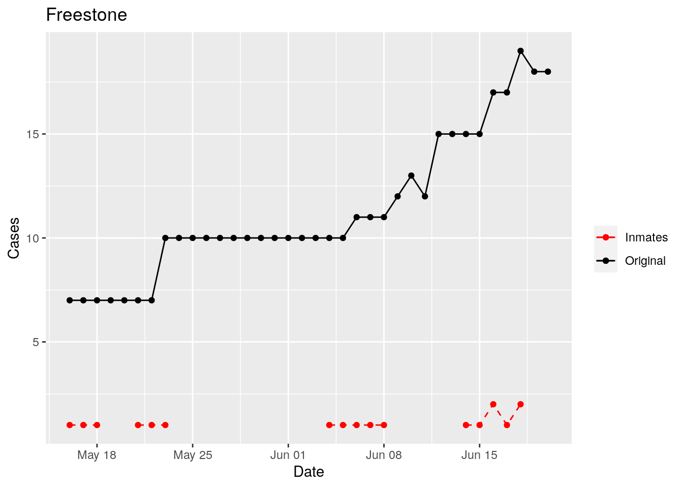
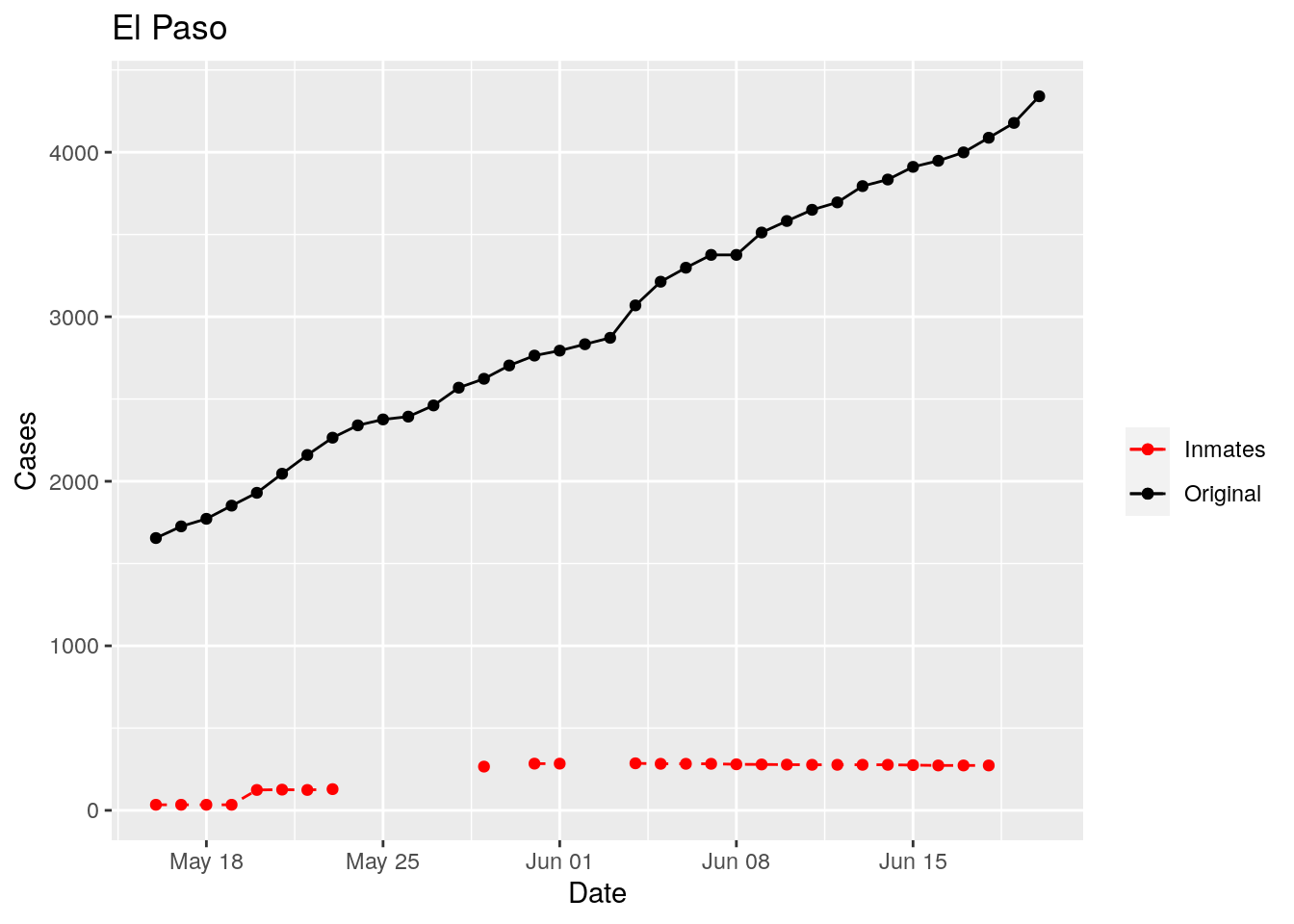
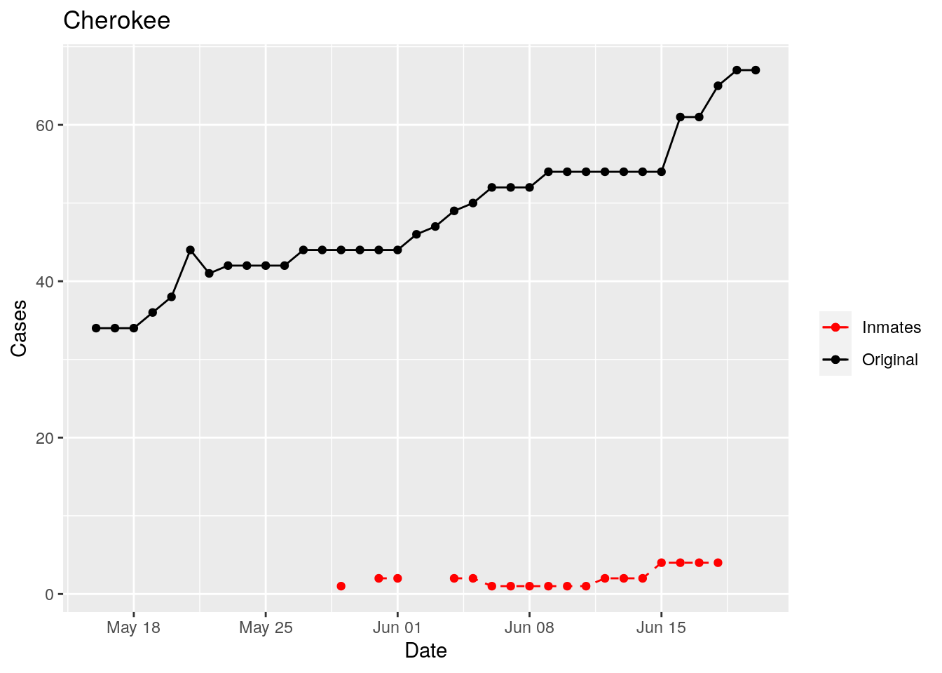
In the plots above, the points show the inmate numbers, the dashed lines show total reported cases in the county. In many cases they seem to correlate, in many they do not, and in some it is just not clear.
These plots seem to help indicate when and where prison numbers began to be added to each county. It appears that I will have to look at each county in detail to flag the exact dates to use. And I wonder if those might also vary within a county by prison unit.
There may also be a day or two lag between test results getting posted for a prison unit, and those results being propagated to the county.
So let’s plot, on a shorter time frame each individual county, and determine when the prison data was added, and at what lag. And then replot that county subtracting out the prison data to make sure it looks reasonable.
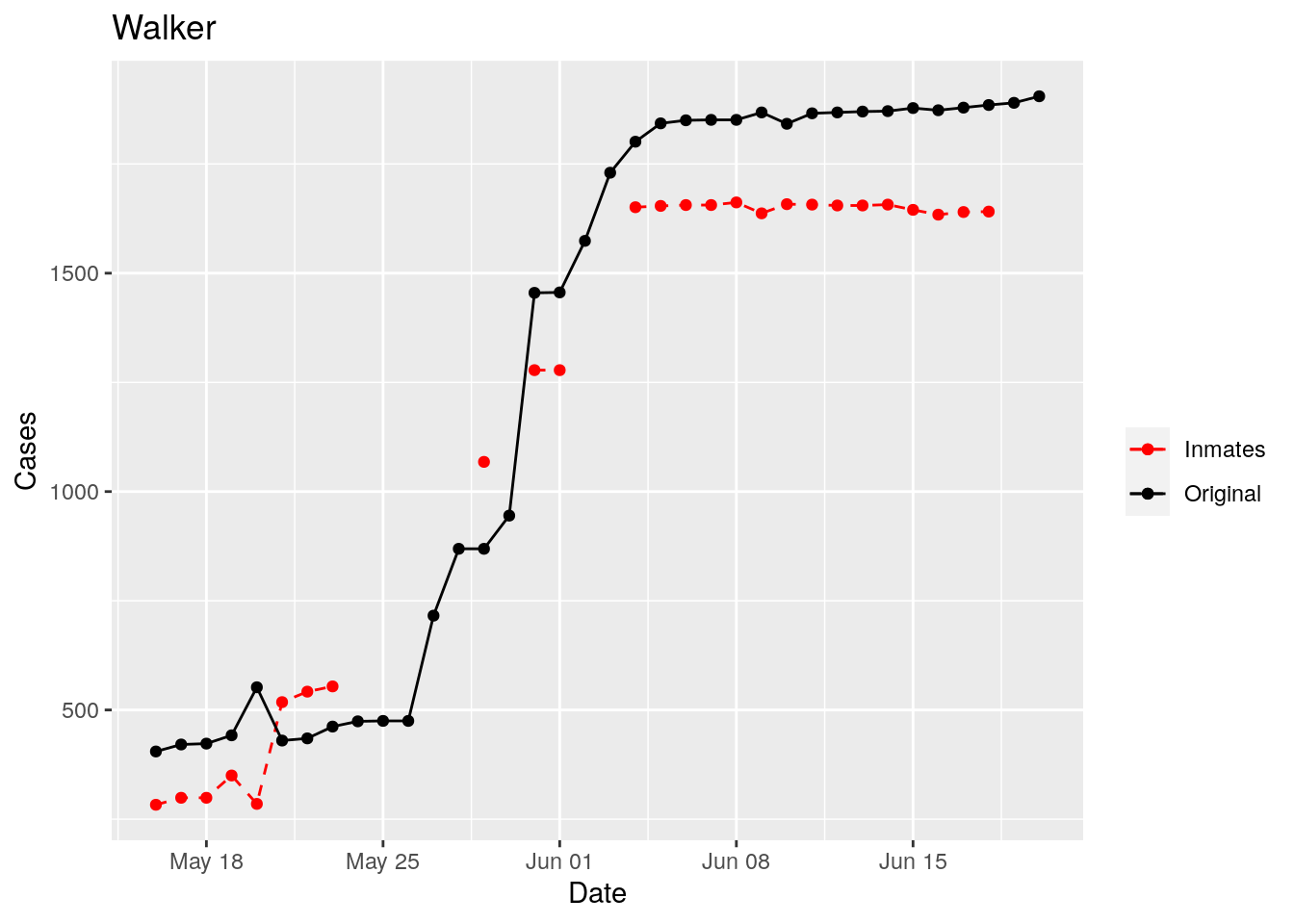
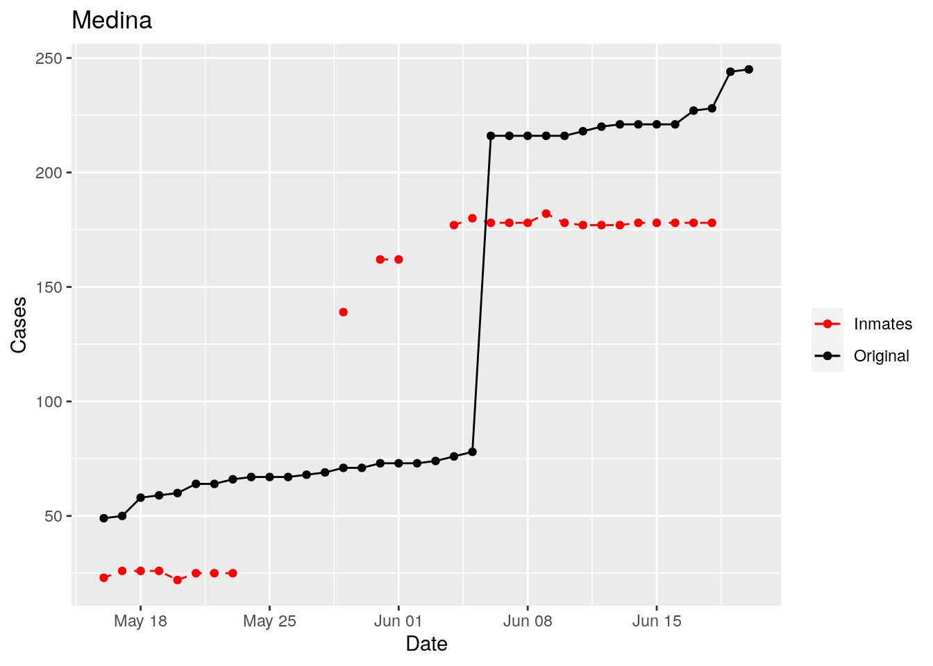
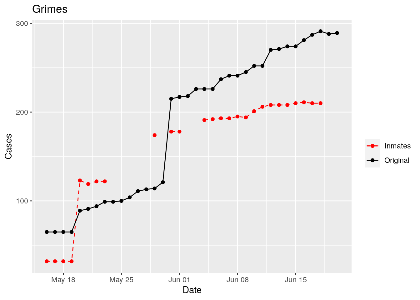
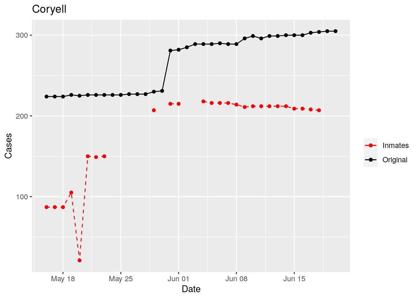
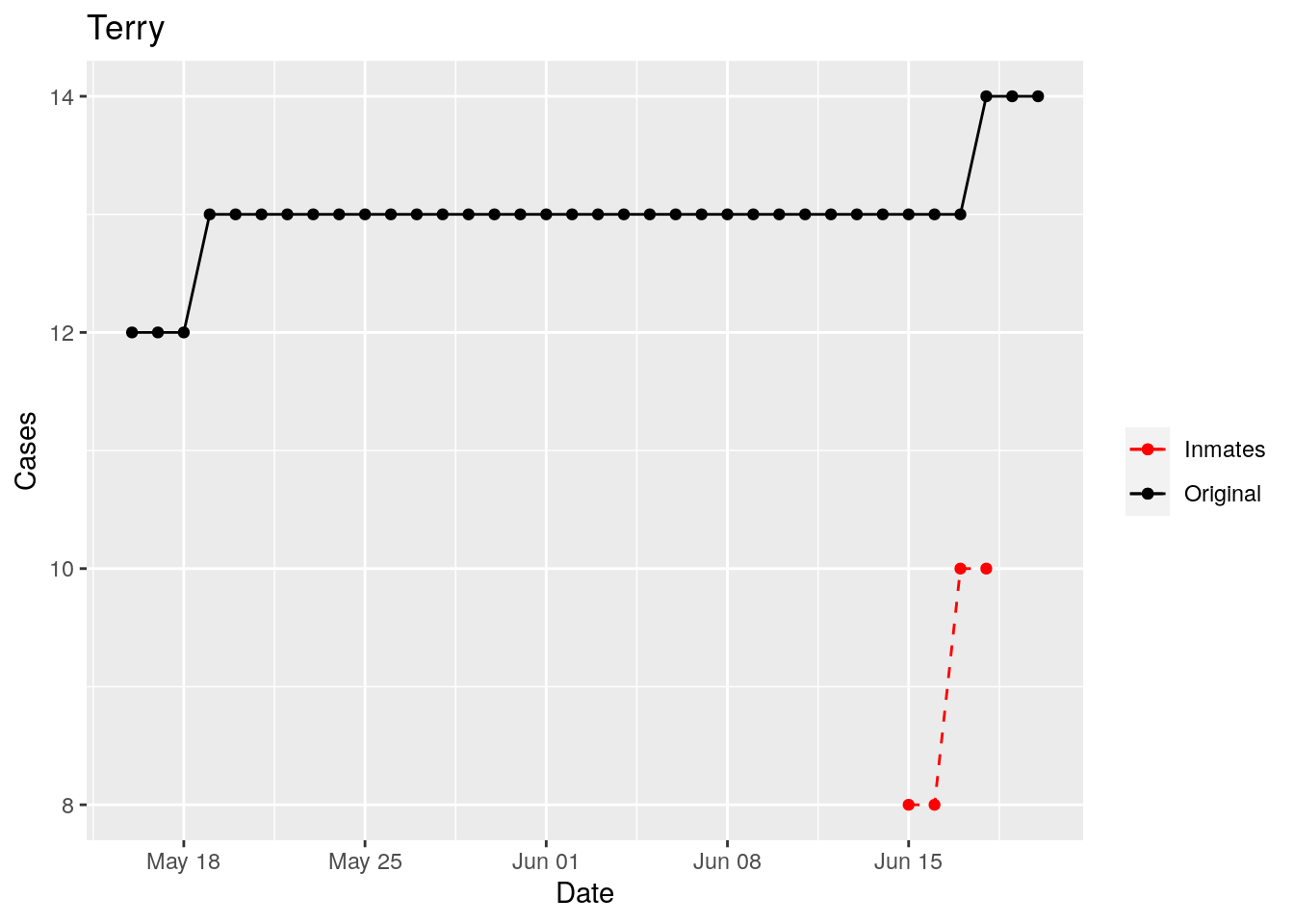
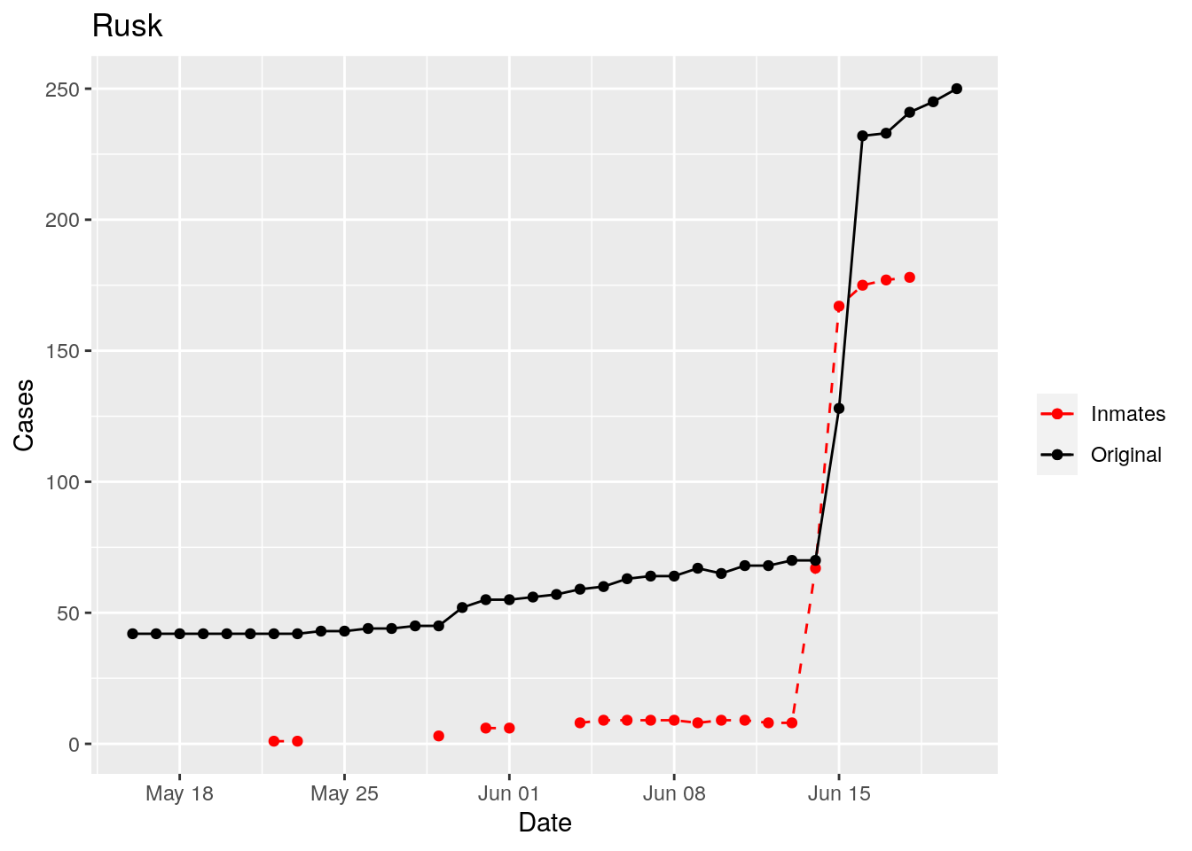
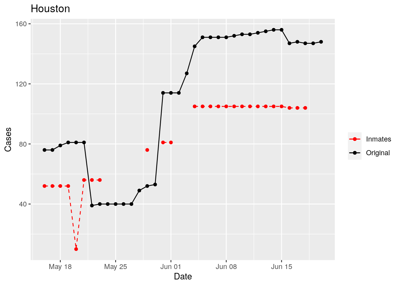
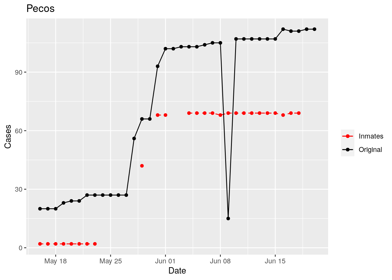
for (county in bigcounties$County) {
  p <- df %>%
    filter(County == county) %>%
    filter(Date>lubridate::ymd("2020-05-15")) %>%
    ggplot(aes(x=Date, y=Inmate_cases)) +
    geom_point(aes(color="Inmates"))+
    geom_line(aes(color="Inmates"), linetype="dashed") +
    geom_point(aes(y=Cases, color="Original"))+
    geom_line(aes(y=Cases, color="Original"))+
    scale_color_manual(name="", values=c("red", "black"))+
    labs(title=county, y="Cases")

  print(p)
}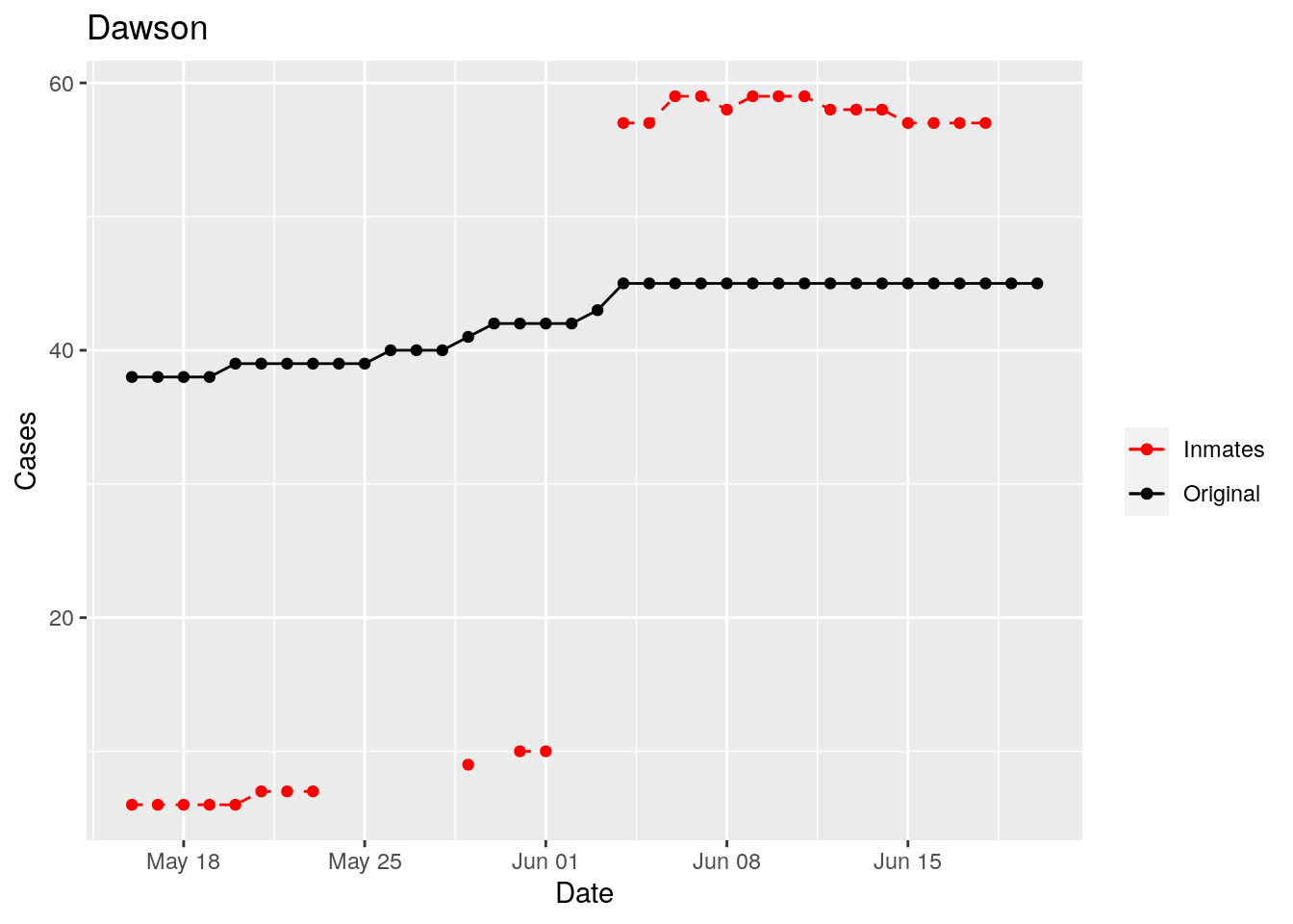
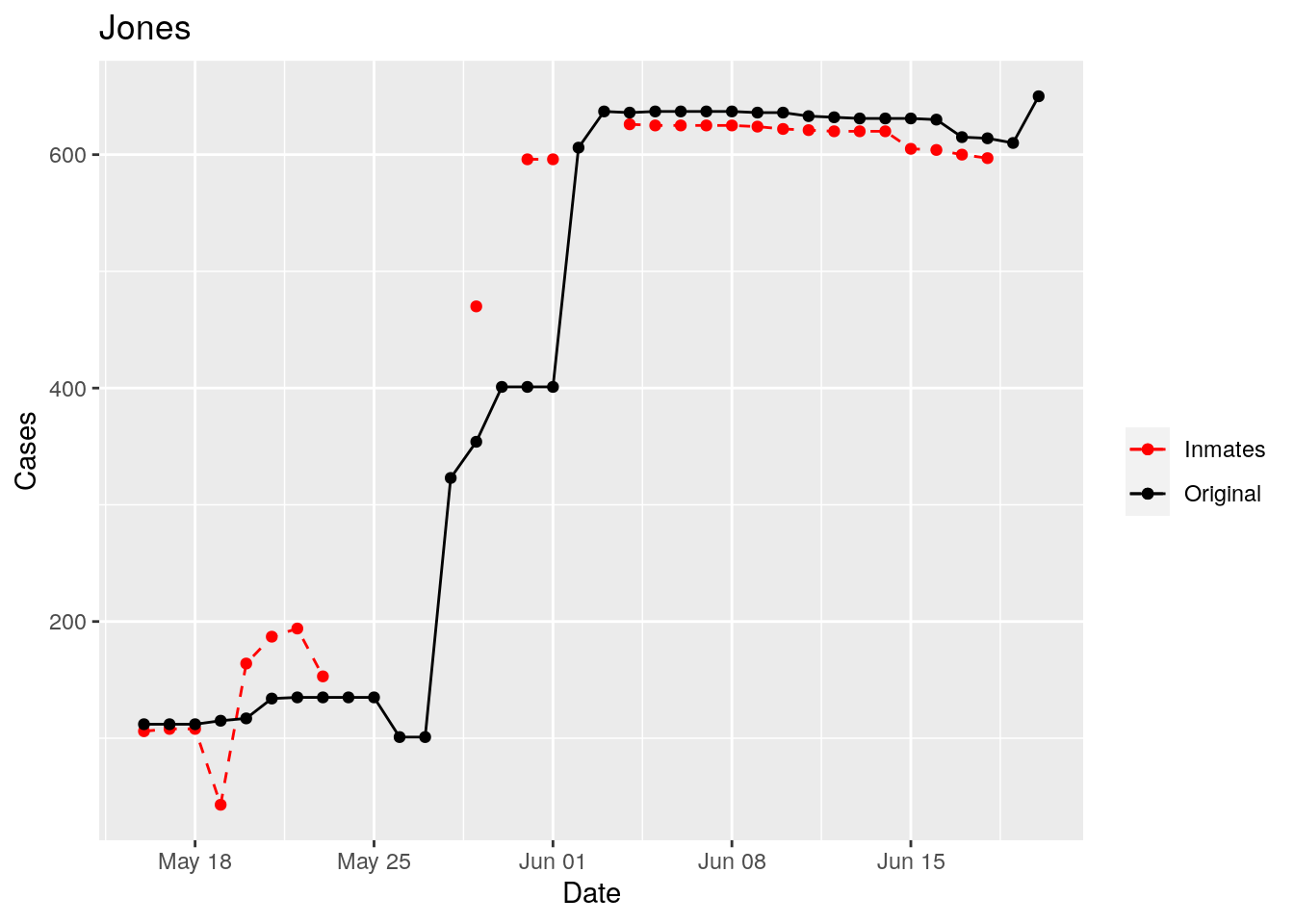
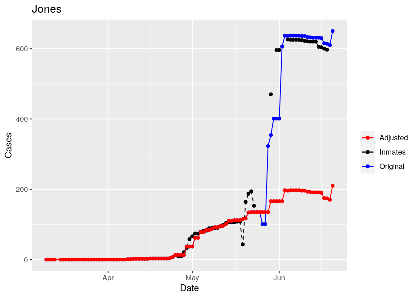
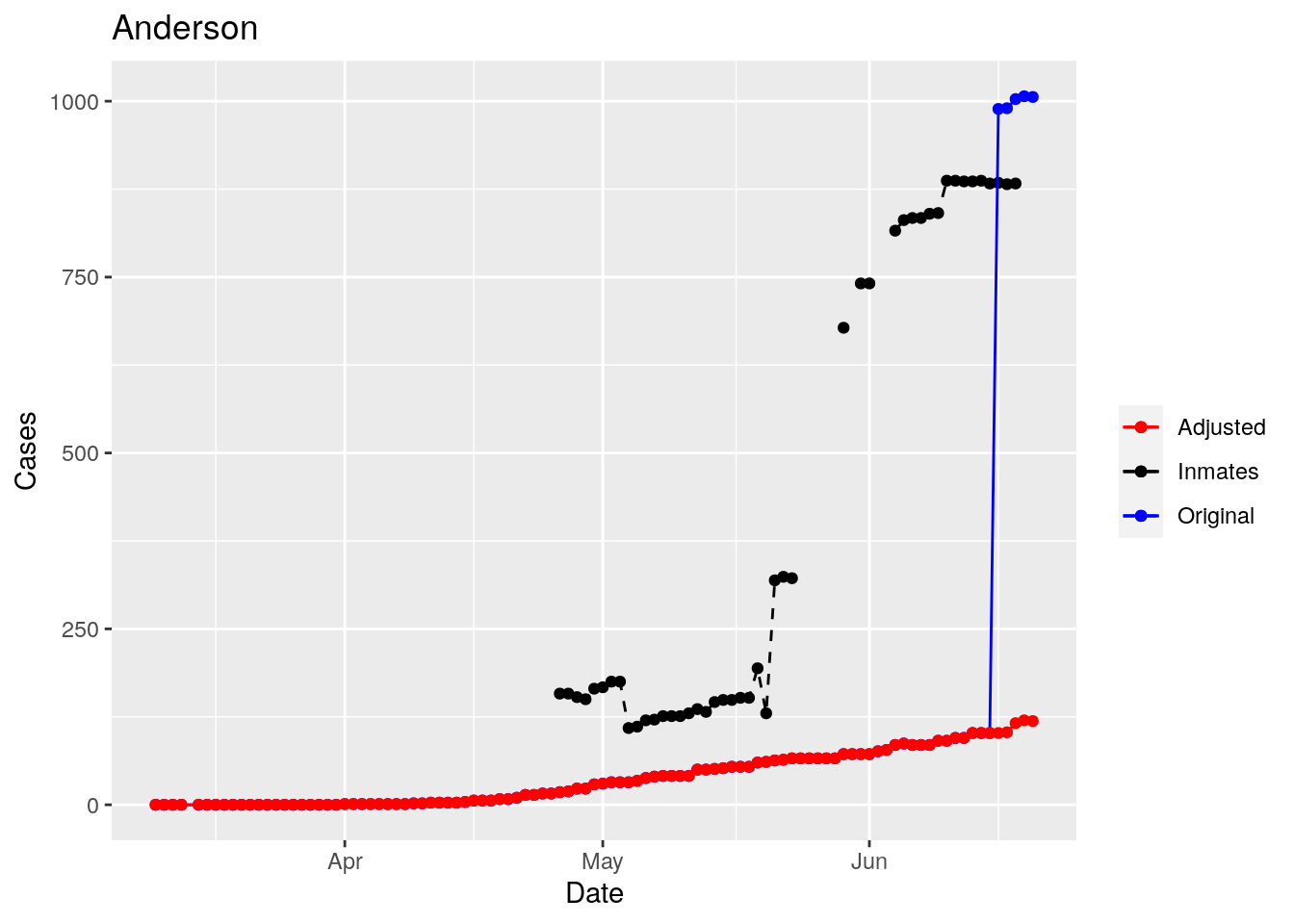
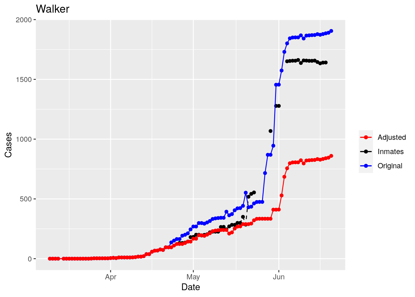
Adjusted <- tribble(
~County, ~Date, ~Lag,
"Jones", "2020-05-28", 3,
"Anderson", "2020-06-16", 0,
"Walker", "2020-04-09", 1,
"Medina", "2020-06-06", 0,
"Rusk", "2020-05-30", 1,
"Grimes", "2020-05-31", 2,
"Coryell", "2020-04-26", 2,
"Terry", "2020-04-26", 1,
"Houston", "2020-04-26", 1,
"Pecos", "2020-04-26", 1,
"Bee", "2020-04-26", 2,
"Bowie", "2020-04-26", 1,
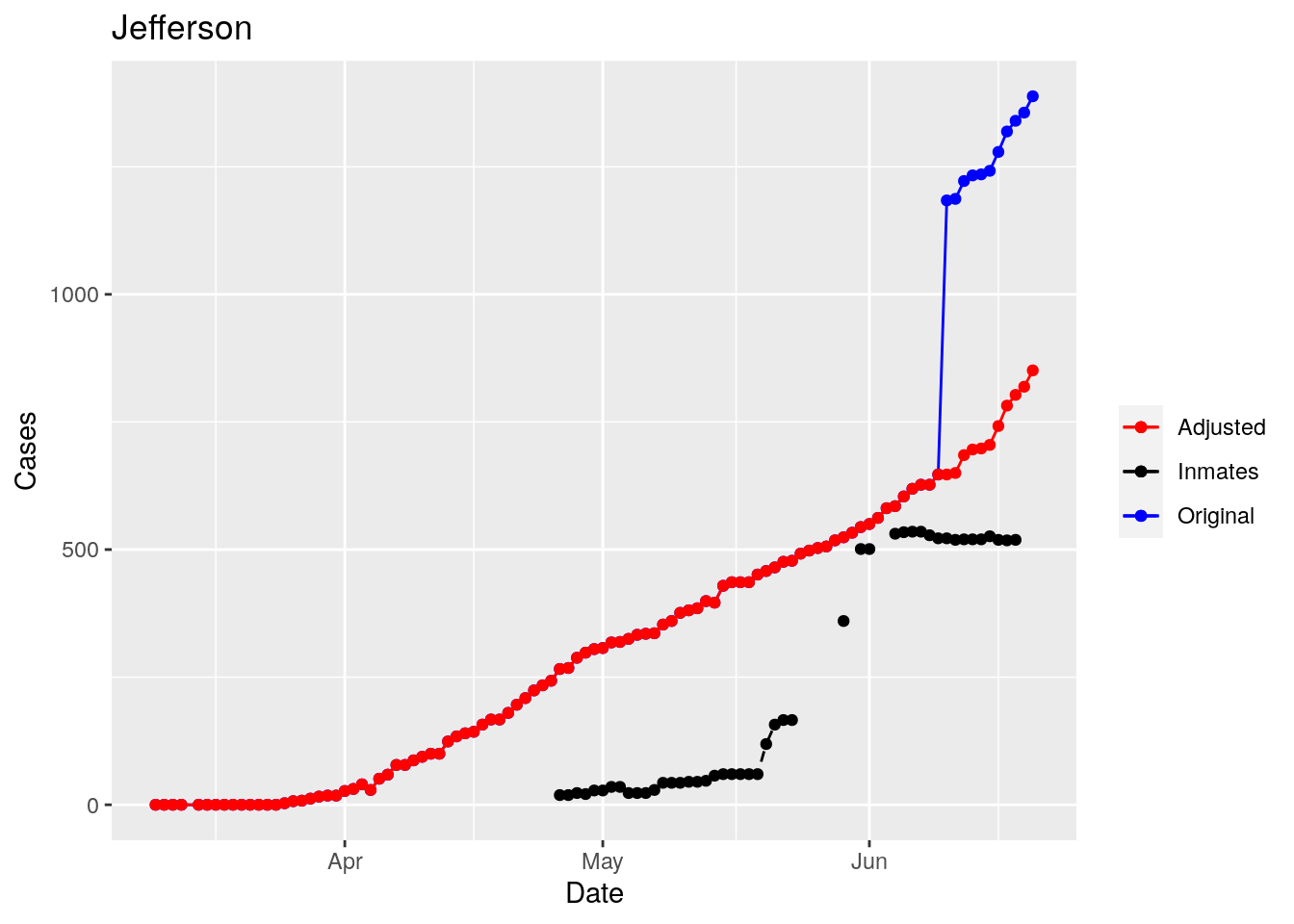
"Jefferson", "2020-06-10", 0,
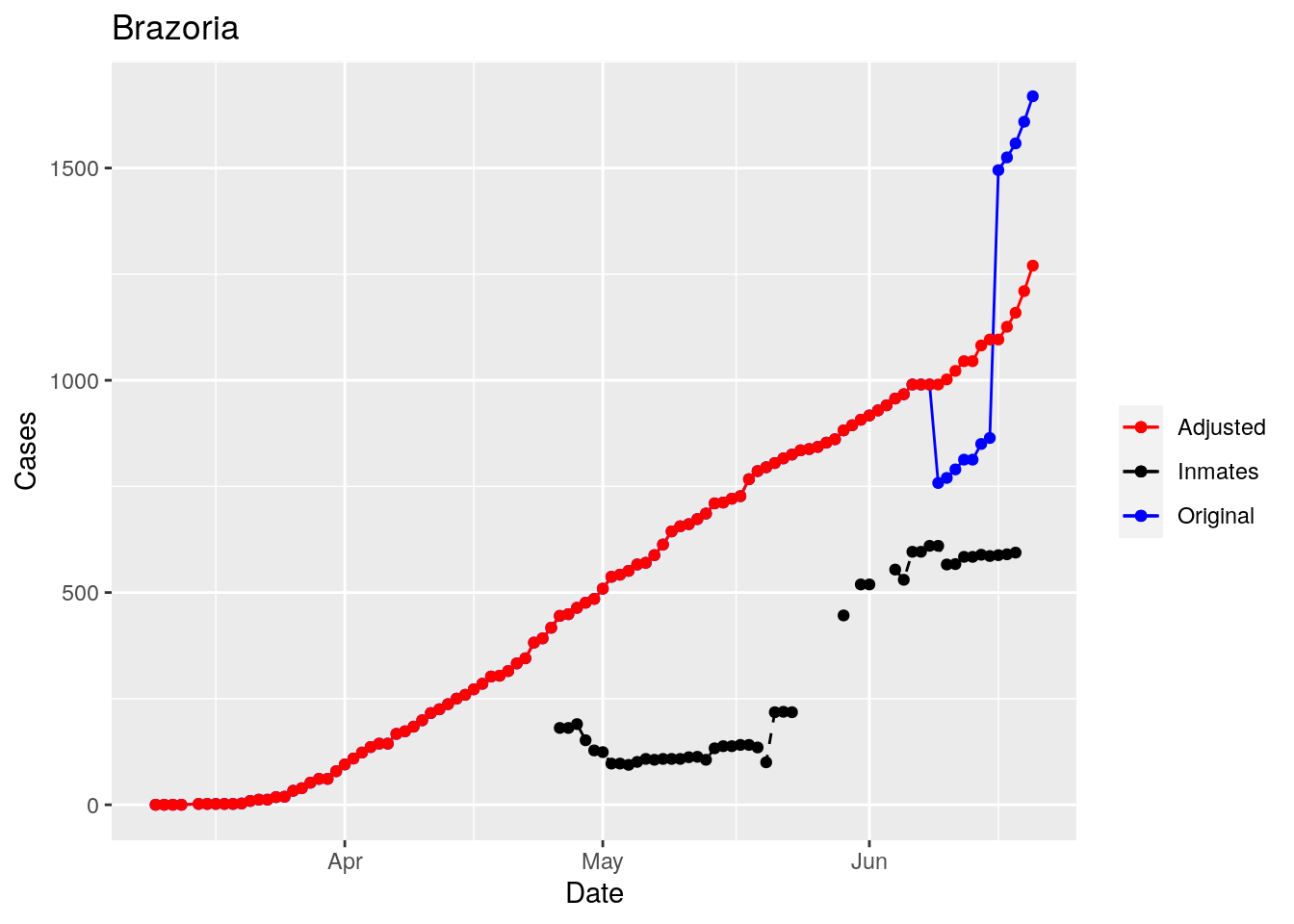
"Brazoria", "2020-06-16", 0
)
Adjusted$Date <- lubridate::ymd(Adjusted$Date)
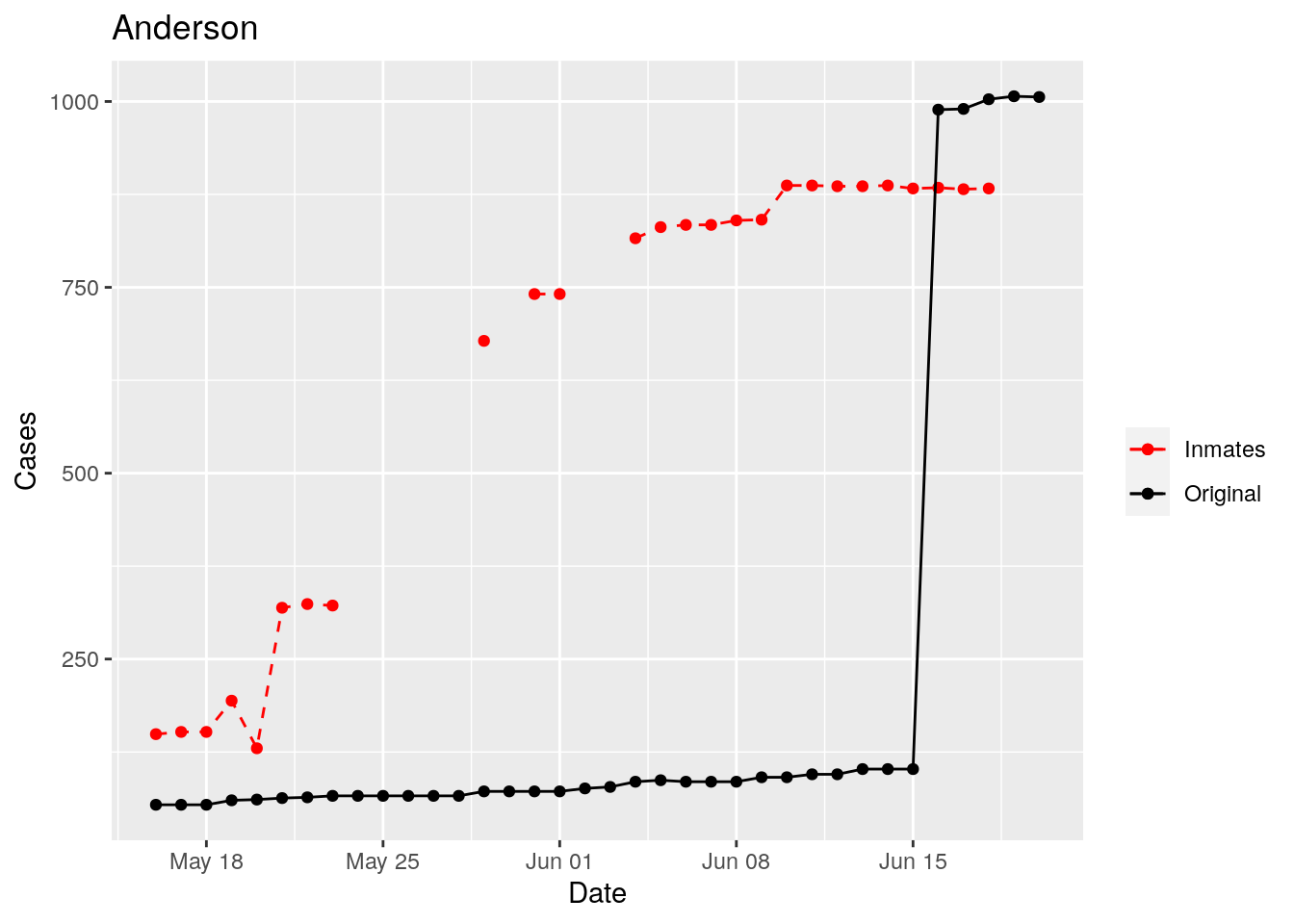
for (county in Adjusted$County) {
Lag <- Adjusted$Lag[Adjusted$County==county]
Start_date <- Adjusted$Date[Adjusted$County==county]
foo <- df %>% # shift dates by lag
filter(County == county) %>%
mutate(Date=Date+Lag) %>%
select(Date, Inmate_cases)
foo[foo$Date<Start_date,]$Inmate_cases <-0
foo <- foo %>% mutate(id=row_number())
# interpolate gaps
#foo$Inmate_cases <- zoo::na.approx(foo$Inmate_cases, foo$id, na.rm=FALSE)
p <-
df %>%
filter(County == county) %>%
select(-Inmate_cases, -Deaths) %>%
left_join(., foo, by="Date") %>%
mutate(Adjusted=Cases-Inmate_cases) %>%
ggplot(aes(x=Date, y=Inmate_cases)) +
geom_point(aes(color="Inmates"))+
geom_line(aes(color="Inmates"), linetype="dashed") +
geom_point(aes(y=Cases, color="Original"))+
geom_line(aes(y=Cases, color="Original"))+
geom_point(aes(y=Adjusted, color="Adjusted"))+
geom_line(aes(y=Adjusted, color="Adjusted"))+
scale_color_manual(name="", values=c("red", "black", "blue"))+
labs(title=county, y="Cases")
print(p)
}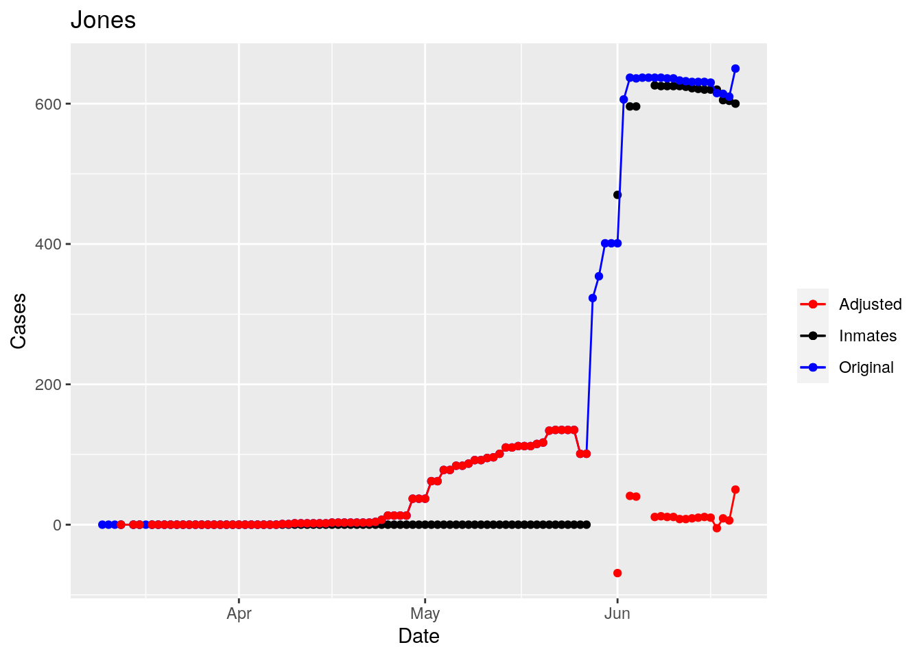
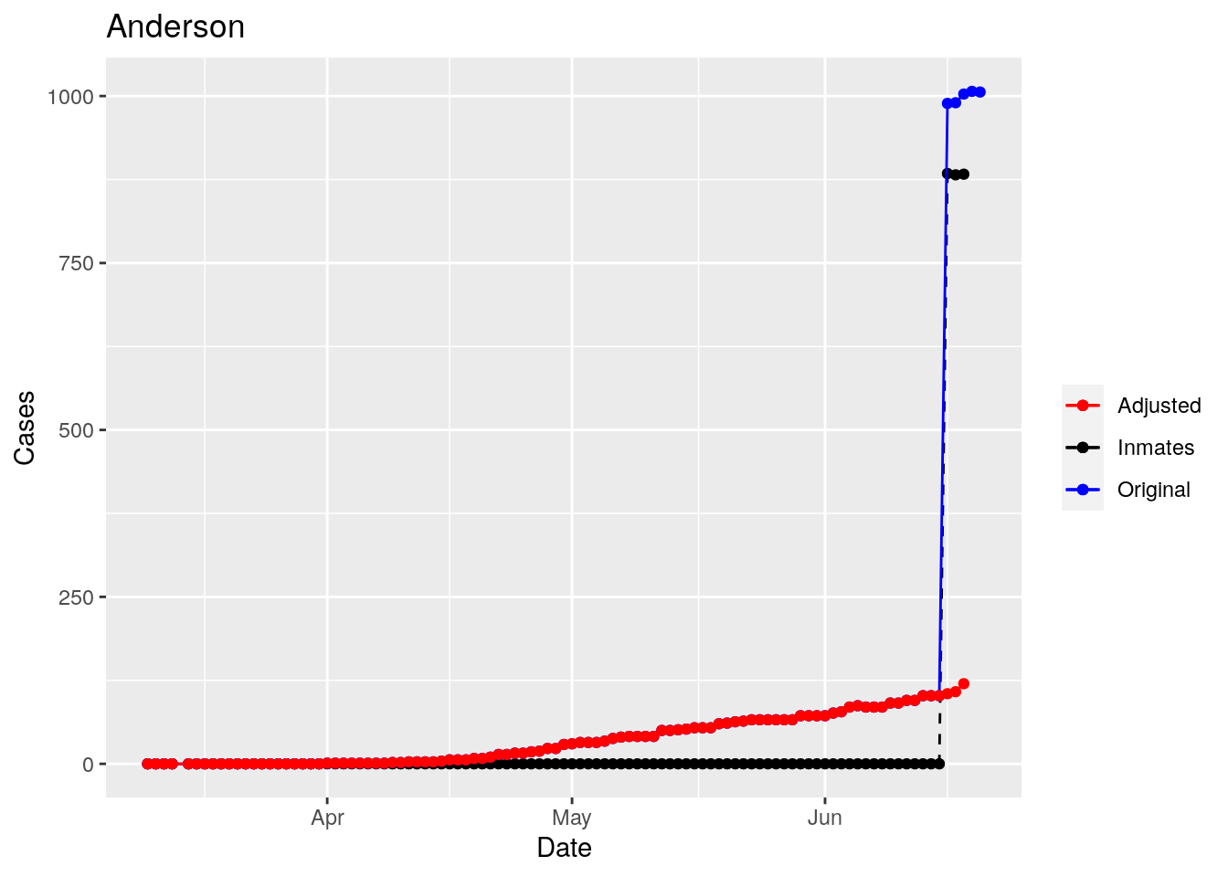
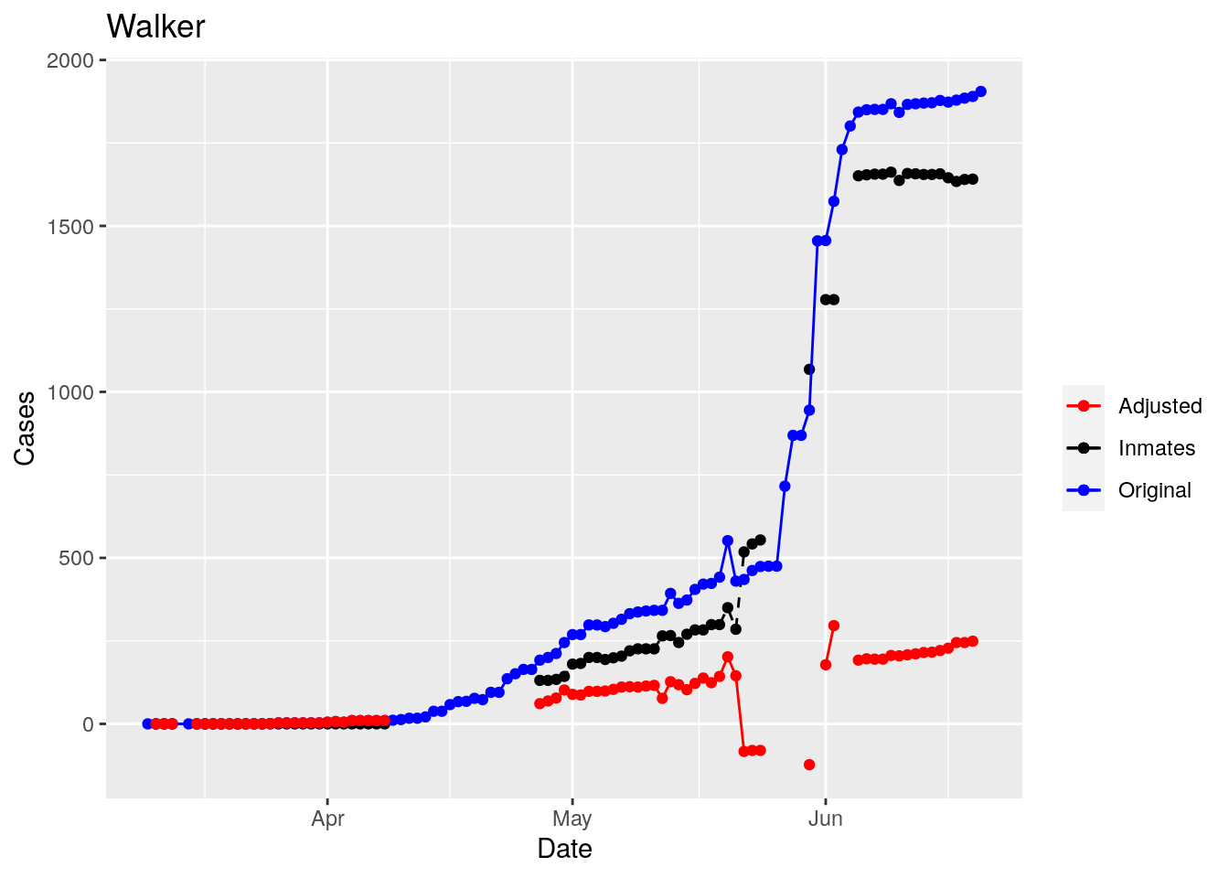
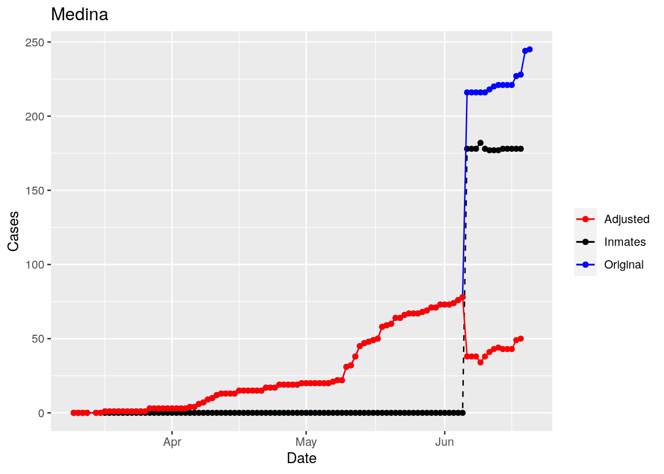
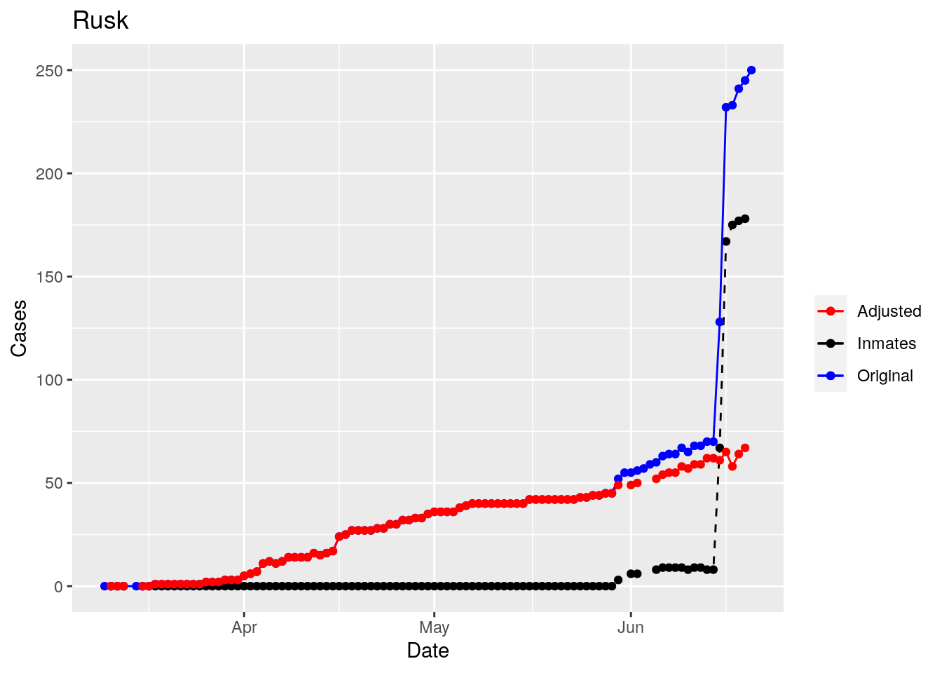
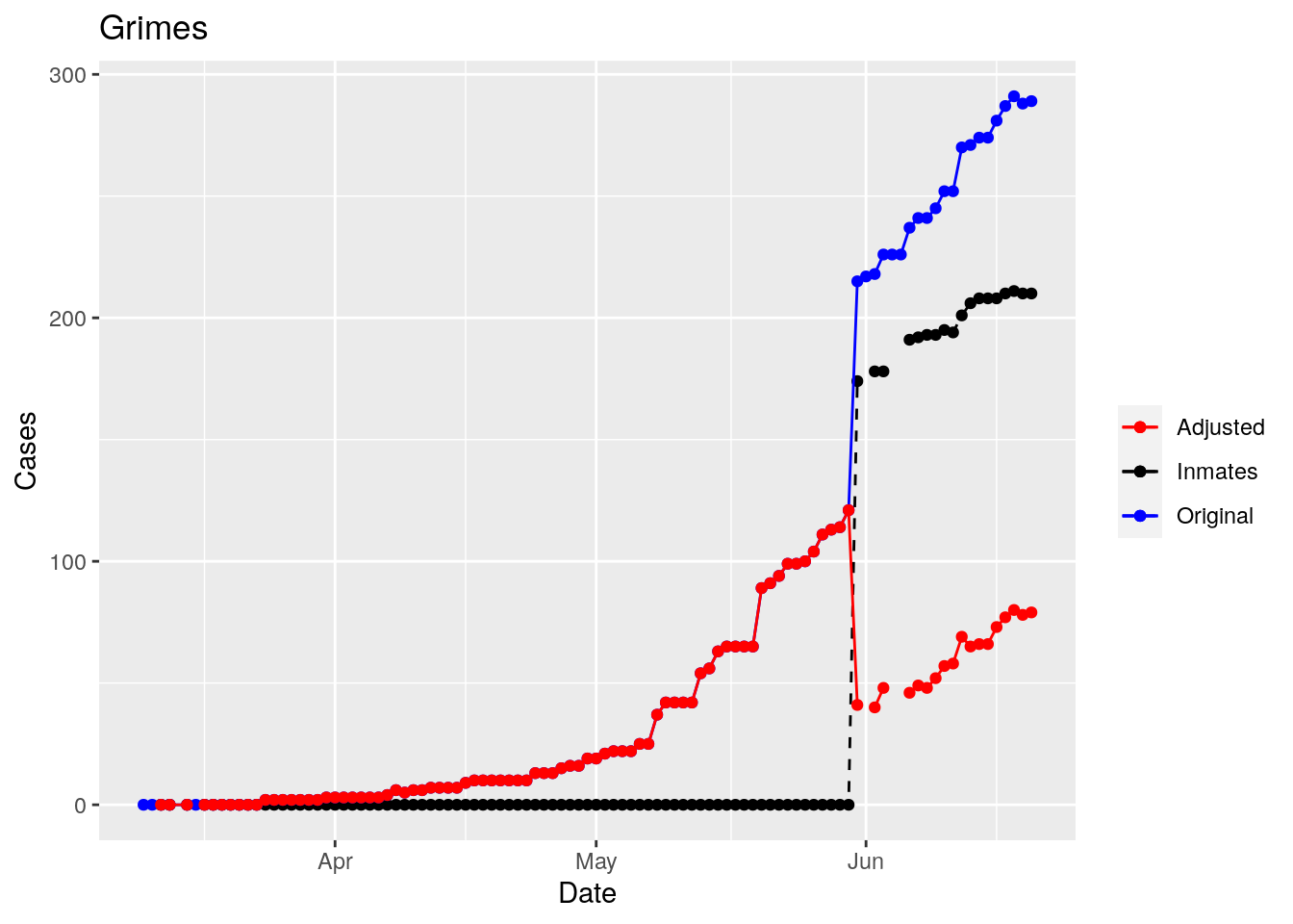
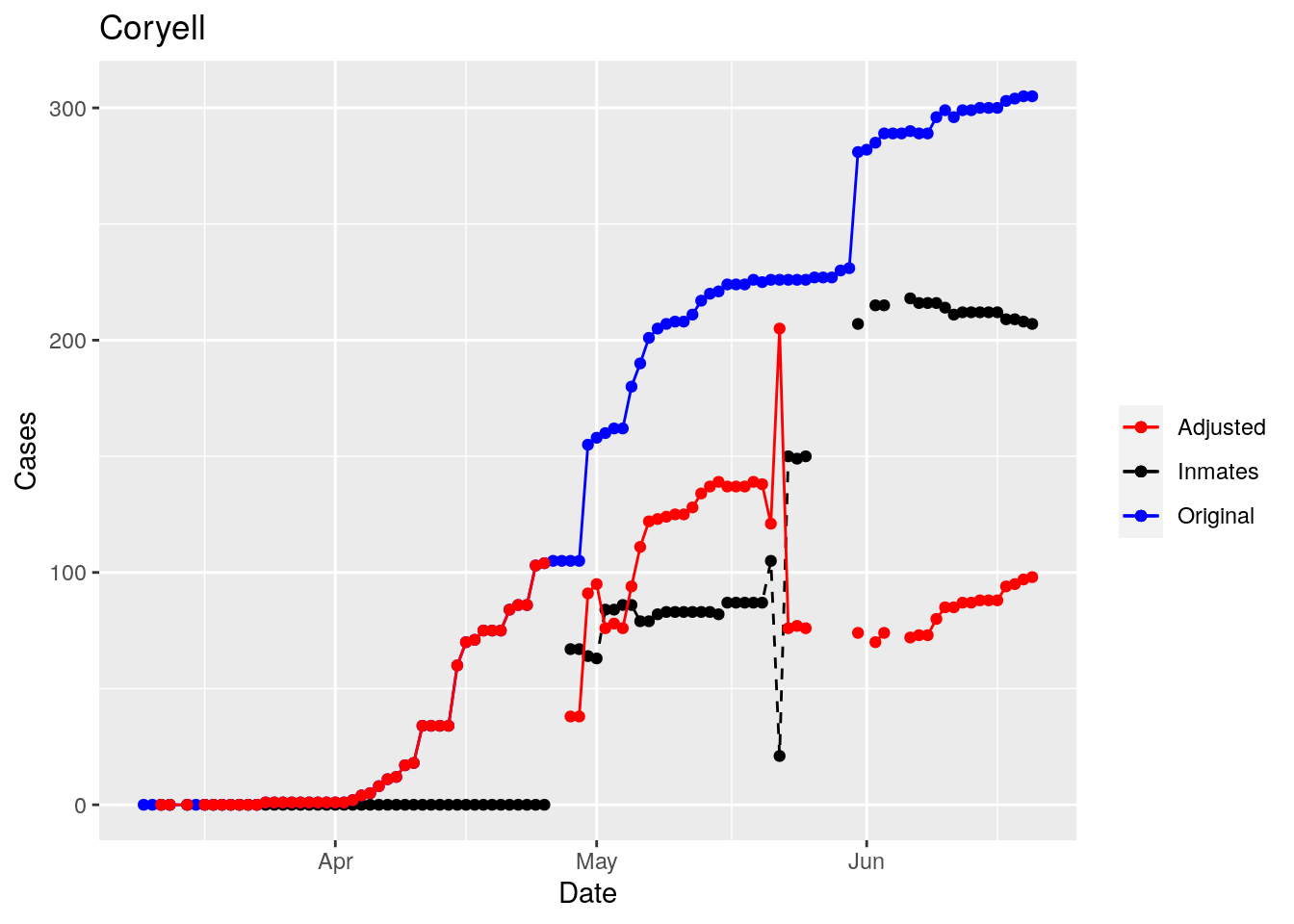
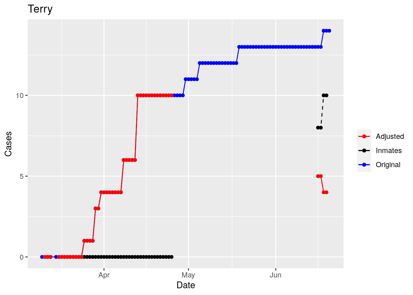
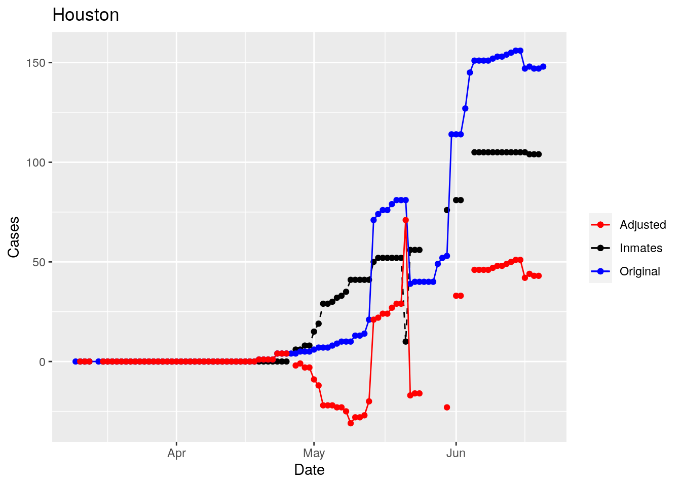
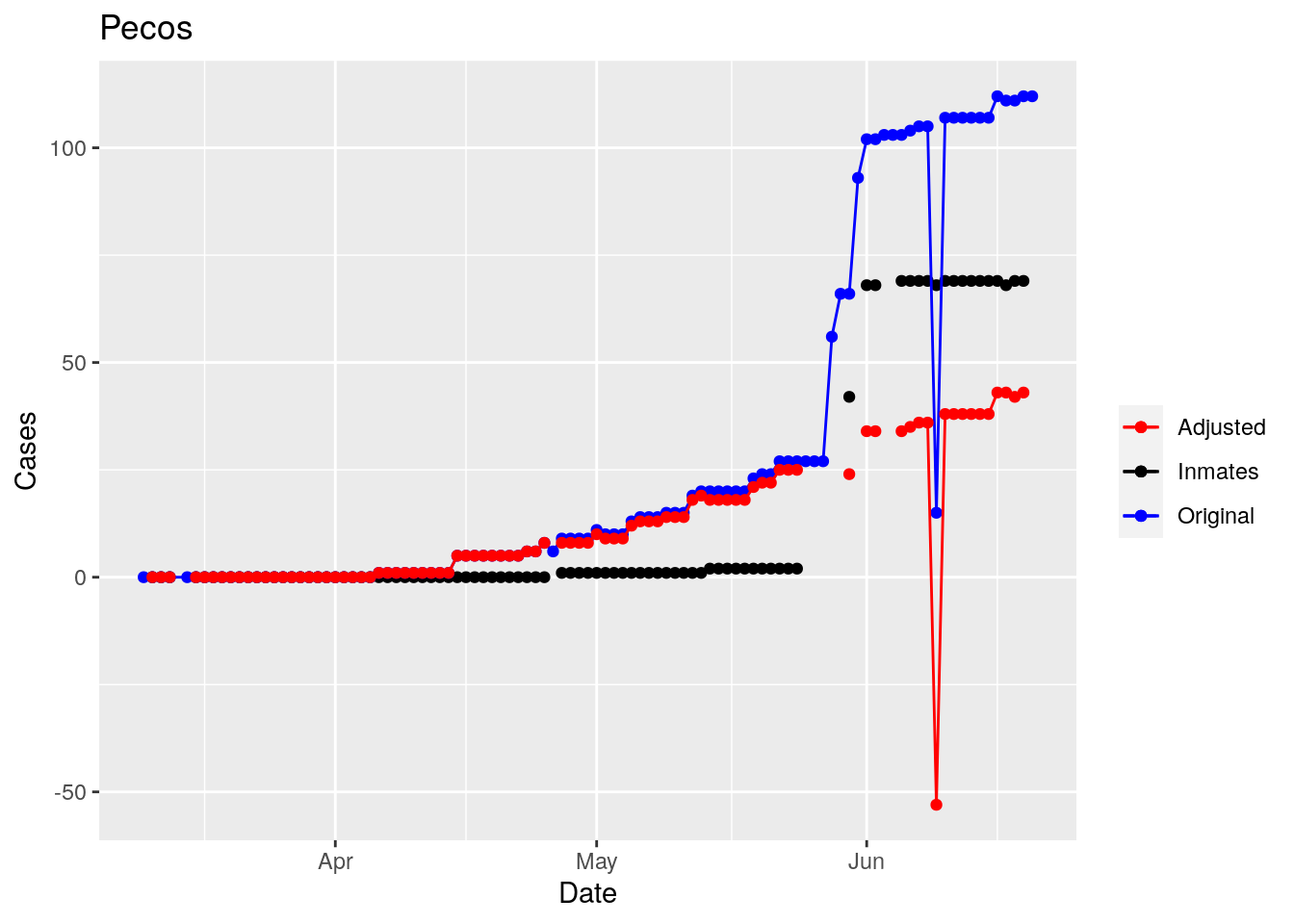
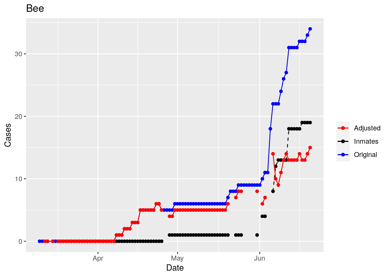
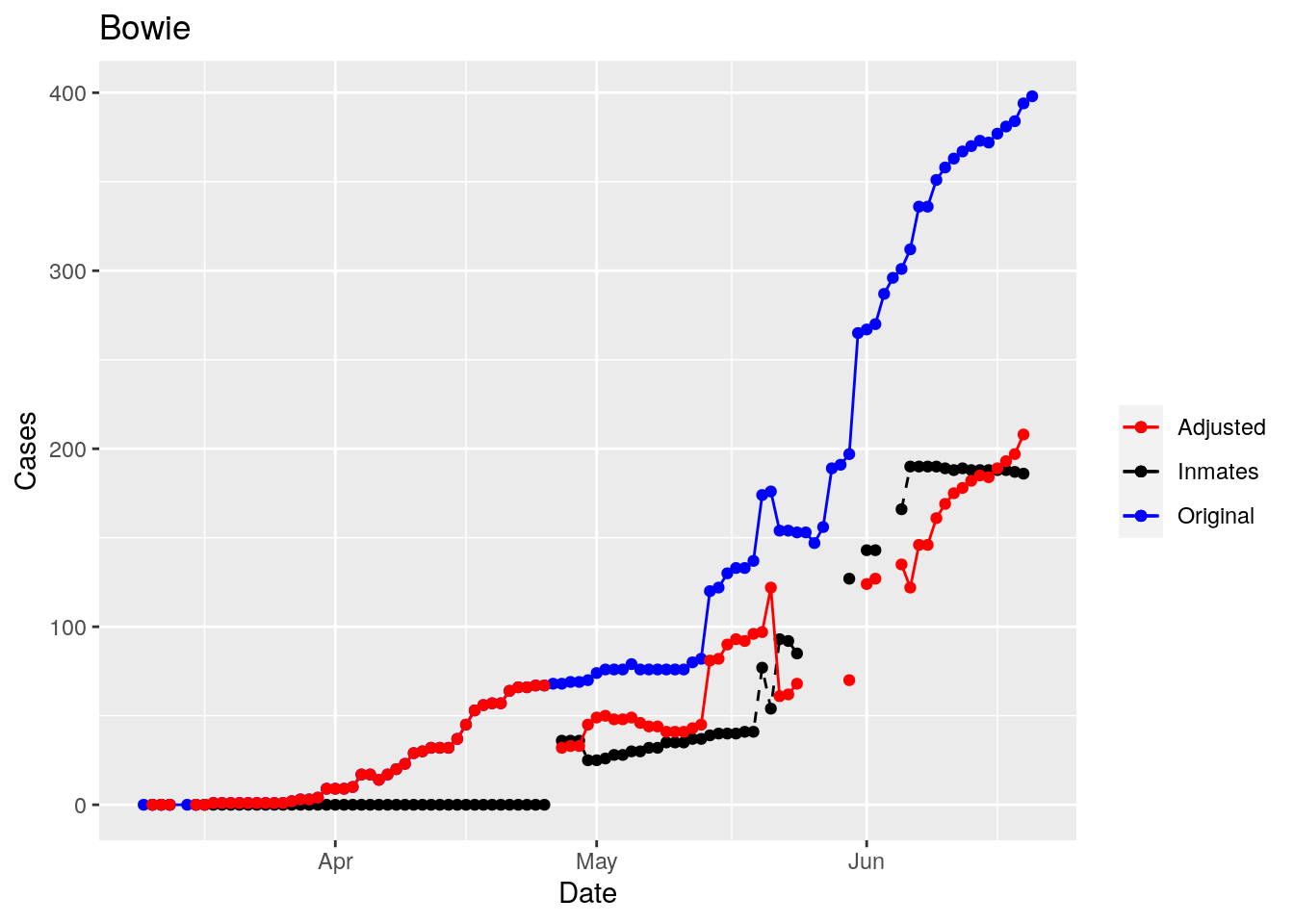
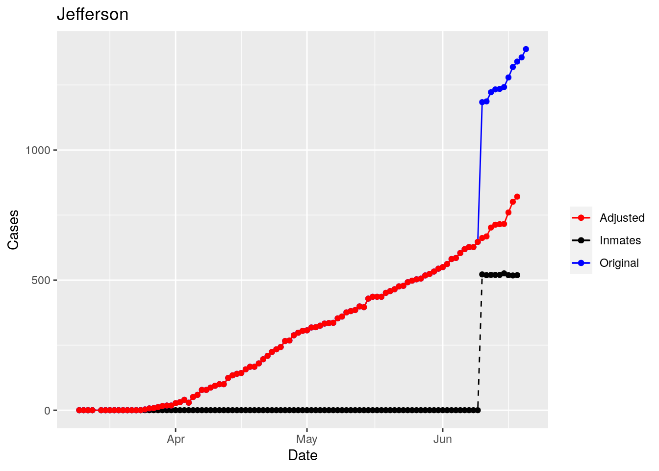
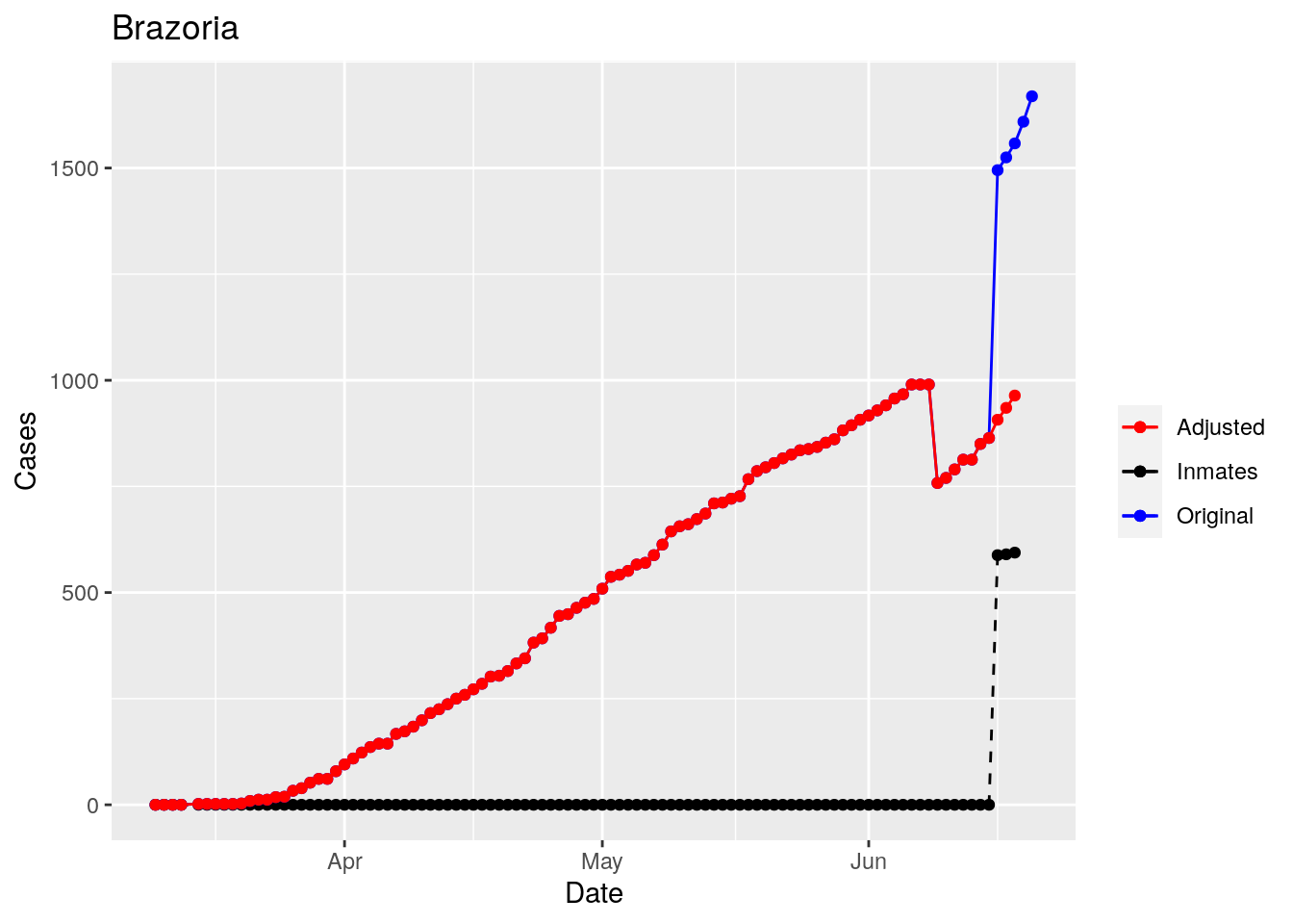
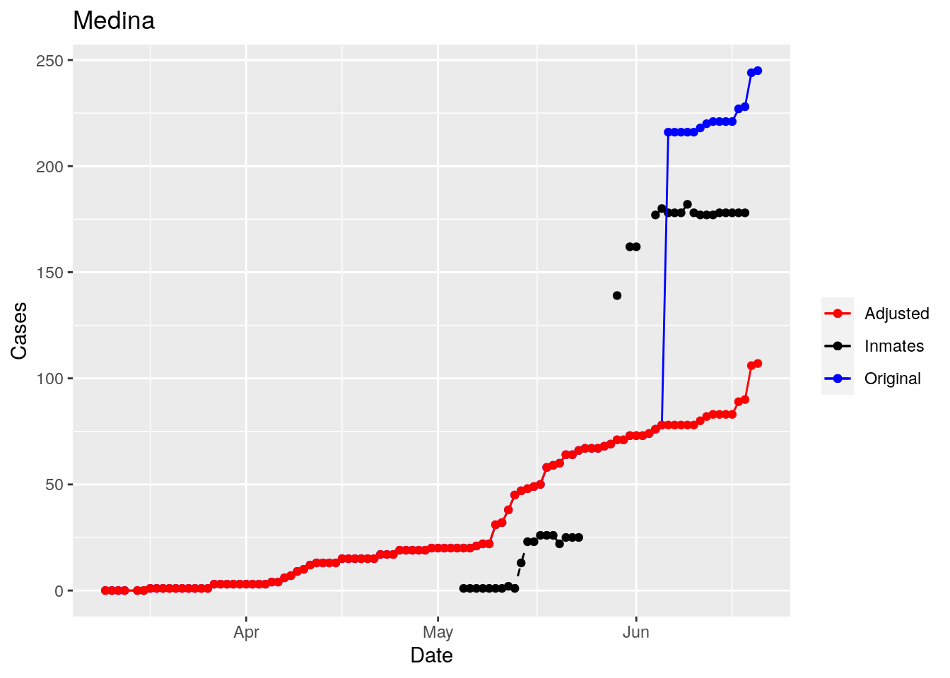
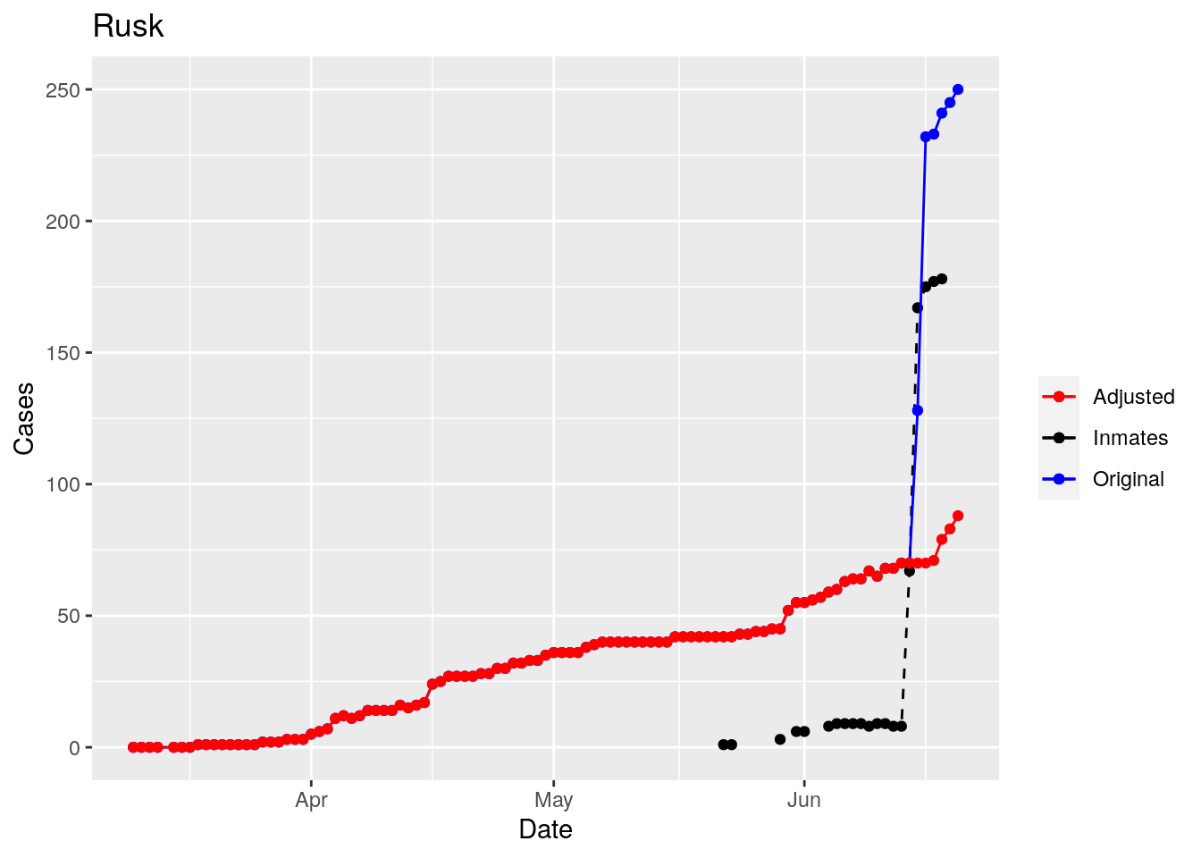
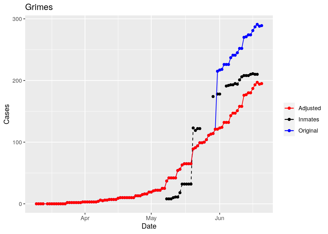
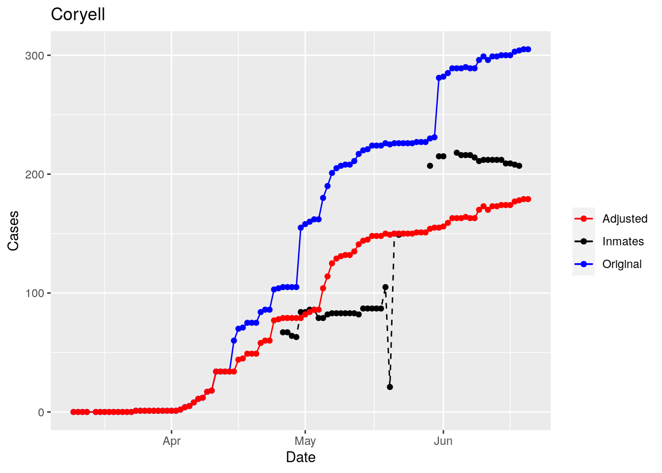
Moderate success. Anderson, Rusk, Pecos, Bee, Bowie, Jefferson, and Brazoria look pretty good when corrected. Walker, Grimes, Medina, and Houston are a bit dodgy. Jones, Coryell, and Terry just don’t work.
So we have a mess. Some counties the prison cases have clearly been added after a specific date. Some counties they appear to have never been added. And for some counties it isn’t clear what the heck is going on.
But clearly the prison cases, because of delayed batch testing, are causing huge jumps in some of the county totals, rendering that data nearly useless for most purposes. Subtracting the prison cases does not appear to be very robust, and given the difficulty in even gathering the prison data in a reliable fashion, it seems an unwise path to take.
However, I think I can remove the jumps - assuming they are due to prison reporting. While not perfect, that should improve the data from it’s current state, which is nearly unusable. So let’s explore that strategy.
foo <- df %>%
  group_by(County) %>%
    mutate(delta=Cases-lag(Cases)) %>%
    replace_na(list(delta=0)) %>%
    mutate(size=max(Cases)) %>%
  mutate(Scaled_delta=delta/size) %>%
  ungroup()

foo %>%
  filter(County %in% bigcounties$County) %>%
  filter(size>50) %>%
  ggplot(aes(x=delta)) +
  geom_histogram() +
  facet_wrap(~ County, scales = "free_x")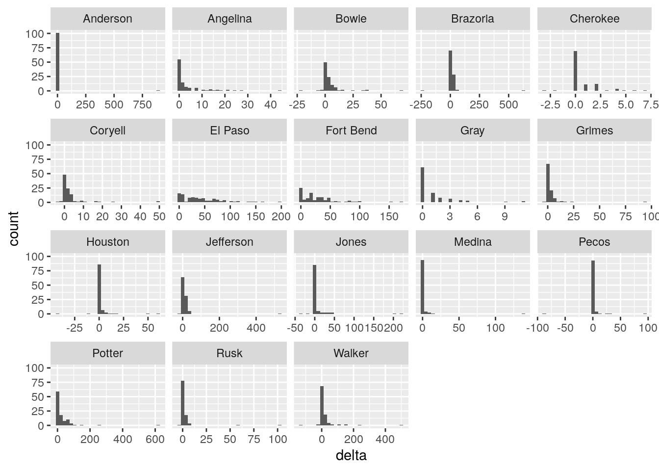
#  lag > 25 and size > 50 and delta > 20%

Prison_counties <- c("Jones", "Anderson", "Walker", "Medina", "Rusk",
                     "Grimes", "Coryell", "Houston", "Pecos", "Angelina",
                     "Bowie", "Jefferson", "Brazoria")

#   De-step

foo <- foo %>%
  arrange(County) %>%
  filter(County %in% Prison_counties) %>%
  filter(size>50) %>%
  group_by(County) %>%
    mutate(Threshold=as.numeric((abs(delta)>25)&(abs(delta)/Cases>0.10))*delta) %>%
    mutate(Threshold=cumsum(Threshold)) %>%
  ungroup() %>%
  mutate(Adjusted=Cases-Threshold)

  for (county in Prison_counties) {
    p <- foo %>% filter(County==county) %>%
    ggplot(aes(x=Date, y=Inmate_cases)) +
    geom_point(aes(color="Inmates"))+
    geom_line(aes(color="Inmates"), linetype="dashed") +
    geom_point(aes(y=Cases, color="Original"))+
    geom_line(aes(y=Cases, color="Original"))+
    geom_point(aes(y=Adjusted, color="Adjusted"))+
    geom_line(aes(y=Adjusted, color="Adjusted"))+
    scale_color_manual(name="", values=c("red", "black", "blue"))+
    labs(title=county, y="Cases")

    print(p)
  }
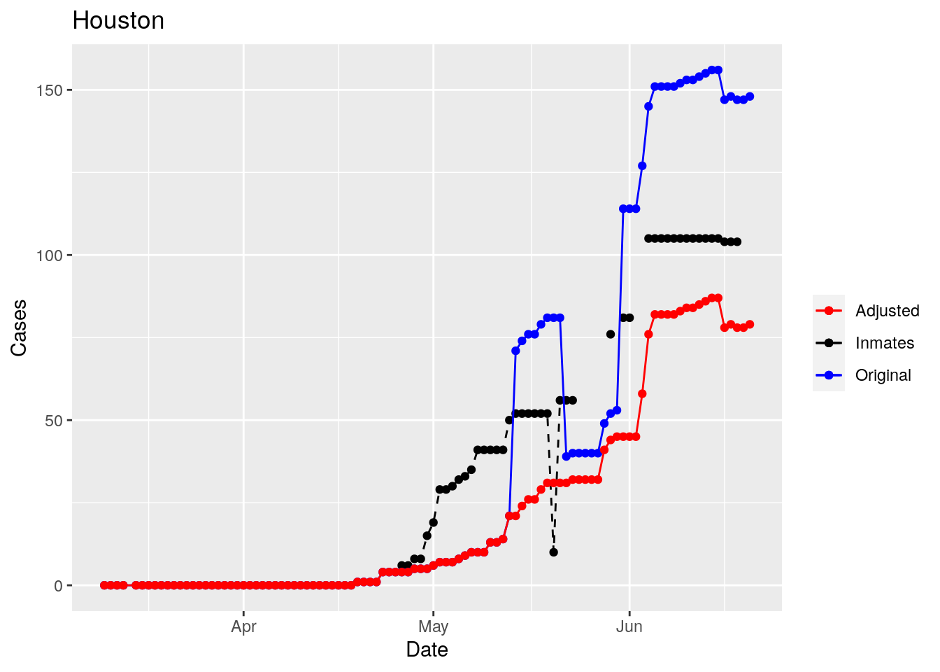
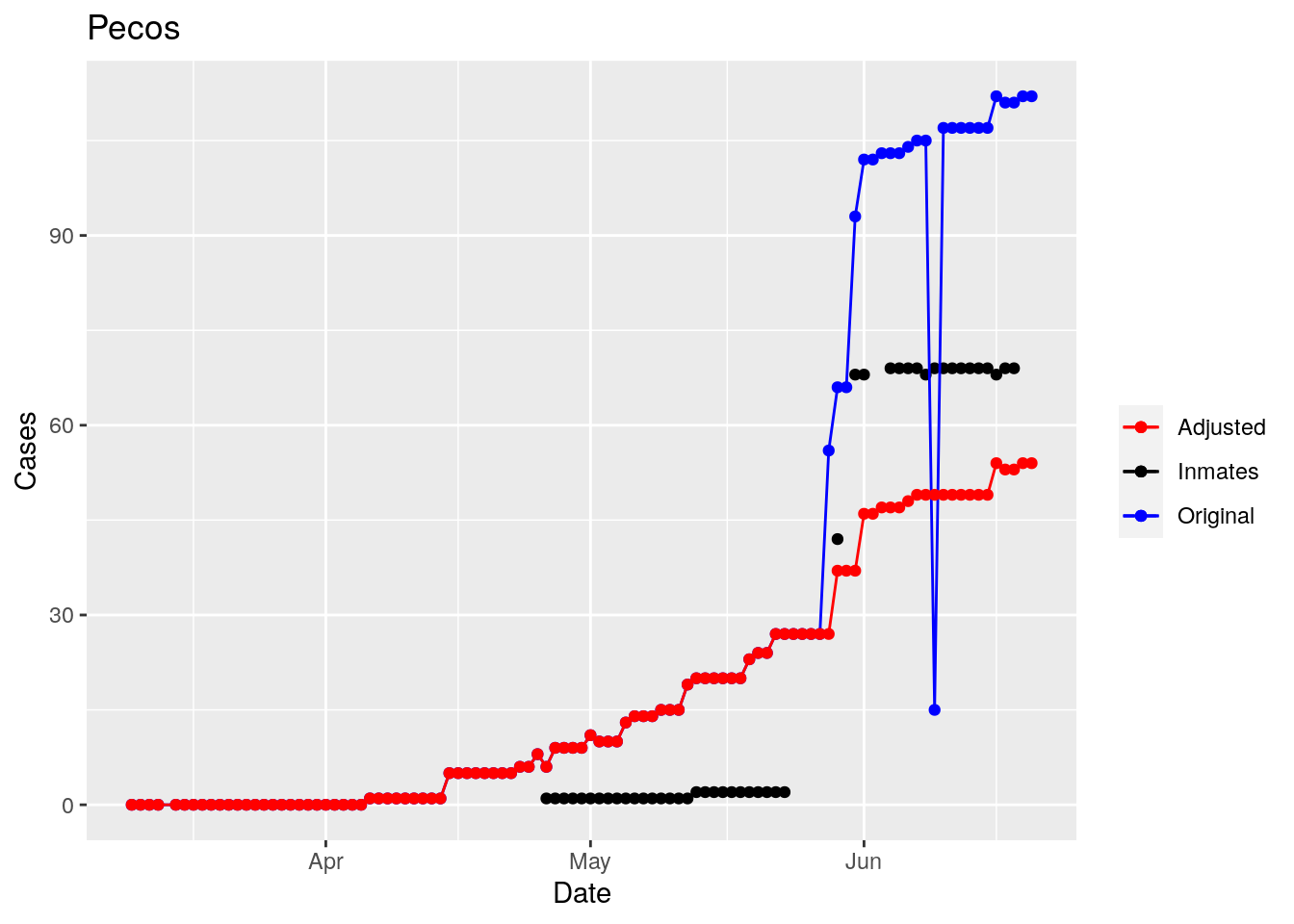
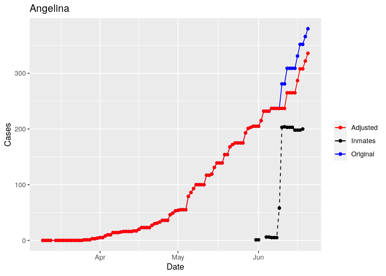
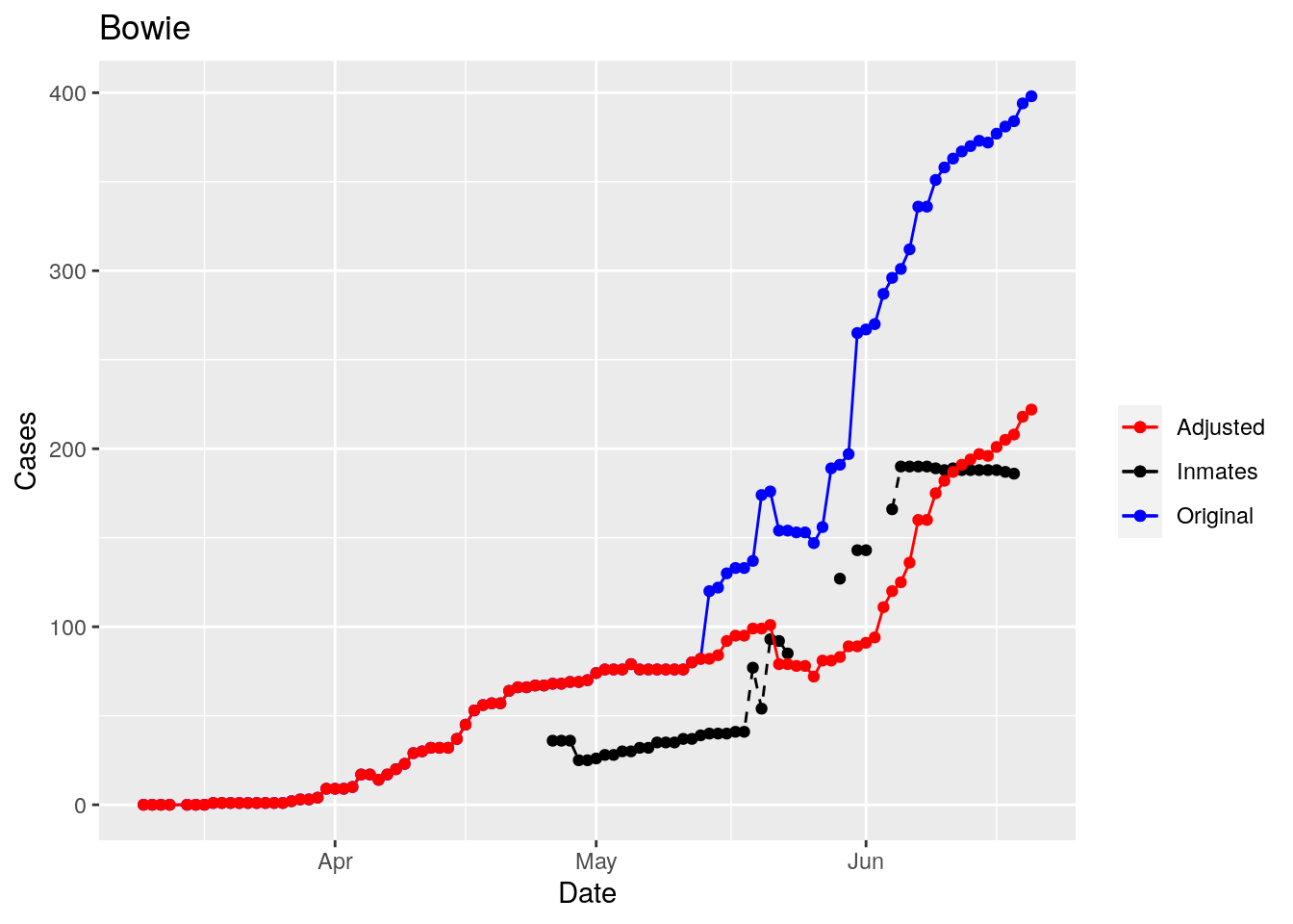
That looks pretty good, especially after I restricted the counties I apply that logic to. Basically, if a jump is greater than 25 and greater than 10%, then remove it. The downside is that the numbers now have lost a lot of meaning - they represent the county at large with some or most of the inmate cases removed, but then it isn’t totally clear what they represented before the adjustment. I think this should help make the time-series behavior more interpretable, even if the absolute numbers are uncertain.