
Piecewise Fitting of Covid Data
Piecewise data fitting
As the COVID-19 pandemic progresses, the simple exponential and logistic models no longer fit the data very well. As waves of infection and retrenchment occur, it seems likely that the best fits will be done piecewise. For this blog entry I will experiment with various schemes to see if I can get a reasonably good strategy for constrained fitting to the data.
As I have a well-structured dataset for all the counties in Texas, that is what I will use for the experiments.
Exponential trials
Let’s start simple and fit successive exponentials starting at the first 10 days of data, and add a single day at a time, and then look at the fit statistics to see what they can tell us.
results <- tibble(Days=numeric(0),
                  m=numeric(0),
                  b=numeric(0),
                  stddev=numeric(0),
                  Rsqr=numeric(0),
                  min_res=numeric(0),
                  med_res=numeric(0),
                  max_res=numeric(0))

for (i in 10:max(Covid_data$Days)){
  my_data <- Covid_data %>%
    filter(County=="Harris") %>%
    select(x=Days, y=Cases)

  my_data <- my_data[1:i,]

     model <- lm(log10(y)~x, data=my_data)
     m <- model[["coefficients"]][["x"]]
     b <- model[["coefficients"]][["(Intercept)"]]
     Rsqr <- summary(model)$adj.r.squared
     std_dev <- sigma(model)
     min_res <- min(summary(model)$residuals)
     med_res <- median(summary(model)$residuals)
     max_res <- max(summary(model)$residuals)
     results <- results %>%
       add_row(Days=i,
               m=m, b=b, stddev=std_dev, Rsqr=Rsqr,
               min_res=min_res,
               med_res=med_res,
               max_res=max_res)
}

my_results <-  results %>%
  pivot_longer(-Days, names_to="statistic", values_to="value")

my_results %>%
  ggplot(aes(x=Days, y=value, color=statistic)) +
  geom_line()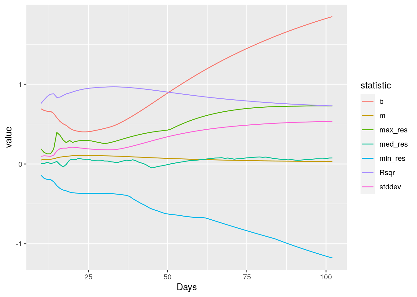
It looks like R-squared is the best measure, though standard error is also not bad. So let’s set up to create a segmented fit, minimum lengths of 10 days, fitting up until R-squared hits a maximum and then starting over.
I also want to reduce the 7 day periodicity in the data, since it really messes with the fits. So lets look for ways to try to pull that out. First I need to try to flatten the data so that the sine wave dominates. Let’s look at the daily new cases, and see what we can do with that.
# Let's look at counties with > 500 cases today

Covid_data %>%
  group_by(County) %>%
    summarise(maxcases=max(Cases)) %>%
    filter(maxcases>1000) %>%
    select(County) -> bigcounties

Bigdata <- Covid_data %>%
  filter(County %in% bigcounties$County)

Bigdata %>%
  group_by(County) %>%
    mutate(newcases=Cases-lag(Cases)) %>%
  ggplot(aes(x=Date, y=newcases, color=County)) +
  geom_line()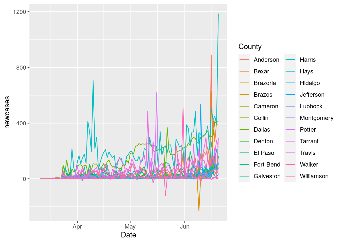
# Let's fit a line to each county, and then subtract that trend

Bigdata <- Bigdata %>%
  group_by(County) %>%
    mutate(newcases=Cases-lag(Cases)) %>%
    nest()

county_model <- function(df) {
  lm(newcases ~ Days, data = df)
}

Bigdata <- Bigdata %>%
  mutate(model=map(data, county_model))

Bigdata <- Bigdata %>%
  mutate(resids = map2(data, model, modelr::add_residuals))

resids <- unnest(Bigdata, resids)

resids %>%
  ggplot(aes(x=Date, y=resid, color=County)) +
  geom_line()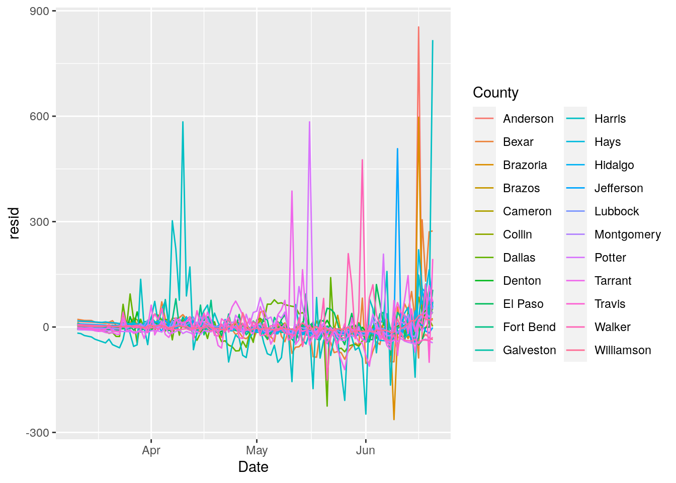
fit_wave <- function(df) {
  df <- df %>% replace_na(list(resid = 0))
  df$resid <- ts(df$resid)
  lm(resid ~ sin(2*pi/7*Days)+cos(2*pi/7*Days), data=df)
}

NewData <- Bigdata %>%
  mutate(newmodel=map(resids, fit_wave))

NewData <- NewData %>%
  mutate(sins = map2(data, newmodel, modelr::add_predictions))

sins <- unnest(NewData, sins)

sins <- sins %>% select(County, Date, Cases, Days, newcases, pred) %>%
  bind_cols(resids$resid) %>% rename(resid=7)

p <-
sins %>%
  ggplot(aes(x=Date, y=resid)) +
  geom_point() +
  geom_line(aes(x=Date, y=pred), color="red") +
  facet_wrap(~ County, ncol=4, scales="free_y")

print(p)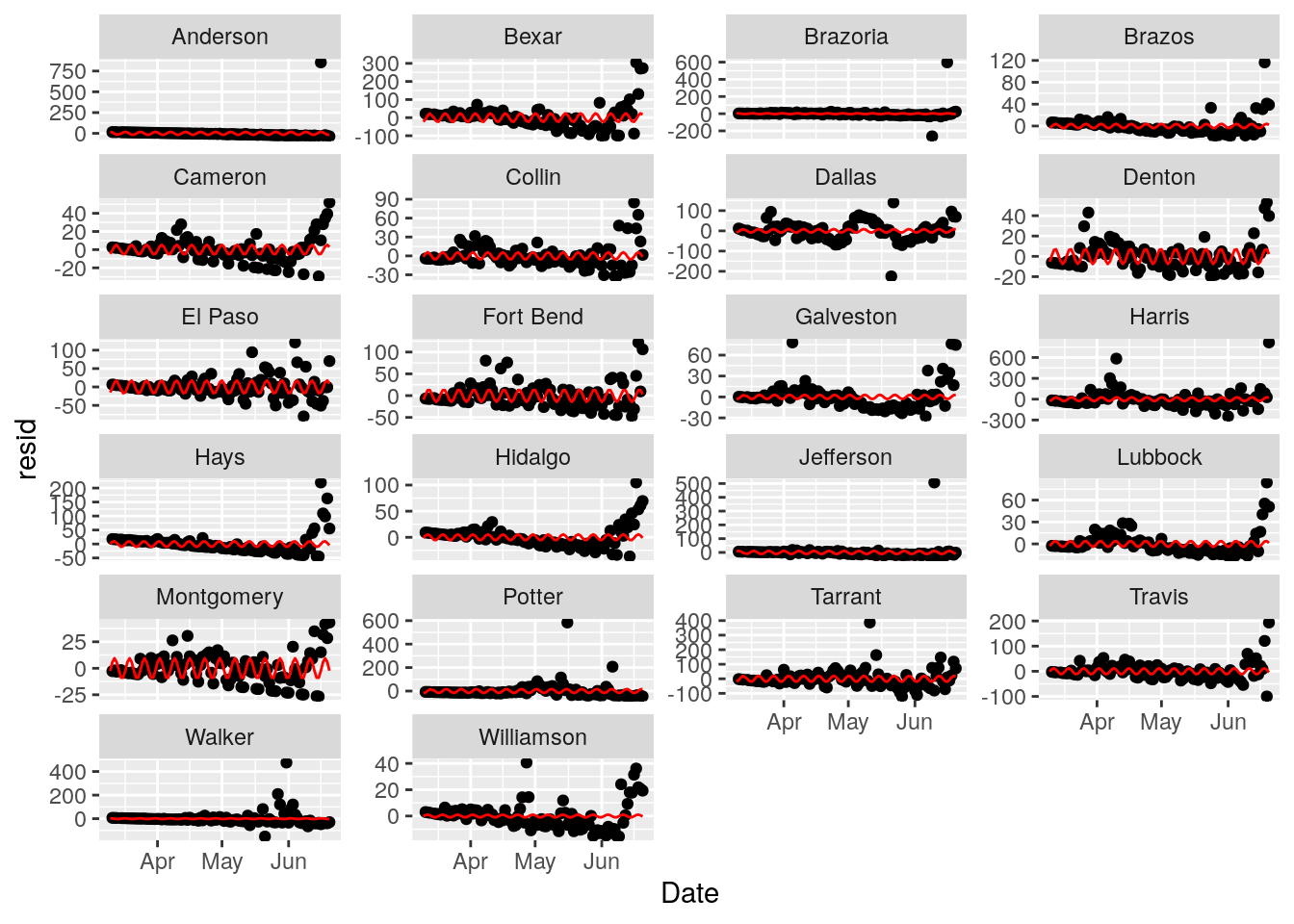
Looks like Cameron and Montgomery counties take the weekend off - I guess this isn’t serious enough to work weekends. Other counties don’t seem to show an obvious 7 day signal. The sine fits are pretty unimpressive. I’ll give this a miss and focus on fitting exponentials.
Fitting piecewise exponentials
Tried looking for the maximum R squared value as a time to break the fit, but that is a little unstable, so I settled instead for getting an R squared less than 0.98 as the breakpoint - or for a residual of greater than 5%. Those seemed to look pretty good. With an 8 day minimum fit length. I also start at the most recent data and work backwards, since what I care most about is the recent behavior, the past not so much.
fit_segment <- function(data, start) {

  oldRsqr <- 0
  for (i in ((start-8):0)){ # count backwards
    #print(paste("==== ", i, start))
    my_data <- data %>%
      select(x=Days, y=Cases)

    my_data <- my_data[i:start,]

         model <- lm(log10(y) ~ x , data=my_data)
         worsening <- ((Rsqr<0.98) ||
                    (max(10**model[["fitted.values"]]-my_data$y, na.rm=TRUE)
                                         > max(0.05*my_data$y, na.rm=TRUE))) &
                     (start-i>8)

       m <- model[["coefficients"]][["x"]]
       b <- model[["coefficients"]][["(Intercept)"]]
       Rsqr <- summary(model)$adj.r.squared
       std_dev <- sigma(model)
       double <- signif(log10(2)/m,3)

       if (worsening){ # Rsqr has hit a maximum
         return(list(stop=i,
                     Rsqr=oldRsqr,
                     m=old_m,
                     b=old_b,
                     double=old_double,
                     model=old_model))
       }
       oldRsqr <-  Rsqr
       old_m <- m
       old_b <- b
       old_double <- double
       old_model <- model
  }
   return(list(stop=i,
               Rsqr=Rsqr,
               m=m,
               b=b,
               double=double,
               model=model))
}


for (county in bigcounties$County){

  #print(paste("---->>>>>>", county))

  df <- Covid_data %>% filter(County==county) %>%
    mutate(Cases=na_if(Cases, 0)) %>%
    filter(Cases>0) %>%
    mutate(Days=Days-min(Days)) # renormalize Days

  #     exponential fits
  results <- tibble(start=numeric(0),
                    stop=numeric(0),
                    m=numeric(0),
                    b=numeric(0),
                    double=numeric(0),
                    Rsqr=numeric(0),
                    model=list(),
                    tidiness=list())

    start <- nrow(df)-1
    while (start >=8) {
      answers <- fit_segment(df, start)
      results <- results %>%
        add_row(start=start, stop=answers[["stop"]],
                m=answers[["m"]], b=answers[["b"]],
                double=answers[["double"]],
                Rsqr=answers[["Rsqr"]], model=list(answers[["model"]]),
                tidiness=list(tidy(answers[["model"]])))
      start <- answers[["stop"]]-1
    }
    lines <- NULL
  for (i in 1:nrow(results)) {
    foo <- augment(results$model[[i]],
                     newdata=tibble(x=results$start[i]:results$stop[i]) ) %>%
                   mutate(y=10**(.fitted), color=i)
    lines <- rbind(lines,foo)
  }
  lines$color <- as_factor(lines$color)
  results$Cases <- sort(df[(df$Days %in% results$start),]$Cases, decreasing=TRUE)


brks <- unique(lines$color)
labs <- results$double

  p <- df %>%
    ggplot(aes(x=Days, y=Cases)) +
    geom_point() +
    geom_line(data=lines, aes(x=x, y=y, color=color)) +
    scale_colour_discrete(name  ="Dbl Times",
                            breaks=brks,
                            labels=labs) +
    geom_text(data=results, aes(x=start, y=Cases, label=double),
              hjust="right", vjust="bottom") +
    labs(title=county)

  print(p)
}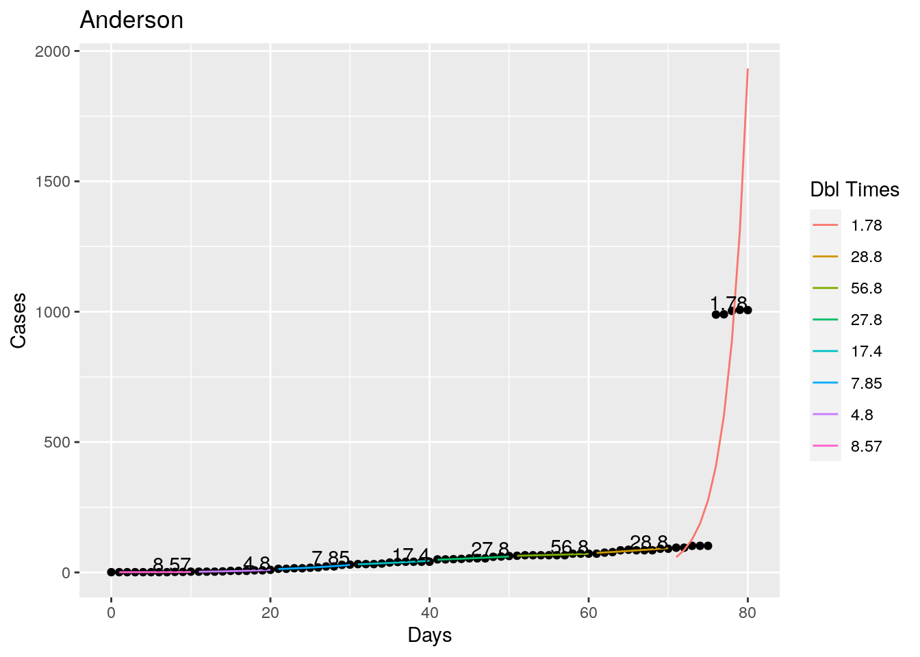
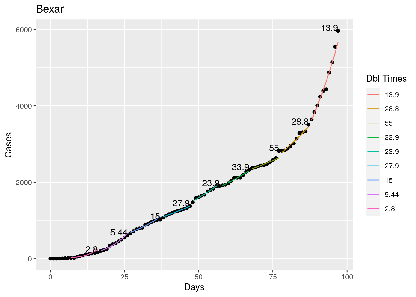
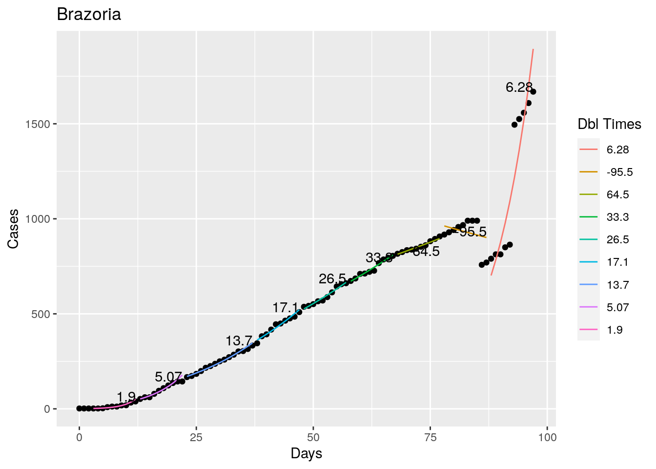
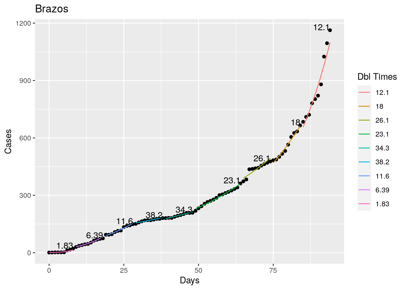
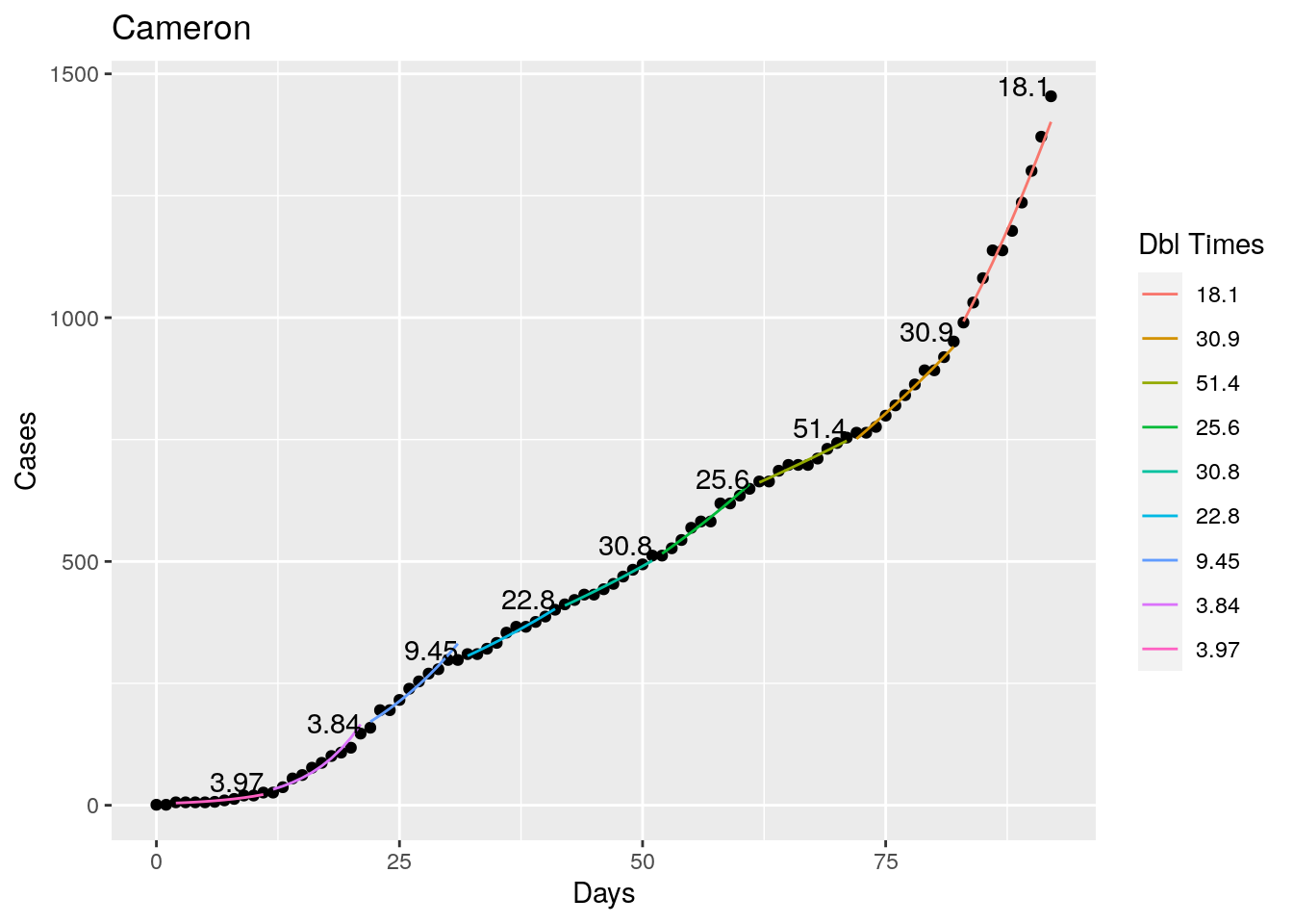
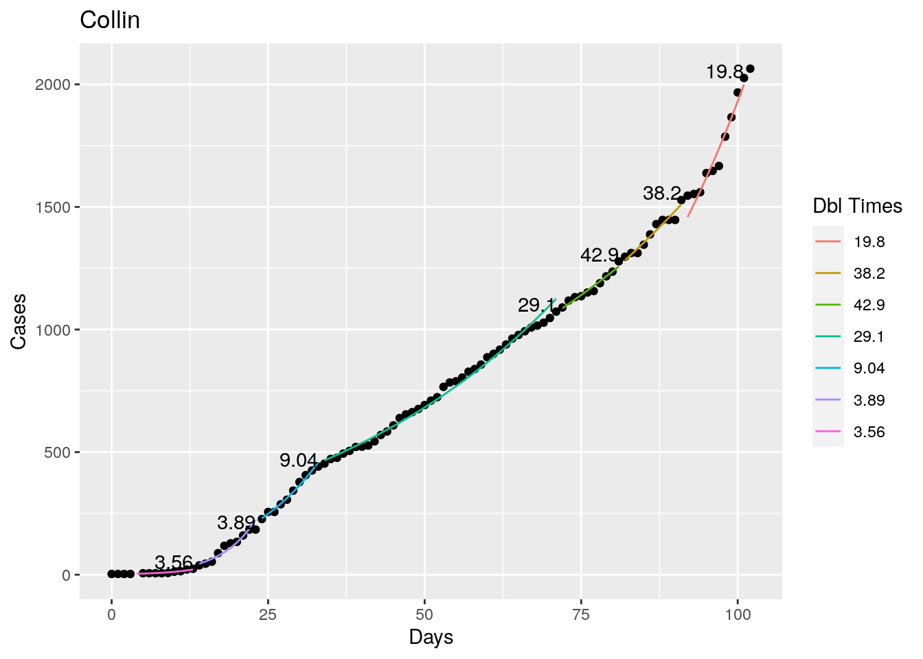
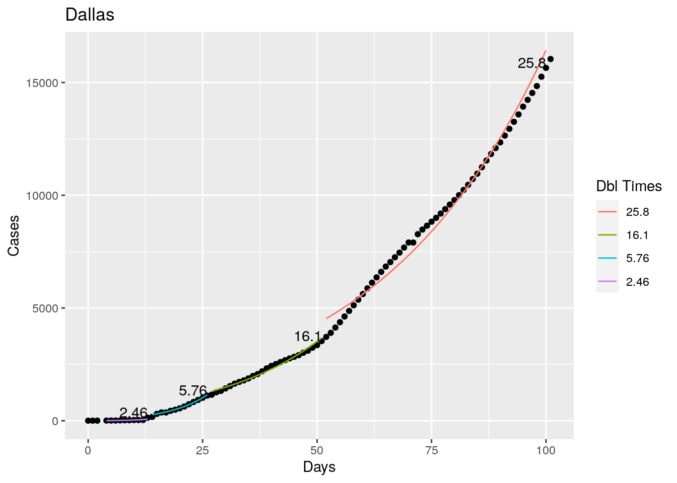
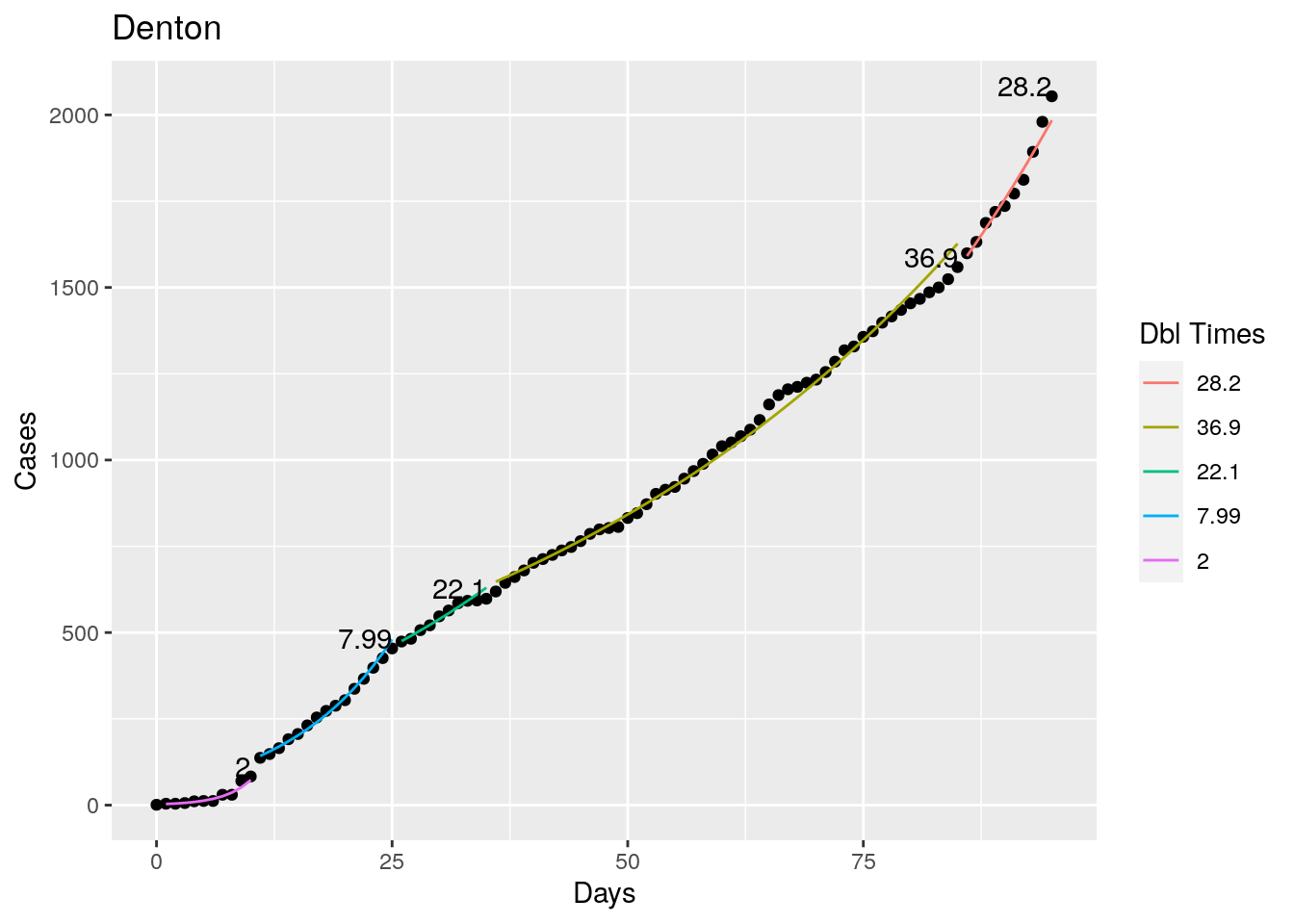
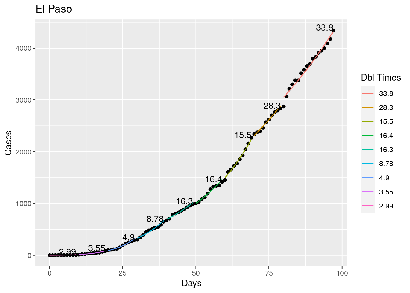
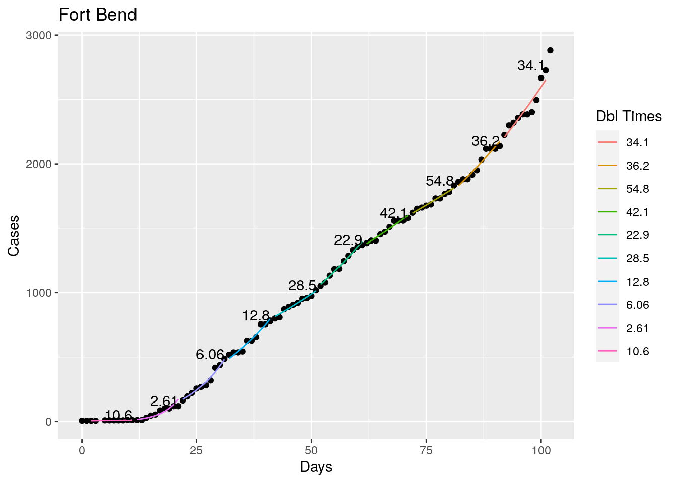
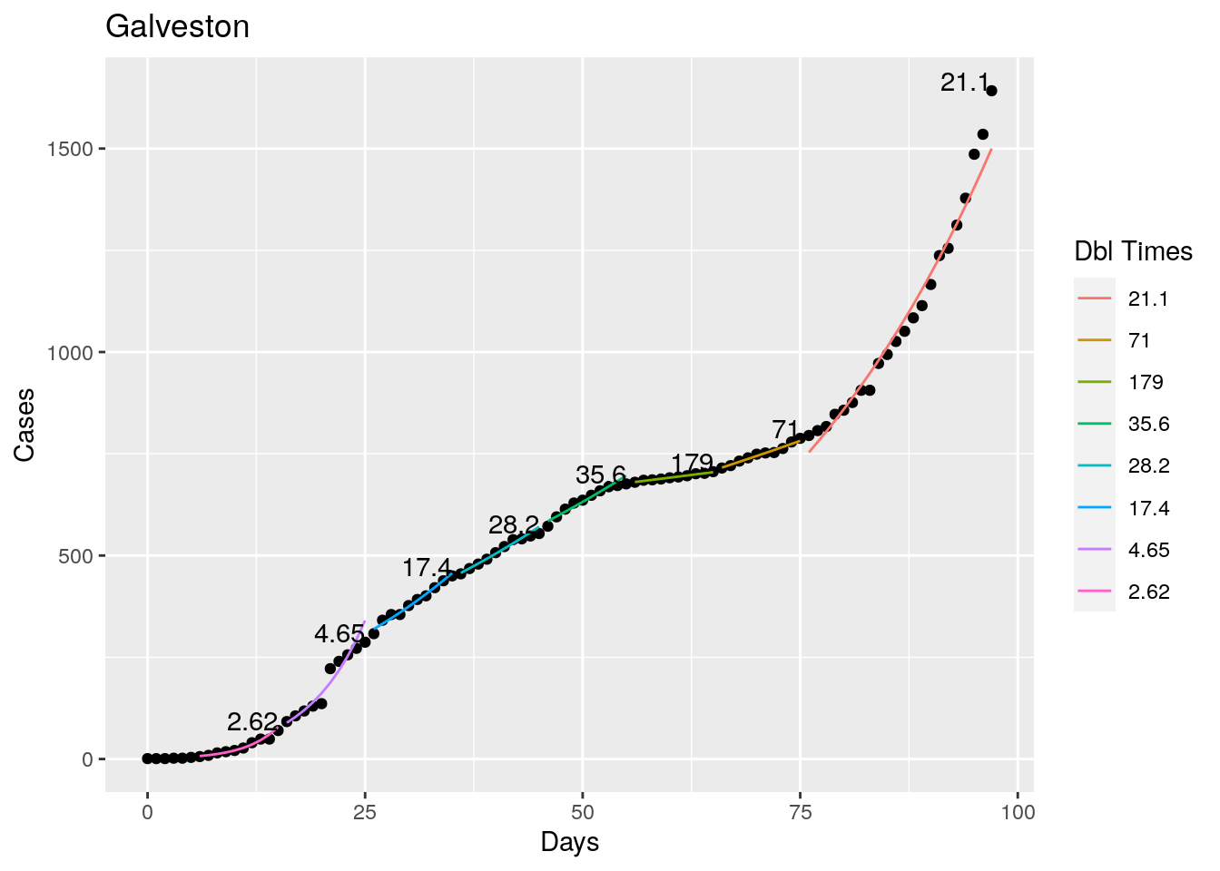
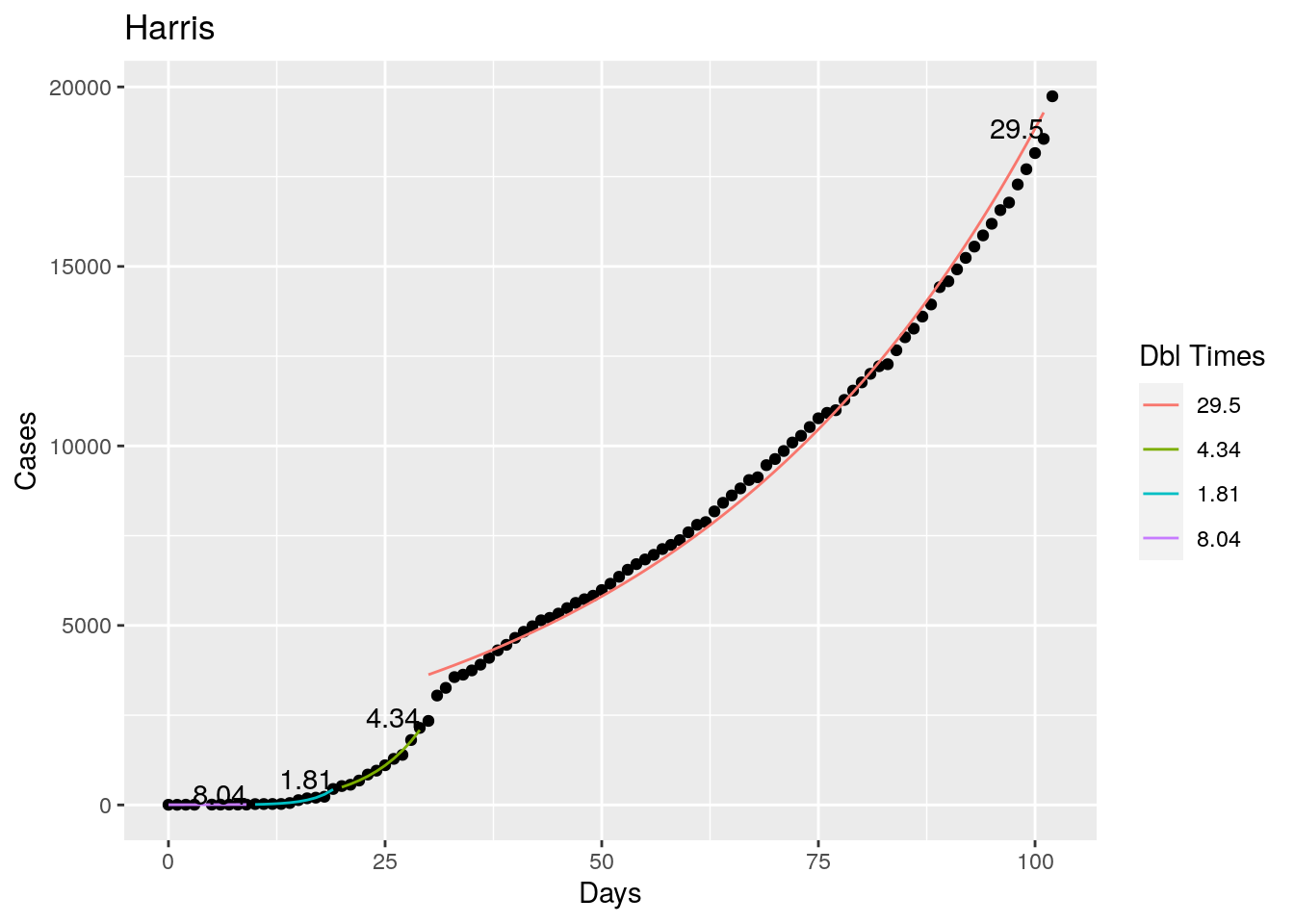
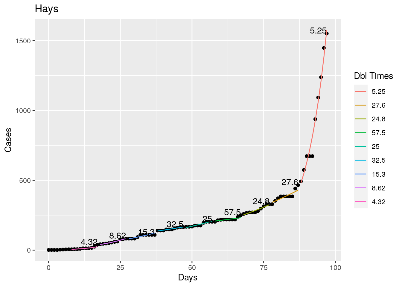
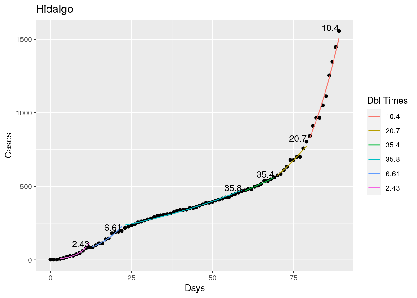
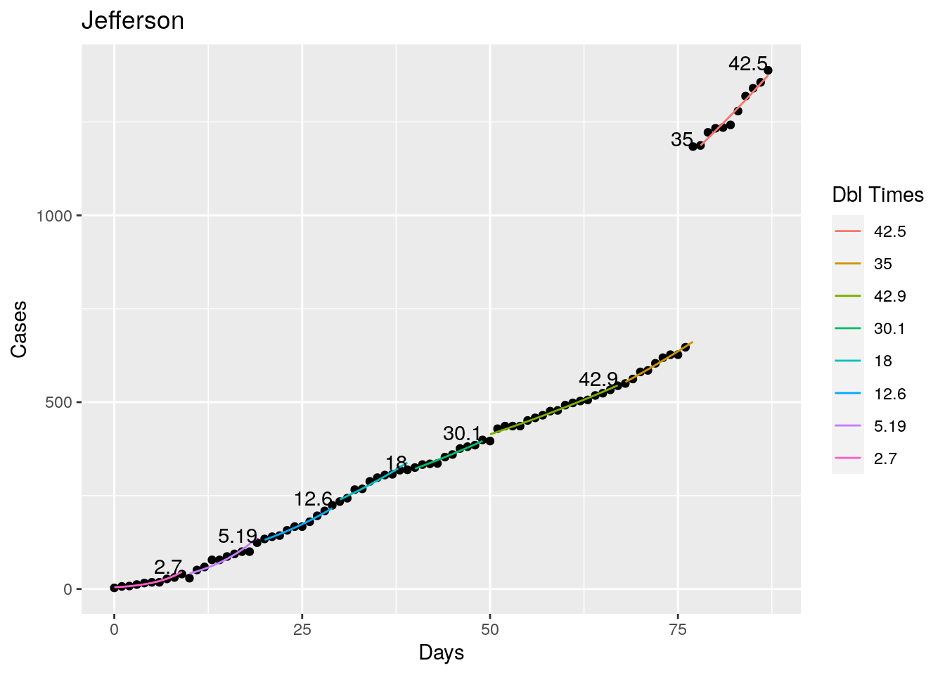
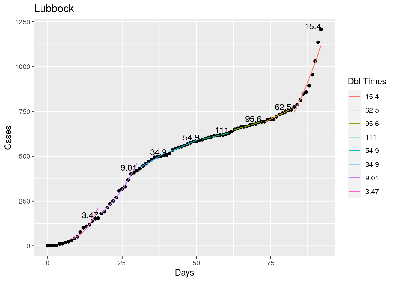
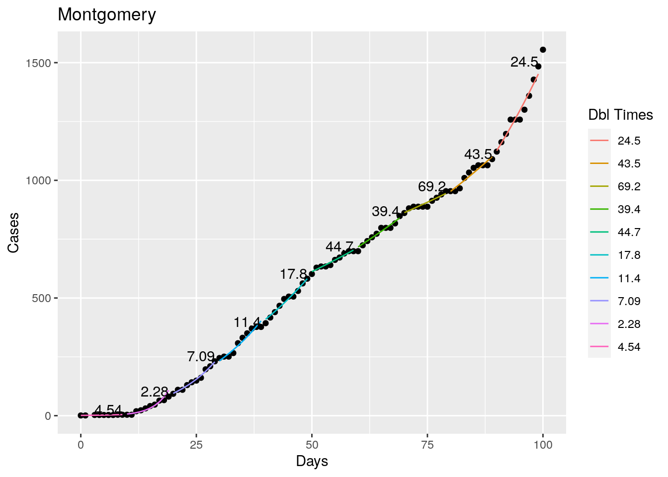
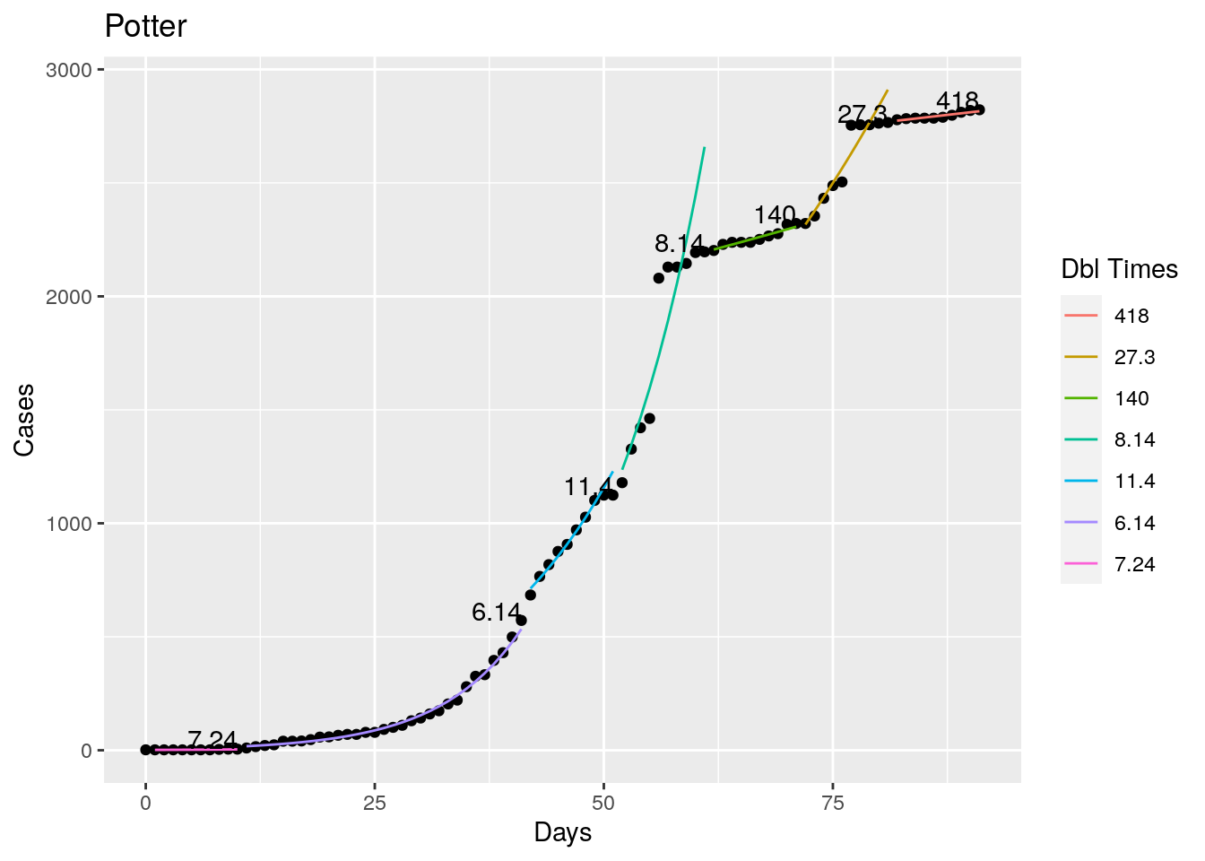
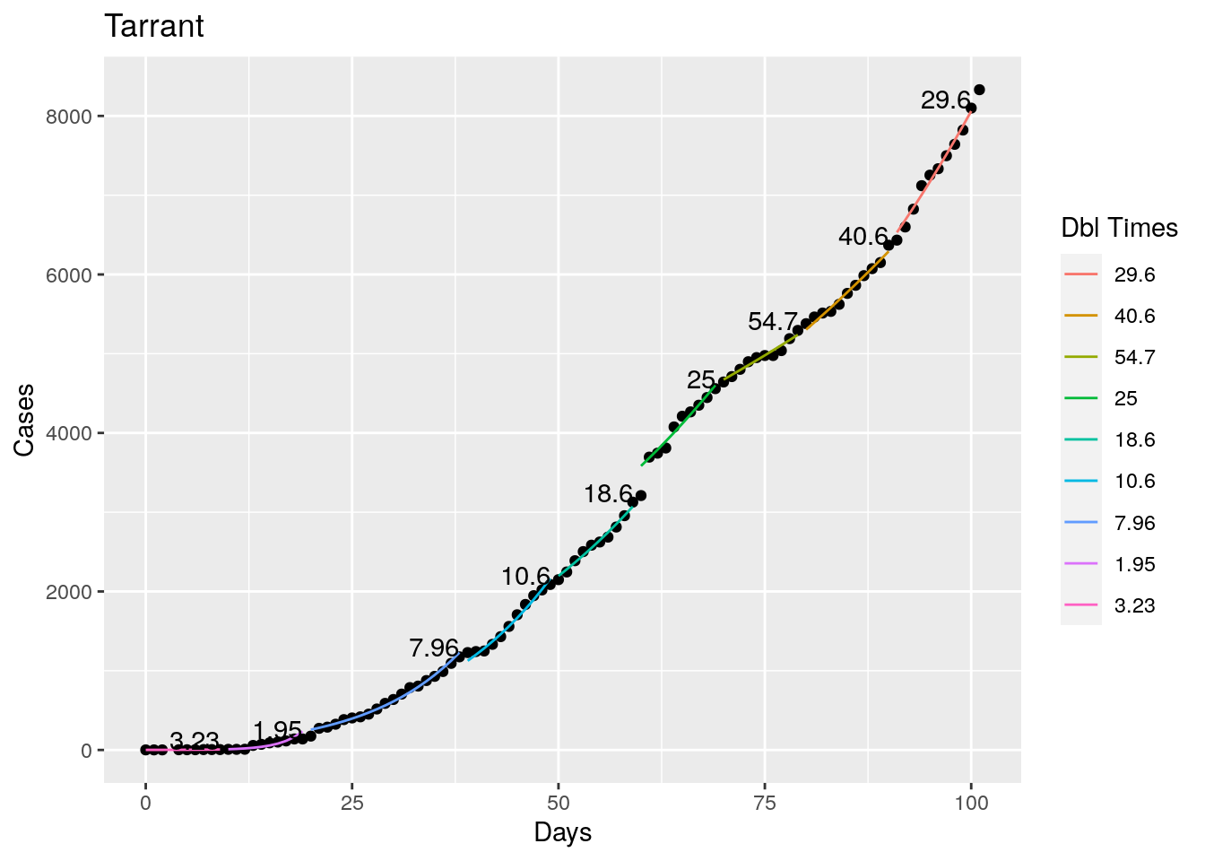
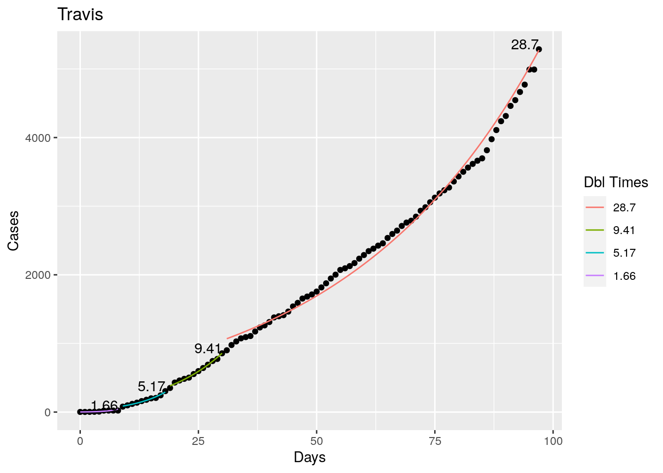
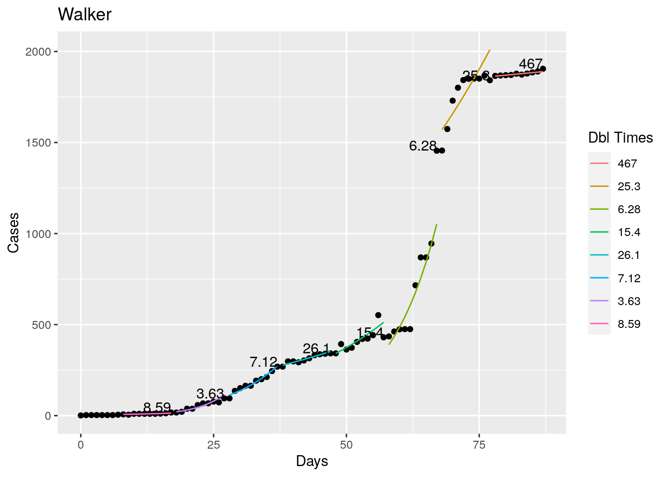
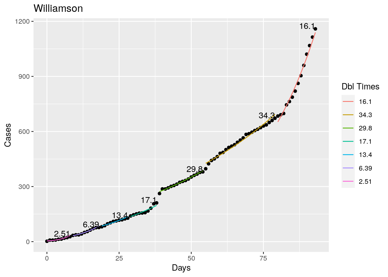
Not too bad, though it certainly struggles at a few points. But the data is probably corrupt in those early days as well. Overall, pretty satisfactory.
Note that in a few cases, prison data got added to the county data suddenly, causing huge spikes.
In any event, I’m pretty happy with the performance so next step will be to implement this into my shiny app.